Since we moved nearly two years ago, we've been on the hunt for the right house. Spending all this time searching has taught me at least one thing: People really, really need help taking photos for their listings. I have no intention of shaming anyone (because frankly these photos below are not the only ones out there), but I feel like I need to share what not to do. A house is a big-ticket item and you want it to look its best so it can move off the market quickly. Listing photos are supposed to draw people in and make them want your house, not make them laugh or run scared. (PS: Realtors, when I see you've posted a listing with questionable photos, it makes me question your attention to detail and quality as a professional.) I won't lie, it can be hard to get good pictures when you've just found out or decided you're moving and haven't packed up yet and there's clutter all around. But try your best to remove distracting and overly personal items. When we were moving from our first apartment to our house, we had a lot of papers, miscellaneous decor, and photos. But we spent a couple days, packed all that stuff up and brought it to a storage space that was running a two-month special. It made a huge difference in the amount of stuff in the apartment, which I then staged for the photos and showings. The apartment sold within 24 hours of being listed. Granted, it was in a highly desirable area and it was before the economy tanked, but I have no doubt that the cleared-out space helped. We even removed all photos of family and friends, save one wedding picture where you couldn't see our faces. People want to see themselves in your house, so even if it feels weird to you, try to depersonalize your house when you put it on the market. This advice is not new, but it seems people don't take it to heart: 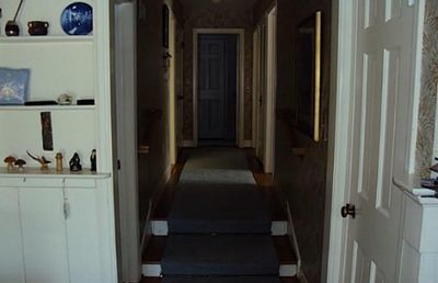
Turn on the lights
I can barely see this hallway. Is it painted, is that wallpaper? Where is this leading? Aside from the lights being on, I think the door at the end of the hall should have been opened. People want a sense of how the house flows. 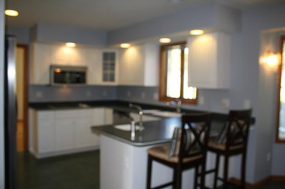
Make sure the photo is in focus
In the digital age there is no excuse for posting a blurry photo like this. I can't see the details clearly. Is that a tiled backsplash or simply a gajillion outlets all along the wall? Take a minute to scroll through the images on your camera display and see if all the important details look clear. 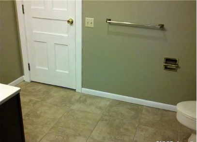
Show the most important parts of the room
It's safe to assume every bathroom has a place for towels and toilet paper, so I don't really need to see that. I'd rather see what the vanity and lighting look like and how many sinks there are. Powder rooms and half baths can be hard to shoot, but at least show me all of something. Showing me fractions and corners of multiple things doesn't help me visualize the room. 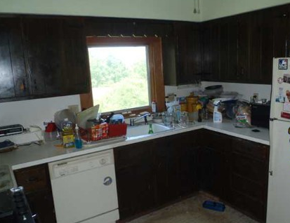
Clean up, or at least hide, the messes
I'm the first to admit that on any given day I have a stack of laundry and school papers somewhere. But I wouldn't show them to you in my listing photos. You want your house to look its most attractive when you're trying to sell it, so straighten up and put away dishes and cleaning supplies. People want to see how much counter space a kitchen has, keeping it cluttered is not appealing. 
What is happening here?
I'm not a plumber or an electrician and I don't know what this is but it looks like a hot mess. And probably not code. I'm not sure why this was included in the listing photos; is this supposed to entice me to want to see more of the house? This makes me want to call Mike Holmes to do a full house inspection. 
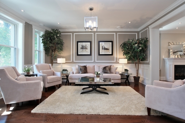
Now, let's look at this beautifully finished room again. This is a good example of what I would like to see in a listing photo. Obviously it's a professional image so I don't expect a listing photo to be this high quality or the average room to be this well decorated, but here's what this photo has going for it and what you should strive for: -The picture is clear and in focus, is not taken from any funny angles, and shows the approximate depth of the room. Because I can see the whole room, I'm not left wondering what I can't see. -It gives an idea of how the house flows because you can see into the next room. -The lights are on and the windows are letting in natural light so you get a sense of how the room looks during the day and you can see everything in it. -The furniture is nicely arranged and the room is lightly accessorized but there are no personal items, photos, toys, or other kinds of clutter. This room absolutely makes me want to see more of the house. When I see the bad images, sometimes I can look past the poor photos if it seems like the house is in good shape. But if the pictures are blurry, make the rooms look small, or if the rooms are a mess, it makes me wonder what state the house is in and whether it's worth my time to see the house in person. I can generally tell within 3-5 pictures whether I'm going to want to see a house in person or not. If everyone is judging your house by the photos, don't you think it's imperative to have the best possible selection of images for prospective buyers?
0 Comments
This week, as part of my part-time job, I'm attending a local conference called the WISE Symposium. WISE stands for Women Igniting the Spirit of Entrepreneurship. All day tomorrow I'll be tweeting and posting from the conference and I'm excited to hear the speakers who have been successful in starting their own businesses, attend the panels all related to starting and running a business, and learning more about local businesses who will part of the expo section.
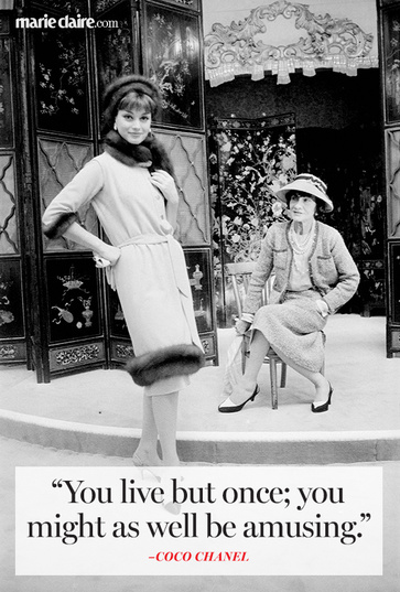
The company I work for is a small business founded and run by a woman. My mother-in-law is an entrepreneur and I don't think of myself as an entrepreneur, but going out on a limb and working freelance as opposed to being on staff is a direction I wasn't ever sure I could succeed in. Marie Claire posted 11 of Coco Chanel's best quotes and they seemed especially appropriate this week. The one above is my favorite as it's pretty close to my philosophy on life and decorating (to some extent). Check out the rest of the inspiring quotes here. 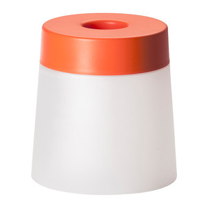
The other day it actually smelled like spring in the air and it was the best thing I've smelled in a long time. I can't wait to spend more time outside. Even when you're busy, everything feels a little lighter in spring, don't you think?
Spring and outdoor products are in stores now and this adorable item comes from IKEA. Developed by design studio Rich Brilliant Willing for the PS 2014 collection, the LED stool/lamp is suitable for indoor and outdoor use, and was inspired by the very summery idea of fireflies alight in a jar. The name indicates the obvious double duties of the piece acting as a stool and a light. It is also available with a white top. The collaboration with RBW started in 2011, when founders Theo Richardson, Charles Brill, and Alexander Williams were invited by IKEA to be part of this year's collection. It's always interesting to me how long in the making collaborations like this are. The goal of the entire PS collection was to create innovative and accessible items. The stool/lamp is portable and is powered by rechargeable batteries. When fully charged, the batteries will provide full light for approximately five hours and the batteries themselves last for at least two years. The charger and cord are stored conveniently under the lid. The stool/lamp uses LEDs which consume 85% less energy and last 20 times longer than incandescent bulbs. Over the last several years, IKEA has committed to making all of their lighting extremely energy efficient and environmentally friendly. I can picture a bunch of these scattered around a pool or on the lawn glowing as the sun goes down, while friends hang out and enjoy each other's company. 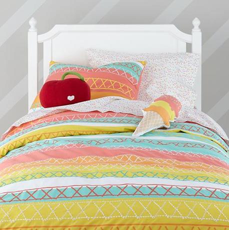
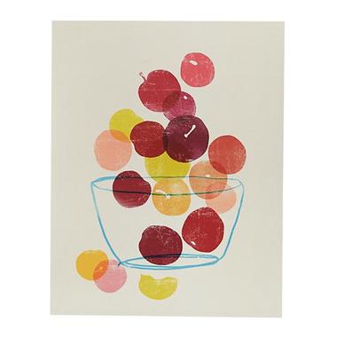
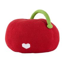
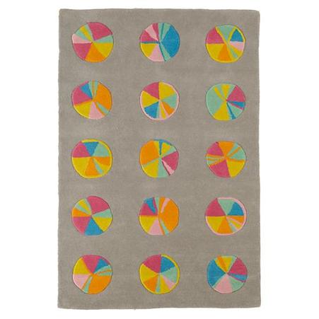
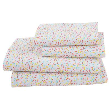
There is a way to decorate kids' spaces without being too juvenile or relying too heavily on characters that your children are likely to outgrow by the time you wash the sheets for the third time. Buying designs that can or will grow with your child is also economical because the pieces you select will have more longevity. (Though I do still have my twin-size Rainbow Brite fitted sheet, circa mid-80s. That's right, be jealous.) And just because something is for a kid's room doesn't mean it has to be bought at a kids' store. I also believe the reverse is true. There are several products from Land of Nod that I would buy for myself, especially from their insanely good lighting department. In my opinion, the best way to design kids' spaces is to include bright colors, graphic shapes and patterns, soft things to snuggle, and a sense of whimsy. The Oh Joy! for Nod collection has all those elements: Bright sherbet-y colors, oversized designs like a sweet cherry pillow and pinwheels on a rug, and adorable sprinkles-patterned sheets (like Joy Cho's daughter, the too-cute Ruby, my older daughter is huge on ice cream and sprinkles). The line launched yesterday and is inspired by both Ruby's interests and Joy's aesthetic with an emphasis on playfulness. While the majority of the products are geared toward young children, there are many pieces that will grow with them, and some, like the lamp below, that will appeal to adults regardless of parental status. The partnership between Joy and Land of Nod has produced two bedding collections, four lamps, pillows and soft toys, a rug, and a selection of curated art prints. Here are my 5 favorite pieces from the collection:
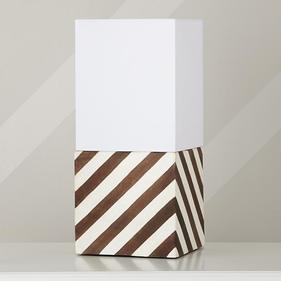
Modern Cube lamp shade & base
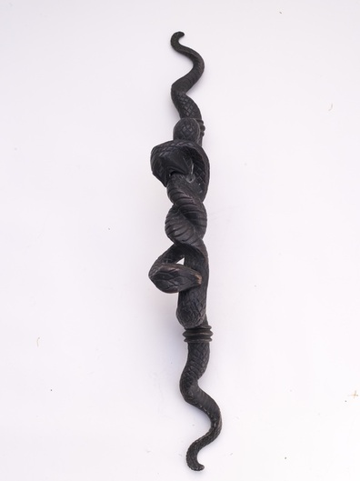
 I'm not the type of person who looks for products (or anything really) that is exactly like what everyone else has or things that will blend in unnoticed. If I like it and it's popular, oh well, what matters most is my feelings about it, but in general, I'd rather have decor that is different from others'. This works out because most of my family and friends have very different taste. Finding unique items can be hard, but when you find the right thing, it can make a serious statement.
Can you imagine entering a room with this double head snake handle on the door? It suggests there may be even more interesting things inside and says a lot about the personality of the person dwelling there. Someone bold, wild, sexy? The handle, designed by interior designer Lisa Jarvis, is two feet long, so it can be used on a door, or perhaps a larger cabinet. It's not for the faint of heart and I love the idea of having one on my front door (I'd have to have a separate mechanism to lock the door, but I'm not thinking about practicality right now)—what a statement that would make. 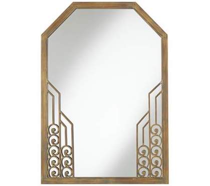
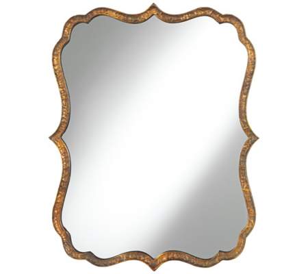
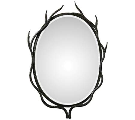
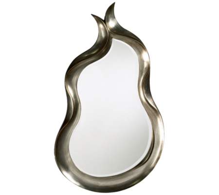
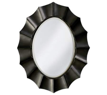
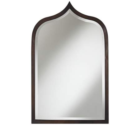
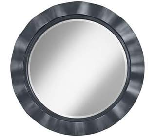
The sunburst mirror has certainly had its day in the sun, so to speak. If you gravitate toward a different style, check out the 55 Downing Street mirror sale, which started today and runs until Saturday, April 5. They have nearly 1500 decorative and functional (the magnify-your-face-to-uncomfortable-degrees kind) options and they're going fast. Some have already sold out and the sale's been open less than half a day! Frameless and framed options in a multitude of styles, shapes, and sizes are all discounted. Personally, I prefer large mirrors as opposed decorating with clusters of tiny ones, and I've shared my favorites from the sale here. I love the Art Deco frame above because it reminds me of the office building I worked in on 42nd and Lexington when I was at Traditional Home. The building had some of the most beautiful elevator doors I've ever seen, gold with great imagery and detailing similar to what is on this frame. As you can tell, I'm also drawn to mirrors with a bit of movement and while I've only shown metallic or neutral frames here, I would also use a colored frame if I found the right one (the mirror on the bottom right comes in dozens of colors). I also think using one or more good mirrors like these instead of one large unframed (ugly) piece of glass in a bathroom is much more attractive. Interesting mirror frames are just another way of injecting your personality into your decor and of course provide the added bonus of creating more light in dark rooms and making small ones seem larger. What is your mirror style?
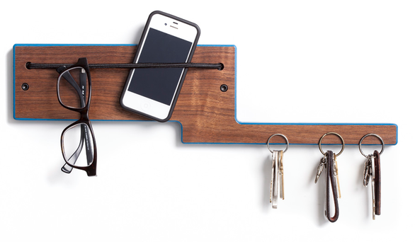
Ever have those days where you can't find something important in your bag and you look and look and it's not there?You search the whole house and finally you find it, when you check your bag again. Or, is your place too small to have a table by the door and so you don't have a consistent, convenient place to leave your keys, sunglasses, etc? Elefunction's newest products will take care of that for you; their tagline is Design That Never Forgets. The Elephant mounts on the wall very easily and can become your command center to corral your things.. The strong cord holds glasses, sunglasses, phones, mail, and other small items, while super magnets embedded in the 'trunk' take care of your keys (even if you're a janitor, I've seen it in person). Available in walnut or ash, and with or without an edge color, these products are all handmade in Colorado. 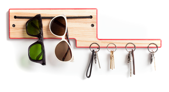
If you like to check your hair/teeth, or throw on some last-minute lipstick before you run out the door, the Echo mirror allows you to do that and has the same organizational function as the Elephant. Echo comes in walnut or ash. 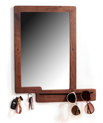
Keeping your keys and glasses in one dedicated spot like this also keeps your keys from scratching the lenses of your glasses, which can happen easily in a bag. Plus, most importantly, you don't run around like a chicken with its head cut off looking for things when you're trying to get out the door to work or to meet friends.
Designer Brad Reed Nelson, founder of Board by Design - who I first met when I fell for his fabulous rockers at the AD Home Show a few years ago - initially started Elefunction as a way to keep track of his sunglasses. The product, the I Wear rack, was a simple board and tension cord (it and earlier iterations are still available). In the process Brad found that what they were doing was creating better relationships because people were happier, less stressed, more prompt, and more pleasant to be around all because they weren't wasting time looking for their things. It's pretty powerful when a simple product can do that! 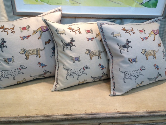
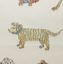 Whether you are a devoted dog lover or just a really big fan of Go, Dog. Go! (as I am), you'll probably love this totally adorable cushion from Chelsea Textiles. This hand-embroidered cushion is designed by Scottish artist Domenica More Gordon on linen and cotton. It's high end, so not a cheap throw pillow, and too cute not to share! There are a few other styles available, as well. Take a look at More Gordon's website, as it has images of her adorable wool felt animal figurines, watercolor dog portraits, and other whimsical drawings and illustrations, as well as charming video clips introducing her books, Archie, which came out a few years ago, and Archie's Vacation, which is officially available tomorrow, but you can pre-order today. top image my own, bottom image via chelsea textiles
Xx a 
In one of many procrastination breaks late last night (I'm on deadline again), I finally signed up for Instagram. I've had the app on my phone for probably two years, but never registered. It wasn't that I didn't find the app interesting or valuable, it's just that sometimes I get overwhelmed by how many things there are to register for and sign up for. Websites that you have to register with to see the content kind of drive me crazy. Does that happen to you? Thank god for password keeper apps. I was the same way when I had to go from Friendster > MySpace > Facebook. I really resisted Facebook. I was good about limiting my time on there in the beginning. Now I'm checking my feed pretty often. I'm not sure how consistent a Intagrammer I'll be, but I definitely want the infusion of inspiration. So that's where you come in: What's your favorite Instagram account to follow? Leave it in the comments!Help a girl by leaving your own account or your favorite accounts to follow, and I'll check them out. And if you follow me, I'll try to keep it interesting! Find me at instagram.com/xxabl - I'll start posting as soon as I finish my article.
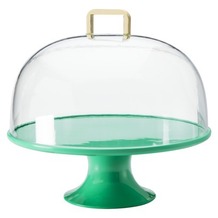
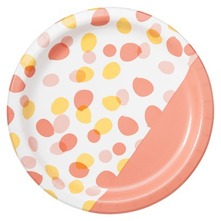
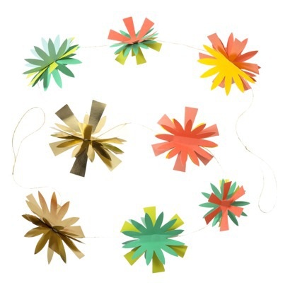
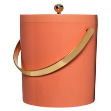
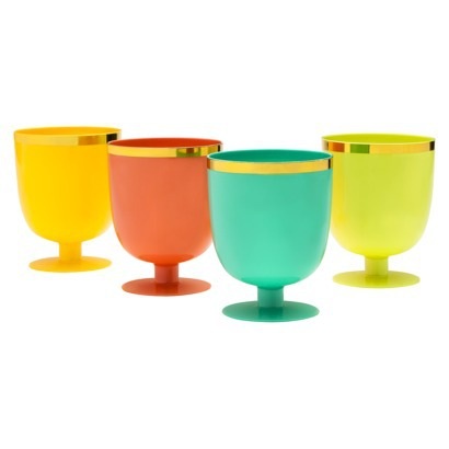
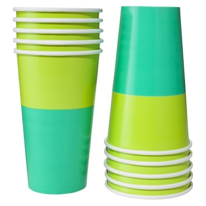
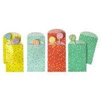
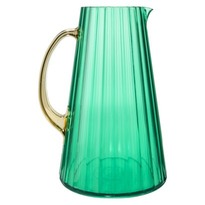
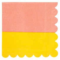
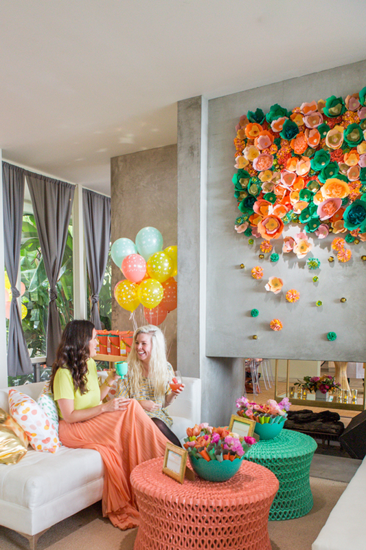
image via thepatterns.info Xx a 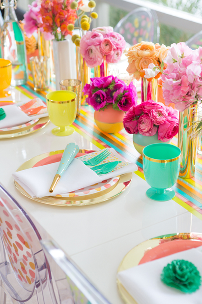 I'm not the first person to be excited about Oh Joy!'s collection for Target, which just launched, and I certainly won't be the last. I have to say in all honesty, that Joy Cho is probably my favorite blogger of all right now (I even bought her book on my Kindle so I could learn more about blogging as a business, now if I could just find time to read it). In addition to having an insanely attractive family (I want to have a playdate with our daughters), her taste is fabulous, and she seems so down-to-earth and real; she's very positive, but she isn't afraid to peel back the layers and share her hectic reality. Somehow it was comforting to know that Joy struggles with a lot of the same things I do; you always know other parents feel the same way but it's reassuring to hear it anyway. Her collection for Target is really lovely and feels very much "her"—as much as you can know someone from reading their blog, it feels like an accurate translation of who she is and her style. The products are very cheerful and feminine, and the shots from her LA launch party have so many great entertaining ideas and decor moments in them. The paper goods are adorable, but I especially love the entertaining pieces that have more longevity. The collection includes more paper goods, cutlery, decor items, cake toppers, and balloons.
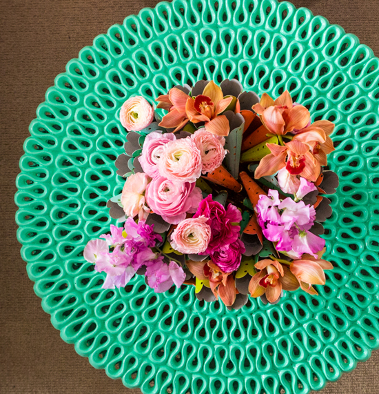
The launch party in LA was intended to be an outdoor garden party, but rain drove them inside. I don't think the party lost much of anything by being indoors. There are so many great and easy entertaining ideas that I'm actually planning to blog about them tomorrow for my other job at the event planning company. But decor-wise, here's something I loved. We've seen this cocktail table around for years, but it's always in white. How fresh does it look in color? I love how they painted the tables to coordinate with the collection.
|
#checkout this blog with shop-themed puns
archives
August 2014
categories
All
© 2014 | mrkt
|
 RSS Feed