|
I was sitting around all afternoon trying to figure out some vaguely back-to-school or office-related post I could write for today, but I just wasn't feeling it. Then I skimmed my Facebook feed and saw two pictures that a college friend posted. He has been in Montréal for a couple days, and today went to the botanical garden there. I was amazed by what he was seeing. The feature exhibit, called Mosaicultures Internationales®, has returned to the city after a decade-long absence. Nearly 50 incredible living sculptures have been created by horticulturist-artists from 25 different countries under the umbrella theme "Land of Hope." The event started at the end of June and runs until September 29, 2013. The detail on these pieces is pretty astounding. I'll let the works speak for themselves: I wish I had time to drive up to Montréal in September to see the rest of the exhibit and gardens in person. The artistry is really incredible, and I still have yet to make it to Montréal.
I hope everyone has a wonderful long weekend! images 1, 2, 3, 4, 7, & 8 via Espace pour la vie Montréal website here and here images 5 and 6 courtesy JP Hormillosa Xx a
0 Comments
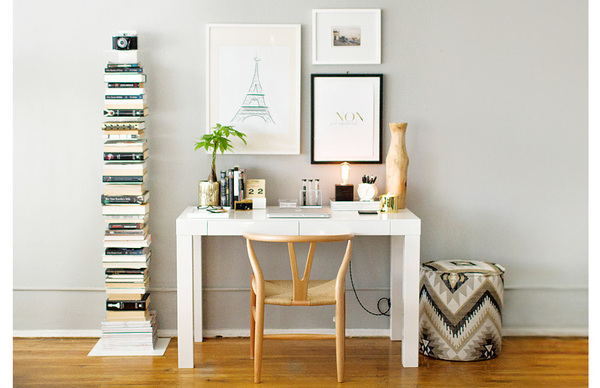
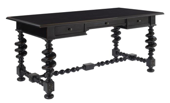
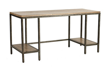
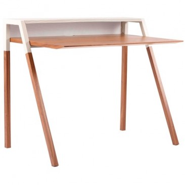
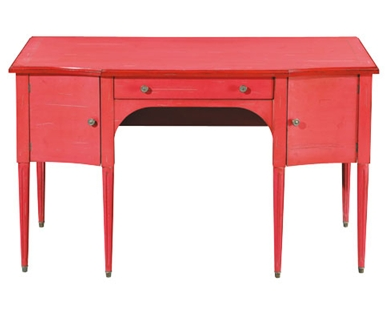
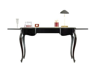
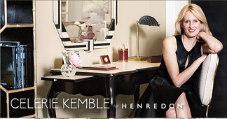
Better late than never. I've been busy this week on deadline, and then we went out to dinner with my father-in-law, who has been in town for a few days. We haven't seen him in a year and he just finally got to meet the baby, who turned 10 months today. When I bought my desk--the ubiquitous white lacquer Parsons desk from West Elm--it wasn't quite as, well, ubiquitous, as it is today. I still adore it, but sometimes I wish I had something off-beat, a little different from everyone else. The nice thing about the Parsons is that it's a great blank canvas; there are so many ways it can be styled. I am still trying to decide if I want to do brights or neutrals. Above, from The Everygirl, is a lovely neutral approach. I could easily go in this direction, and not simply because I also have the Sapien bookcase that is to the left of the desk. Maybe someday I'll go with a different style. I also love the idea of a big table as a desk. I think I would pair the Thalia with a few modern elements to keep it from feeling too serious. Love the ornate legs and support strut, it definitely catches the eye. The Durham has a more industrial look, with a mix of wood and aged steel. I have a Mac, but if you were someone who had a tower for your computer, it would fit nicely on one of the lower shelves so it could be kept off the floor and out of the way. The cool slim silhouette of the Cant is warmed by the walnut and grey finish. This would be great for someone with a small space, or who works on a laptop so they can utilize the upper shelf for storage and decorative objects. My monitor would obscure the whole thing. Grange's traditional, feminine Ermitage has been a favorite of mine for a few years. The piece is available in 20 paint colors and 3 distress levels. I'm not really into distressing personally, so I would choose the least distressed finish, called classique. All of their colors are great, but I always find myself drawn to the purples, so I'd pick prune for the desk. Although, this fall, Grange is debuting seven new color finishes, so I could change my mind. Super-talented and super down-to-earth designer Celerie Kemble designed a collection for Henredon, which includes this desk, the One Forty Five. This desk is so luxe, made of Philippine mahogany with a creme leather inlay on the main surface and two pull-out shelves. The cabriole legs add to the effect; it's a really beautiful piece. You can see the leather better in the image with Celerie. Also, that black and white mirror behind the desk is amazing! interior image via The Everygirl
desk images via Century Furniture, Ballard Designs, Blu Dot, Grange, Henredon Xx a I think I'm successfully on Bloglovin' now, so you can click the link above or the link in the navigation menu.
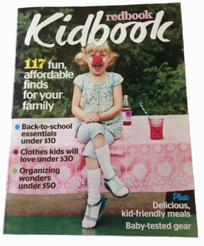
Thanks to those who asked for this! Xx a During late spring/early summer, I worked on my first project with Redbook magazine, a supplement to their September issue called Kidbook. It came out a few weeks ago, but it had limited exposure because it only went to subscribers.
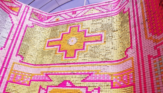
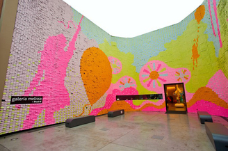
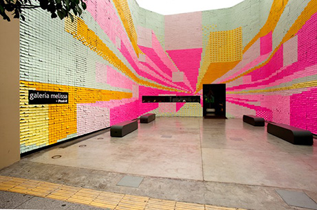
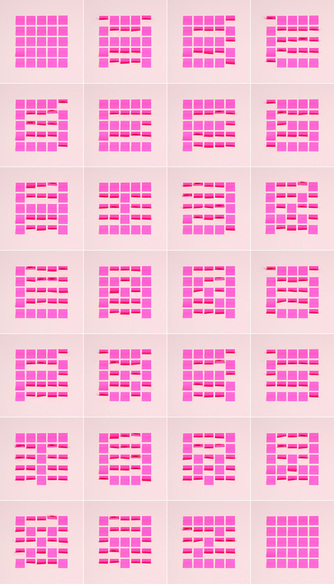
I did all the market work from Syracuse, which was a first for me; but it worked out really well, thanks to my amazing pr contacts/friends and the editor who worked with me. I produced two stories: One piece was about organizing kid clutter and the other was a cute bath decor story. I think both stories have a lot of really fun, useful products, and I'm excited to share them with you! Post-its are so functional it's generally hard to imagine them any other way. (My husband and his former co-workers would beg to differ: when my husband returned from vacation once, he found every surface of his office covered in sticky notes. This was, of course, after they had filled someone else's office so full of blown-up balloons, the guy could barely get in.) Luckily, others are more creative. In 2011, Brazilian footwear company Melissa and agency Casa Darwin paired up with Post-it maker 3M for a project that took 5 months to complete. Amazing designs made entirely of Post-Its adorned the outdoor exhibit space, Galeria Melissa, at their flagship in São Paulo. 350,000 Post-its were used, and unexpectedly, visitors left love messages on more than 30,000 of the notes. New York-based designer Jon Newman recently completed a year-long challenge to himself to create a new project each week, called Daydreams & Nightschemes. Project #38, above, uses Post-its to illustrate his love of typography as a design element. His challenge was to create a font using the notes only, though he used a portable fan to help create the letters' shapes. It takes a minute to really see the letters, some are easier than others to make out, but it's pretty genius. His other projects are equally impressive. Post-it's website also has an online tool for creating wall art of your own, if you're so inclined to try your virtual hand at it. images via couleurblind, laughing squid, melissa, daydreams & nightschemes
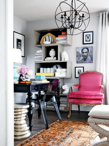
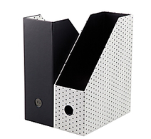
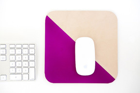
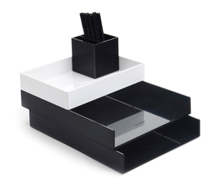
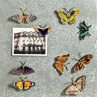
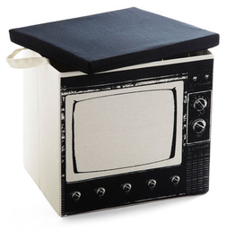
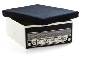
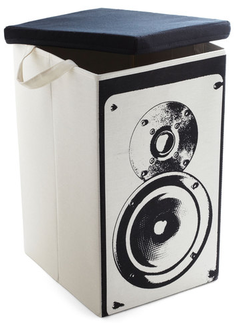
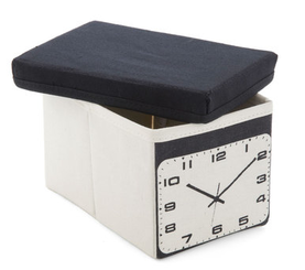
*I'm also a ridiculously big fan of Home Alone... Xx a Now that I work out of my house full-time, and most of the house is chock full of kids' goodies, I have to be very conscious of my workspace and try to stay as organized as possible. My space is part of the living room and there are shelves, but they're not yet dedicated solely to my work. I purchased a couple new magazine files (Nate Berkus for Target, not available online) but, it never seems like I have enough, between the magazines I keep for my portfolio and the ones I read for work/pleasure. Unfortunately, there are never as many of one style as I need at the store when I'm shopping, so my mag file boxes are a bit mismatched. I've liked these from Office Depot for a while now, I've been really feeling the little polka dots lately, especially in black & white, which I know is big right now (when isn't it?). I happen to have a memo mousepad from Galison, not this design though. I started with two and I've somehow made them last for a long time, even though I do rely on their convenience quite often. If you need to jot something down quickly, like a phone number or a time and place, it's right there. When you run out of sheets, a soft foam mousepad remains. If I didn't write on my mousepad, I would upgrade to a beautiful handmade leather mousepad from Susan at Freshly Picked. Poppin's desktop set is great for separating notes, research, and business receipts. The accessory tray could hold the recorder I use for in-person interviews and my washi tape. I just bought a white board calendar with a magnetic surface, but it only came with two magnets. I really like the colors and detailing on these hand-painted butterfly magnets from Ballard Designs. Ballard often has great magnets and pushpins, so even though they're not really an office store, they're always a great place to check for accessories like that. Because it sometimes feels like all the cardboard storage boxes are the same, I like these tromp l'oeil containers carried by ModCloth. They fold flat when they're not in use, and of course, hide papers, product samples, and, sure, even toys when they are in use. interior image via gold and gray
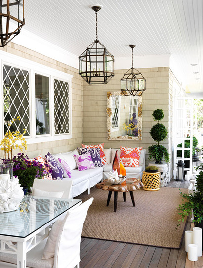
images via office depot, galison, freshly picked/Heather Mildenstein, poppin, ballard designs, modcloth Xx a At least we can take comfort in the fact that there is one more week of (official) summer. But if summer must end, why not take advantage and save up on seasonal finds from some favorite shops. See each site for end dates and details. 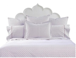 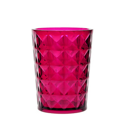 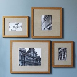 West Elm 15% off upholstered seating 15% off mirrors & shelving 20% off laundry & cleaning essentials extra 30% off rug markdowns 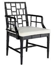   I love this open porch off the kitchen of one of Traditional Home's Hampton Designer Showhouses. I admit, it's from a few years ago, but it certainly doesn't seem dated in any way. The feel of this outdoor room epitomizes my idea of the perfect place to start a summer day.
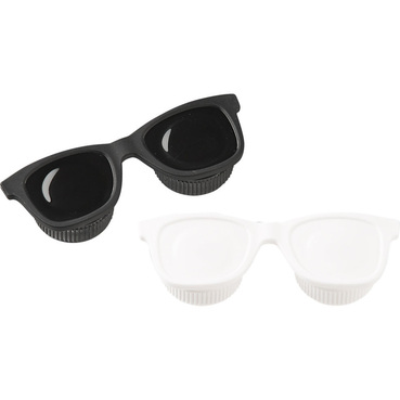
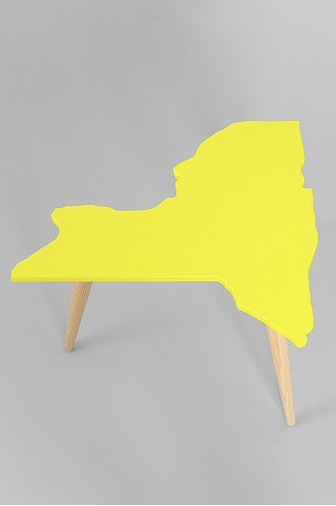
Interior designer Nancy Pearson mixed materials, styles, and colors in a way that makes the space feel so breezy and light, but thankfully, not in the traditional beach house color scheme—which is often executed well, but is predictable, and doesn't interest me as much as this. Low-slung seating topped with bright patterned pillows create a comfortable space to catch up on a good book, or just to have morning coffee (juice, in my case) and read the paper. Or, again in my case, scroll through Twitter and news sites online (sorry!). The antiqued zinc finish on the hanging lanterns is a nice departure from the polished nickel usually seen. A natural-edge cocktail table, flowers, and topiary add natural elements, while the shell-and-antique fragment mirror gives a nod to the house’s setting. The yellow garden stool references the lattice windows, and the lovely dark floor is an unexpected detail. I also really appreciate that while there are shells present, we’re not being beaten over the head with a shell/nautical theme. Because of the bright palette, the fish-patterned magenta pillow coordinates well with the silk ikat pillows. The whole space feels so relaxed and refreshing, like its very own getaway. image via Traditional Home Xx a This lovely little product is exactly the kind of thing I'm talking about when I say I want even my utilitarian items to be interesting. Funny, functional, and adorable, the u-lens contact case from CB2 does the job with style. I've been wearing contacts since 8th grade, so I always need a case or two handy for traveling, or if my eyes get tired and I have to switch to glasses. This baby is under $5 and has the added bonus of getting Corey Hart's classic "Sunglasses at Night" stuck in my head. And now, yours, too. You're welcome. In honor of the great New York State Fair's opening day, I present the New York State table by creative studio 900 Blok. This solid-wood carved accent table is the perfect quirky touch to any home that's Empire State-proud. Available through Urban Outfitters, in four lacquer colors.
The New York State Fair runs today through Labor Day at the fairgrounds, here in Syracuse, NY. I'm looking forward to going there with my family for kid and adult fun, fried goodness, candy apples, and of course, a look at this year's butter sculpture. table image via Urban Outfitters Xx a |
#checkout this blog with shop-themed puns
archives
August 2014
categories
All
© 2014 | mrkt
|







 RSS Feed