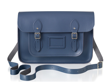
 'Tis the season for limited-edition collaborations! If you read shelter magazines regularly, you know that Farrow & Ball is the high-end paint brand widely favored by magazine editors and interior designers. And if you read fashion magazines, you've likely seen the handbags by The Cambridge Satchel Company in both classic and neon colors. Now the two British companies have joined forces on a small collection of exclusive bags that has just launched. 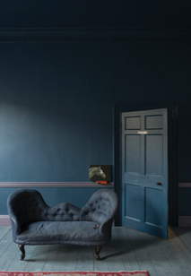 I think it's almost always a no-brainer for great fashion and home brands to match up and offer a tactile combo of both their strong suits. With this partnership, you get the benefit of the exceptional craftsmanship that is a hallmark of both brands: a chic durable leather bag in a bespoke shade formulated by color experts.
One of Farrow & Ball's latest colors, Stiffkey Blue is inspired by the remarkable color of mud found at the beach in the hamlet of Stiffkey on the north coast of Norfolk in England. I would love to know what makes the mud this unique shade! The nautical/beachy background of the color makes the satchel perfect for summer and beyond. The shade is a bit moody, which you know I love, and it will go well with other neutrals, metallics, and brights as well. The bags are handmade in England and will be available in four sizes as a limited edition of 200; each piece will be embossed with a number inside.
0 Comments

As I spend time looking at local neighborhoods and perusing online real estate listings, I'm thinking a lot about exterior paint color combinations. In the majority of neighborhoods in the US (at least all the ones I've ever been in), houses are generally painted in variations of brown, gray, white, green, yellow, blue, and red. But the colors are always pretty muted: the reds are more brick reds, the yellows like butter, and the greens olive or forest. (But it seems like there's always one blue house that is a weirdly electric color and stands out like a sore thumb.)  Wouldn't it be amazing if our neighborhoods were as vibrant as these blocks in Cape Town, as photographed by Gray Malin? Those blue houses would be right at home among the lavenders and oranges and limes and other saturated colors. I can't imagine how fun it would be to live in a technicolor neighborhood and see where everyone took their house color-wise. I think I would be insanely happy every time I walked on my street. Of the standard colors, I've always gravitated toward gray houses, and my last house was light gray, but lately I've seen a few houses around town that are purple. Subtle though—the purples have gray or brown undertones and they look really nice. Something like this color, left (Cabernet, 2116-30 Benjamin Moore). So maybe I should go in that direction for something a little less typical? If you could paint your house any color--neighborhood associations and judgmental neighbors be damned--what color would you choose? Or for more inspiration, check out my exteriors board. 
I'm a little late in sharing, but the March issue of Redbook magazine features two stories I worked on. For tips from top interior designers on decorating with a little and a lot of color, see the slideshow from the article, featuring the room above, designed by Melissa Warner Rothblum of Massucco Warner Miller. I'm a little obsessed with that royal blue console in the corner. The other story is a cute matchup of great, totally affordable armchairs and throws I found. This isn't online but it's the back page of the issue. Hope you like! 
images via redbook, photographs by philip harvey and alison gootee
Xx a 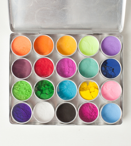
As soon as I saw this set of watercolor paints (above), I knew I had to feature it. The powdered paints, in gorgeous saturated colors, are derived entirely from natural flowers. The powders have a slightly sandy texture and seem to shimmer in the sunlight. Each set of 20 paints is unique and comes packaged in a handmade thin recycled-metal case, which is small enough to travel with. Put a bit of powdered paint and water in the lid of the desired canister, mix, and create! A similarly intriguing set is made of crushed natural stone and sand (below). Gypsya, the retail site of artist Rose James, specializes in handmade products crafted from organic and recycled materials. I love the idea of giving someone a gift they can create something beautiful with--especially if they share their work, it sort of perpetuates the gift giving. Please note, these items are not recommended for children; the listings at gypsya's Etsy page has a bit more information on usage. The supply of flower paints is currently limited, but Rose is working on making more. Flower or Stone watercolor paints, $42 each for set of 20, gypsya.com 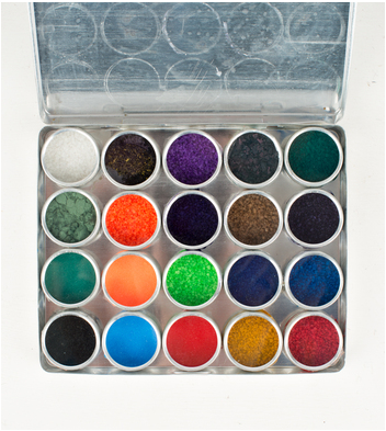
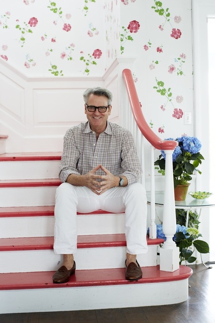 Hope you all had a splendid weekend! For the last week or so, I've been seeing this image pop up on Twitter and elsewhere, because this is New York-based interior designer Tom Scheerer, the subject of the recently-released book Tom Scheerer Decorates, by Mimi Read. I haven't yet had the pleasure of looking through the design book (it's on its way now), but this image struck me for a couple of reasons.
Film-star-spectacles aside, I love how bright and cheerful this stairway and hall are in his family's East Hampton, New York, beach house. If the stairs and handrail weren't lacquered in that coral color, I don't think I would have been as drawn to it as I am. I do like the geranium wallpaper on its own, but if the handrail had remained in a natural wood, I'm not sure I would have spent as much time absorbing the image.
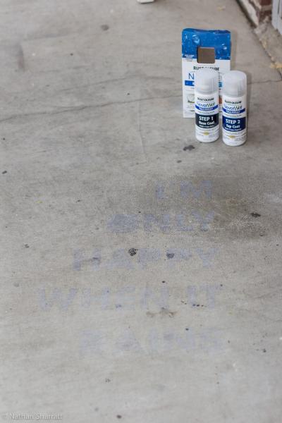
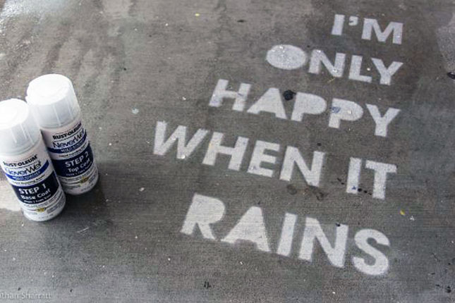
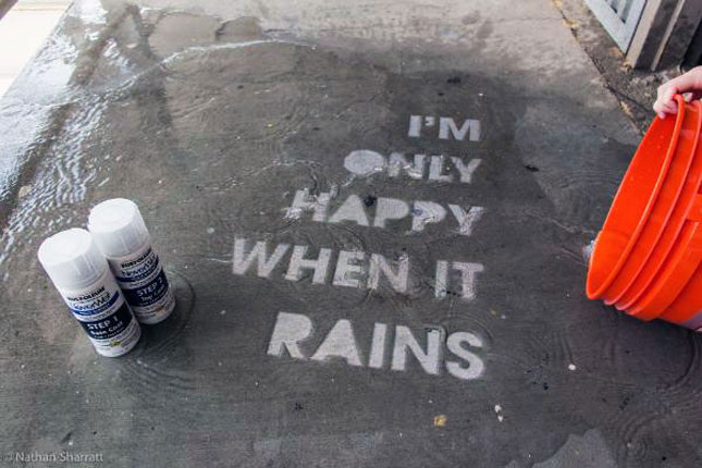
With my reasonably mediocre Photoshop skills, I filled in the coral treads and handrail with black, so I could see what it might look like. It still looked lovely, but the space took on a more serious feel. I also tried a "wood tone;" in my hands it looked a little ridiculous, but it did reinforce how much I think the coral adds to the design, particularly in a beach house where its usually desired to keep things light and airy. Painting these areas in a poppy color that coordinates with the wallpaper elevates the room that much more. I also like that the coral doesn't seem to be an exact match to any color in the paper, but that it references the floral pattern and adds another dimension of interest. I think most stairways could benefit from this kind of treatment (especially including the wallpaper). There are definitely times when natural tones, black, or white, are the right way to go, but where architecturally-interesting railings and banisters are lacking—probably most average houses—a smart paint job is a great way to update and enliven the space. 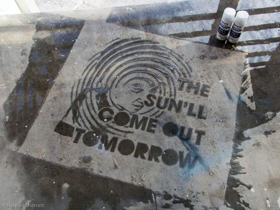 I don't know about where you live, but it's been pouring here in CNY (as it pretty much did all weekend), with a tornado advisory thrown in for fun. Rain can sometimes be a total drag, but I love this creative idea I saw on Brit + Co. It reminds me of the interesting pictures or slogans I'd see spray painted randomly on the sidewalks in New York, but with a sort of Invisible Ink quality. It's a surprise for when you might need an extra smile. Rust-Oleum has a product called NeverWet, which is a two-step moisture repelling system. Introduced as clever Home Depot contest entries (here, with tutorial and here), the idea is to use NeverWet and a stencil to spray your sidewalk, porch, or anywhere really, with a design that will only appear when the rest of the ground is saturated with water. The original idea was to create street art, but if you're feeling less public, it could be a great project to do with kids on a driveway or back patio. Rain puns are an obvious choice, but I wonder what I would stencil. Probably something cryptic and silly to make myself laugh—like the first half of a coded phrase from the original Get Smart: The blue sun melts the red snow.
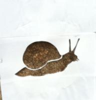
The snail image is adorable. The fun is that it can be as simple or elaborate as you want it to be.
It also occurred to me that if your child is into spy stuff as much as I was (am), you could do something like this as part of a spy-themed party or activity. And if you don't want to keep it forever, when the top coat finally wears off and the water no longer beads you can skip reapplication, or according to Rust-Oleum's site, you can wipe the surface with mineral spirits. What design would you spray on your sidewalk? 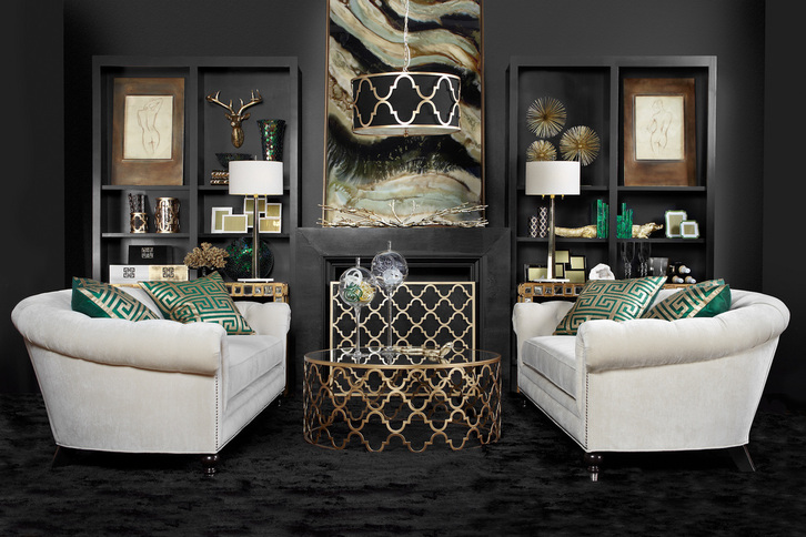
If challenged to choose a handful of only neutral colors and design a room around them, most people would probably not end up with something as moody and glamorous as this. I think we'd see a much lighter room, a lot more creams, browns, tans, greige, maybe some grey, or black, or white—but not this mix and not in this way. This image is actually from ZGallerie's fall look book (which can easily be accessed from their home page or clicking the above photo).
I was immediately drawn to it, not simply because I'm obsessed with moody rooms, but because the concept seems like it shouldn't be too difficult to pull together using an image such as this for inspiration. Essentially, the designers used black, an off-white, green, and a metallic—all of which are neutrals. But the genius is in the pairing. Using more black than white, particularly on the walls, carpeting and mantle creates a very different feeling than if the proportion were the other way around. The sofas balance the darkness and give your eyes a place to rest. The vibrant malachite green acts as an accent color and all of the gold provides additional light and reflection to keep the room from being too heavy and dull. The use of pattern is also fairly restrained, so the mix of shapes and materials is what provides the depth here. Bringing in glass objects, some chrome, and other accessories in these same shades adds interest to the room, and I love the large format framed canvas on the mantle which ties it all together seamlessly. This is also a good example of using a trendy color (emerald) but in a way that's easy to move around if you're someone who likes to switch out accents each season or as trends come and go. Another nice point of balance is the use of a round coffee table and curved sofas in front of the symmetrical very square/rectangular built-ins. I think it all came together brilliantly. What do you think of this room? Does it work for you? image via zgallerie Xx a 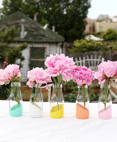 Over the weekend, I finally started working on the decorations for our 10th anniversary vow renewal taking place this Friday. I'm kind of freaking out at how soon all this is happening. I don't feel ready, though a lot of it is falling into place. The weather even looks like it might be nice enough to do the brief ceremony outside. We would really like that since ten years ago it rained until right around when our ceremony ended. We didn't get to have any of the cocktail hour outside, though we did get some great photos because of the overcast sky. Bonus: no squinting! None of the DIY decorations I'm doing are revolutionary, by any means. I'm sure it will look a lot like what you've seen on Pinterest, but I'm limited by time and budget, and it's a small intimate gathering. I know I make it sound like I never do anything DIY, which actually isn't entirely true. It's just that most of what I have done has been stationery related. I did every bit of stationery for our wedding, and spent hours and hours cutting out japanese wrapping paper into small squares to make pockets onto larger squares of card stock. Into these pockets went another square with the name of the table people were sitting at, and the guests' names were written at the top. Also all the names of the tables were named after squares in Manhattan: Madison Square, Washington Square, etc. I was really into the theme... At any rate, we started the table decor and the dipped tealight holder came out pretty well, so taping and spraying the rest is on the agenda today after I work on captions for an article. Speaking of dipped and DIY, I'm glad I'm not the only one still into this trend. Here are three DIY dipped projects that anyone can do. Click the images for the tutorials. 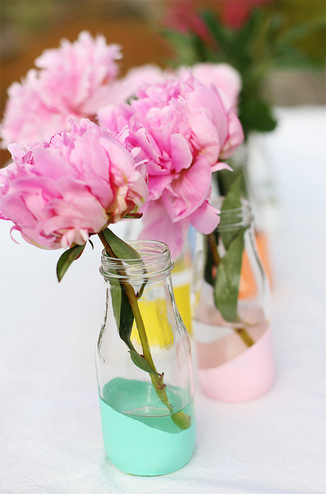 Pastel Dipped Milk Bottle vases These dipped bottles are similar to what I'm doing, but mine are all in gold. I love the palette Liz from Say Yes to Hoboken chose on these. 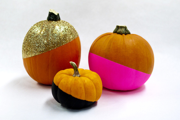 No-Carve Glitzy Color-Dipped pumpkins Carving pumpkins is fun, but this idea from Brit + Co. would really stand out on a stoop or front porch! 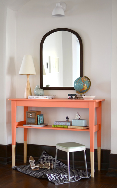 SVALBO sideboard hack This project is a little more involved because Emily, of The Sweet Beast, had to remove pre-existing supports for a lower shelf. It's still a really doable project and inexpensive. I love how glossy the finish looks with the Polycrylic coat she applied at the end.
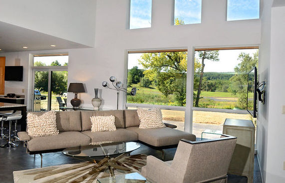 We had a fun afternoon Sunday at the local Parade of Homes. We toured eight houses, each from different area builders, and I think it was a successful show. It's always amusing listening to all the other people touring the houses to see who likes what.
For the most part, I think everyone played it pretty safe design-wise. These showhouses generally aren't about trends or pushing the envelope, so I didn't see any extremely bold colors, patterns, or off-beat design choices, but I saw a lot that I liked that would appeal to the average homeowner. There were a few things that weren't necessarily my taste, sure, but nothing that really turned me off—that has happened in the past. I wanted to share the elements and ideas I liked best that, for the most part, anyone could do. 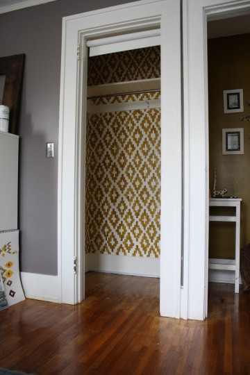
I'm really not a good DIY-er, even though I often come up with projects I think I'd like to attempt, which are probably pretty easy in execution. There are a few reasons for this.
A. I am a bit klutzy and I have sometimes questionable hand-eye coordination (I blame my parents for not buying us video games. Not really. Only a little.) 2. I'm a perfectionist. Relating to the klutzy bit, if I tried to do some of these things myself, I would never feel like it was "right," and I would constantly start over until the swearing became too much for others to bear or until someone stopped me. D*. I'm a very impatient person. A perfect storm—all of my quirks (we'll generously call them) make me not a great candidate for doing large projects on my own, or even with my husband. We work really well together, except for when we have to do "work" together. Or navigate, but that's a different story. I fully admit to being a person who would rather pay a professional to handle things like painting, wallpapering, putting in new backsplashes, or reno-ing a bathroom. I have painted several rooms though, so it's not impossible. But, I was very picky about it and after finishing, my eye targeted any visible streaks and I can always spot that stray paint brush bristle that lodges itself defiantly in the middle of the wall and you don't notice it until it's far too late. So needless to say, when someone has done a fantastic DIY project, I'm in awe of their talent, creativity, and patience. While searching for other things, I happened to come across this ikat closet. It looks as though it could be wallpapered, but it's really a stellar DIY paint job. |
#checkout this blog with shop-themed puns
archives
August 2014
categories
All
© 2014 | mrkt
|


 RSS Feed