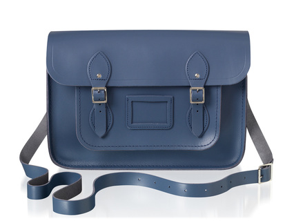
 'Tis the season for limited-edition collaborations! If you read shelter magazines regularly, you know that Farrow & Ball is the high-end paint brand widely favored by magazine editors and interior designers. And if you read fashion magazines, you've likely seen the handbags by The Cambridge Satchel Company in both classic and neon colors. Now the two British companies have joined forces on a small collection of exclusive bags that has just launched.  I think it's almost always a no-brainer for great fashion and home brands to match up and offer a tactile combo of both their strong suits. With this partnership, you get the benefit of the exceptional craftsmanship that is a hallmark of both brands: a chic durable leather bag in a bespoke shade formulated by color experts.
One of Farrow & Ball's latest colors, Stiffkey Blue is inspired by the remarkable color of mud found at the beach in the hamlet of Stiffkey on the north coast of Norfolk in England. I would love to know what makes the mud this unique shade! The nautical/beachy background of the color makes the satchel perfect for summer and beyond. The shade is a bit moody, which you know I love, and it will go well with other neutrals, metallics, and brights as well. The bags are handmade in England and will be available in four sizes as a limited edition of 200; each piece will be embossed with a number inside.
0 Comments
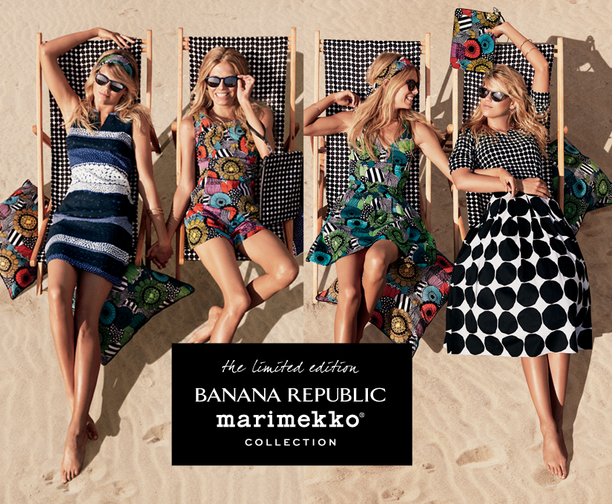
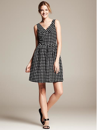
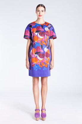
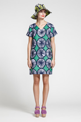
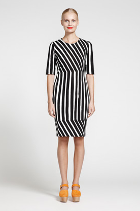
I hope you all had a wonderful weekend! We were very happy to run around and play outside, both on land and by the water. Several years ago, when I interned at Bridal Guide magazine, I was responsible for photocopying important pages from magazines we received at the office that our EIC wanted for her files. Fashion ideas, interesting page layouts, anything that triggered a thought for the future. Rather than just go up to the Xerox machine, do the copies and file the magazines, I would pore over each one, and often I'd make a second copy of certain pages for my own files. This was a great way to learn about the other magazines but also a different way of reading magazines because I was looking at ideas and trying to think of how they could be adapted for a different market. Though the name of the magazine and exactly what else was in this article escapes me, there was an article in a woman's magazine, and the gist was something like, what piece of clothing changed your life? And that sounds like it could be superficial, but one response was from a woman who talked about her first Marimekko dress in the 1960s. It's been so long that I can't remember anything else she said about her style or the pattern of the dress (though I'm pretty sure if I delved deep into my own files, I have a photocopy of this article somewhere), but I distinctly remember that when she wore the dress, it totally transformed how she saw herself as a woman. Ever since then, I've had an interest in Marimekko. I've also loved mod 60s style since I was a child watching reruns of 60s comedies. So, I was very interested to belatedly learn that Marimekko and Banana Republic have teamed up for a limited-time summer collection. The collection just launched a few days ago and is selling out very quickly already. These two pieces are some of the few still available online and in select stores.
Of course, there's always the real deal, too. I love these new dresses available on Marimekko's site:
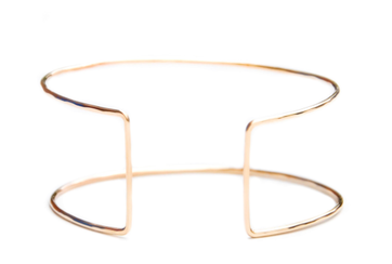
Have I mentioned how much I love cuff bracelets? Probably. I think it stems from a superhero power band place (in high school and college I used to cut the tops off tube socks and wear them like power bands on my wrists). I pretty much like them all, whether they're big and chunky or elegant and minimal, like this 'Eileen Gray' cuff. Handmade in the USA, the cuff is adjustable so it can fit on any wrist. The shape is very simple and architectural. If you aren't familiar with designer Eileen Gray, this is the iconic table she is so well-known for. You can see the direct inspiration between her design and the cuff. 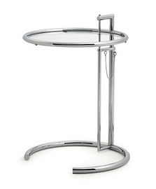
Eileen Gray was an Irish designer who lived in Paris and worked as an interior designer, architect, and furniture designer throughout her career. This table was created by Gray and her partner Jean Badovici for a home in Roquebrune, France. They placed it bedside, but the table is often more likely seen now next to chairs and sofas.
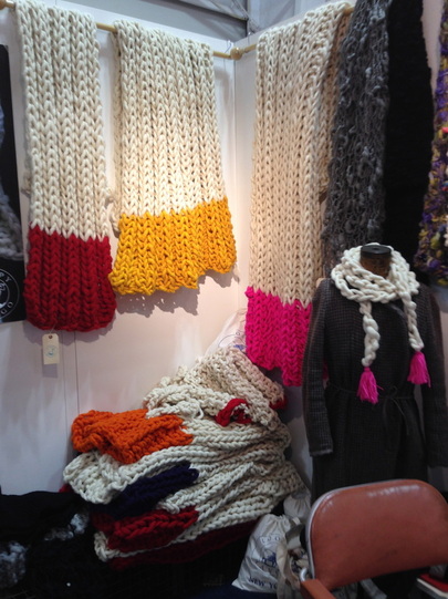
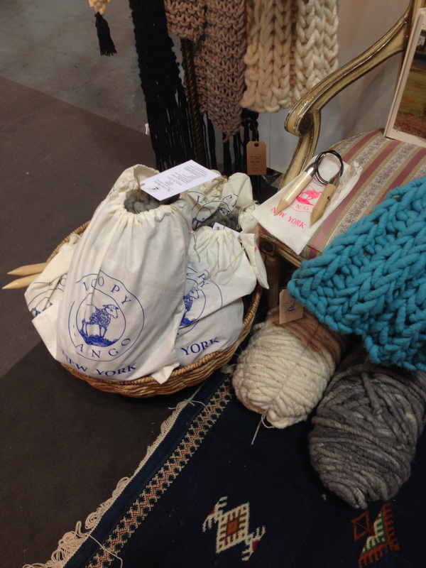
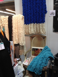
I have this attraction to knit items, things with cable knit patterns, anything chunky and wooly looking. I don't remember if I've mentioned this before, but I'm basically allergic to wool. I can't wear sweaters with wool, even 10% wool content, for more than a miserable hour or two and cashmere is like sandpaper (truly) to my skin. I'm always drawn to clothing and home goods that incorporate chunky, woolen textures—I'm sure there's a psychological term for this. So of course when I saw these big, bright throws, I had to stop. Loopy Mango, which also has a brick-and-mortar shop in Soho, was founded by two women who met at FIT. All the yarn is produced at the company's mill in Massachusetts and all the finished knitted products are handmade in NYC. 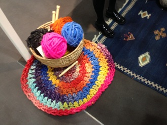 I love the Aspen Crochet Round rug, which unfortunately for me, only seems to come as a DIY kit currently. The kit is available in 20 individual colors but they also sell yarn on their website so you can choose additional hues if you wanted to recreate something something more mult-colored like this rug I saw at the gift show. The solid colored rugs are really chic and gorgeous, though. The super-chunky finished throws come in eight colors, but again, you can buy your own yarn. They also offer custom sizes and designs upon request, so you can likely ask for a throw in any of the colors they offer. In addition to various DIY kits, Loopy Mango also offers several free patterns on their website, in addition to links to their YouTube tutorials.
images are my own Xx a 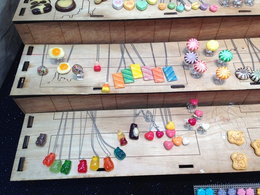
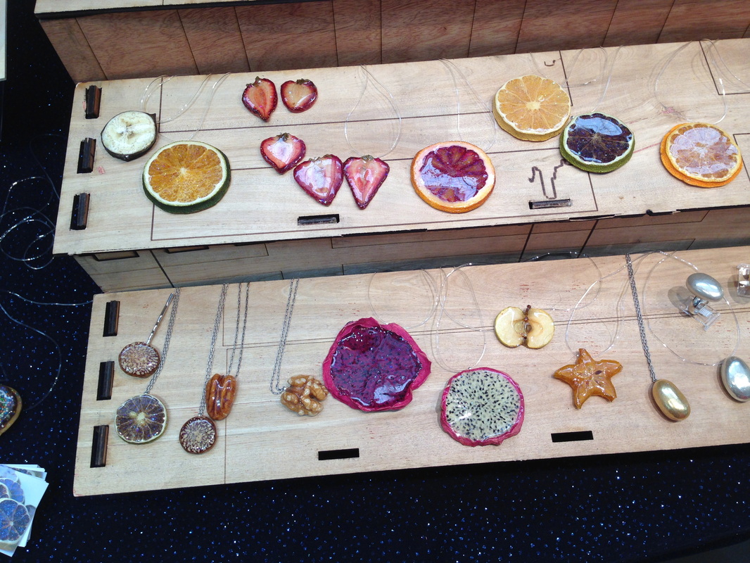
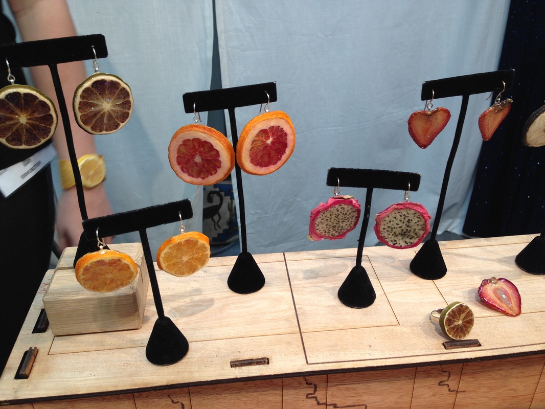
When I was in high school, I really wanted to take the rainbow marshmallows from Lucky Charms, coat them in something clear and make a necklace out of them. Many moons later, someone has done nearly that. Glitterlimes artist Debbie Tuch takes real candy and fruit and encases them in glitter resin. Real gummies, hard candy, chewing gum, and cross-sections of fruit are preserved for wearing pleasure. I love them for the bright colors and nostalgia-factor. They're a bit kitschy but that's what makes them great. The Fruit Stripe gum is really cute and makes you forget that that gum actually tastes really terrible. It might actually taste better covered in glitter resin. Did it always taste terrible? 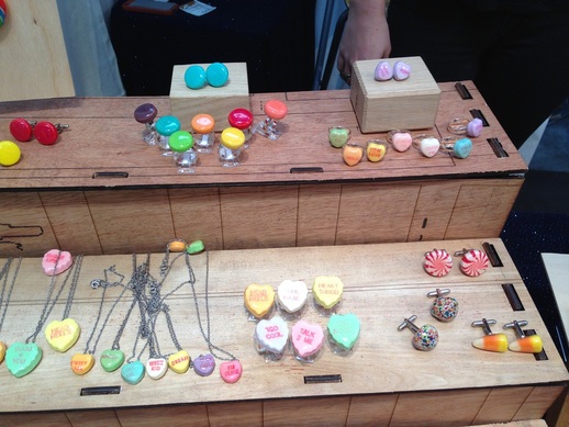
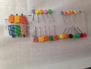 Spree, Conversation Hearts, candy corn, peppermints, sprinkle licorice, and more have all been remained as rings, earrings, necklaces, cufflinks, hair barrettes, and pins. Tuch started with Rock Candy (which was featured in Lady Gaga's Workshop at Barney's) and went from there. In addition to the newer candy pieces, she also works with various fruits, especially citrus, and some nuts, including metallic Jordan almonds. All the different fruits remind me of when my mom was dehydrating oranges and apples for her various crafts back when I was a kid. The dragon fruit slices, in particular, I find so interesting: Their white and black, or purple and black, centers with pink border and the irregular shapes are very eye-catching (left photo, center of the bottom shelf). What do you think of these sweet pieces?
images are my own Xx a 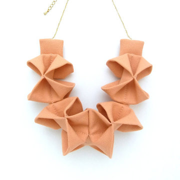
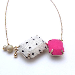
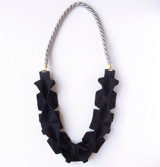
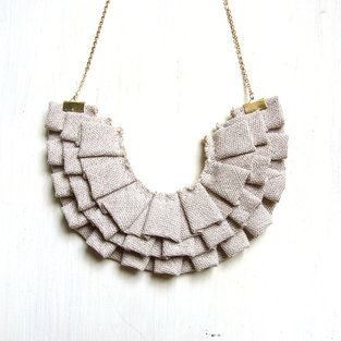
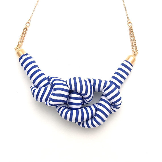
My jewelry style tends toward the colorful, sizable, and architectural. I like big cuff bracelets, cocktail rings, and statement necklaces. Because of an allergy to metals that are for most considered hypoallergenic, I'm always on the lookout for accessories that are made of materials other than metal, or have very little metal incorporated into the design. I love these necklaces by Homako. Materials such as cotton-covered rope, faux suede, fabric covered-gems, and linen are hand-crafted into striking pieces that would look as comfortable dressed-up as they would dressed-down. Throwing one on with a loose t-shirt and jeans would be such a cool, easy weekend outfit, but of course they would be great with a dress for work, too. These are my 5 favorite designs currently available in her Etsy shop.
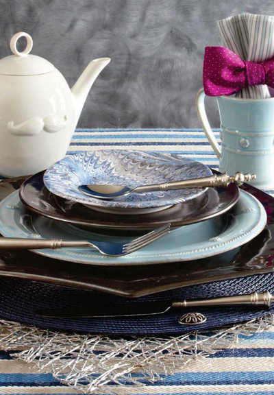
I'm working on an article that's due Friday about the house of a local interior decorator who has a fashion background. So I've had the interplay of fashion and home decor in my head for a few weeks. I happened to be checking TradHome last night to see if there was a new issue I might have missed (there wasn't, but I hope there will be one soon), and came across this menswear-inspired tabletop scheme.
The marbled cocktail plate and the flatware with sculptural handles immediately caught my eye. I think the mix of varied shades of blue and gray is so lovely and sophisticated. The combination of the blues with the pewter stoneware charger and plate, and the patterns on the cocktail plate, fabric (acting as tablecloth) and napkin… all I can think of is Stacy and Clinton from What Not to Wear (who I miss dearly): color, pattern, texture, shine. This has it all. You know I love clever details and a touch of humor, so of course to me, the mustachioed Jonathan Adler teapot and the fabulous punchy purple bow tie used as a napkin ring around a shirt stripe-patterned cloth napkin are just the right notes to make this sing. As with fashion, it's all about layering and the details. The plates, navy placemat, mug, and napkin are all Juliska and the flatware Mikasa. I don't know what that gray background is, but I really love it. I can't stop looking at the marbled plate against that backdrop. Adore. image via traditional home Xx a
These bracelets and vases don't really have anything to do with one another, but with the similar palette and materials, and some special details, these feminine pieces felt like a nice match-up.
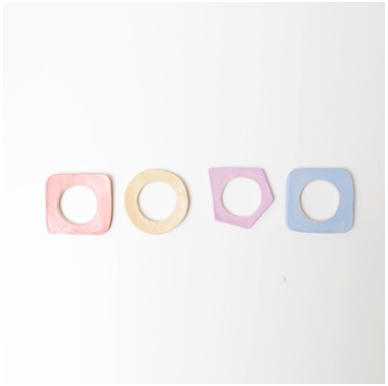
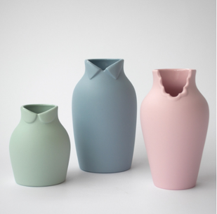
Ria Leigh's ceramic Basic Shapes bracelets come in beautiful glazed color options and I love the shapes, especially the kind-of-edgy geometric lavender style. I'm sensitive to most metal jewelry, so I have to limit how long I wear metal pieces. I'm always on the lookout for accessories made of ceramic, resin, fabric, or other materials so I don't have to worry about a reaction or the color of the metal changing. I feel like these could also go a little 80s, which is just another reason to like them. Nendo's Dress Up vases, also ceramic, are pastel-hued as well, but have the sweetest detailing--each vase has a different collar style at the top rim. From one side, they look like normal round-edged vases but on the other, they feature a little cutout collar shape traditionally associated with either a father, mother, and child. Plus, it's always nice to have a few small vases on hand for arranging flowers, and these look interesting even when they're empty. Basic Shapes bracelets by Ria Leigh, $45 each, Frye Art Museum Store Dress Up vases by Nendo, $25-$38 each or $95 for all three, Fitzsu 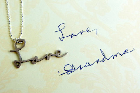
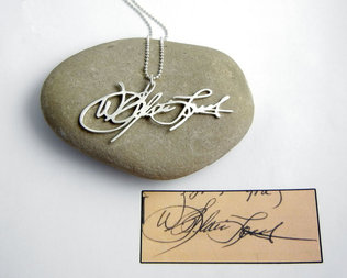
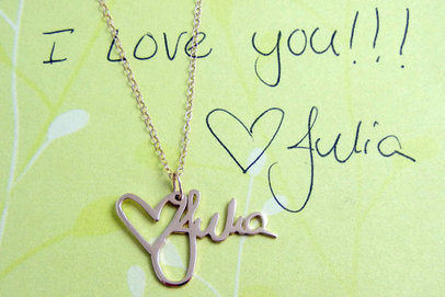
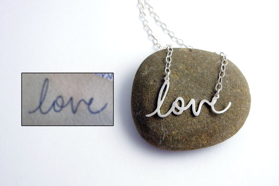
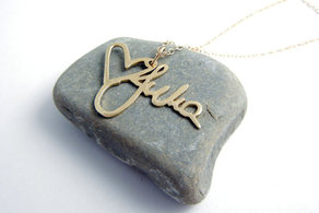
I've always had a bit of a fascination with handwriting. Of course, there are the analyses of the slant and what certain loops and strokes say about your personality. And somehow there are always girls that have that same (it seems) super feminine, rounded, bubbly lettering. My writing, which admittedly has become much less lovely due to all the typing I do, is a full mix of print and cursive. Also, how can they stop teaching cursive in schools?! But, I digress. Really, handwriting is pretty unique and often seeing an old card or letter written in someone's hand can bring back memories or powerful feelings. That connection is the impetus behind the custom handwriting necklaces by BrittanyLeighJewelry on Etsy. Jewelry designer Brittany Isenberg started fabricating these pieces after creating one as a meaningful gift for her mother following the death of her grandmother. The 14k gold version is available in polished yellow or white gold, or you can select polished or matte sterling silver (shown above); bracelets and keychains are also options. At the end of the year and during the holidays people naturally spend a lot of time thinking about loved ones. This is a simple, pretty way of keeping someone you love close, whether that person is truly gone or just lives far away.
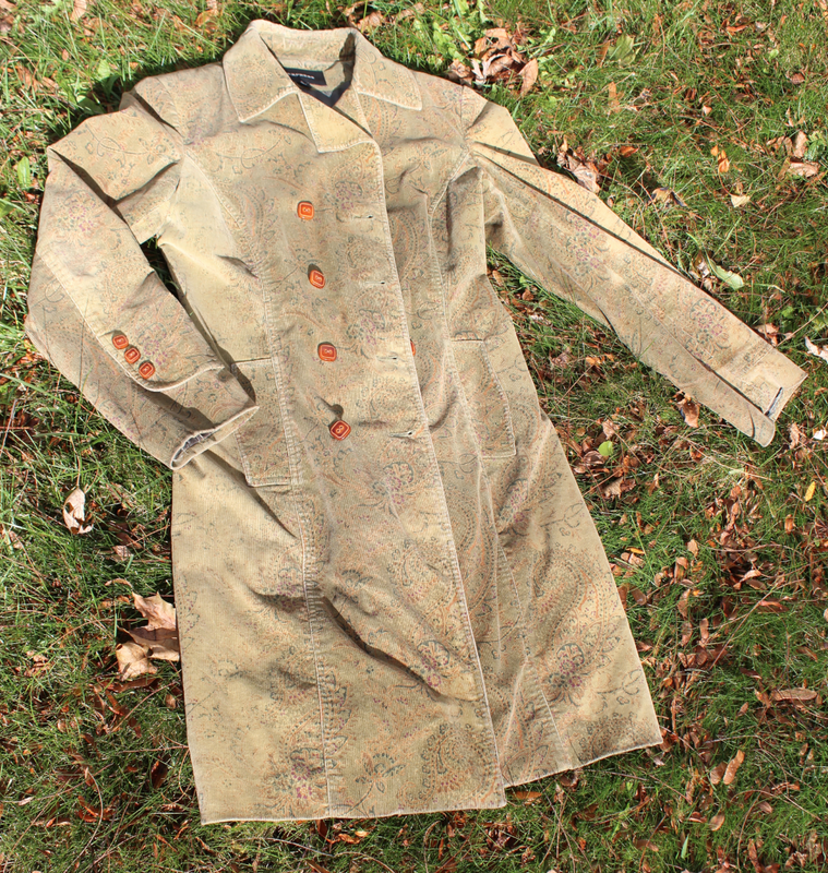
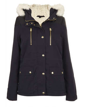
 I have this great coat that I wear faithfully each fall. It's well over a decade old now, though I can't quite remember when I bought it. I love the colors of the coat, and it receives a lot of compliments. However, buttons are missing and the lining is torn. I continue to wear it, but it definitely needs some TLC. I'm not ready to replace it completely, but while it worked well in New York, I'm finding it's sometimes a little thin for Syracuse.
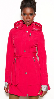
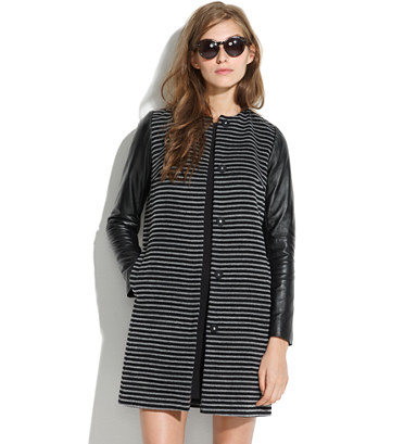
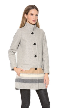
I like a coat that stands out in the crowd, and these coats are just the type that would keep me warm and dry in style. 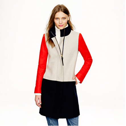 Collarblock Funnelneck coat - J. Crew
|
#checkout this blog with shop-themed puns
archives
August 2014
categories
All
© 2014 | mrkt
|

 RSS Feed