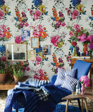
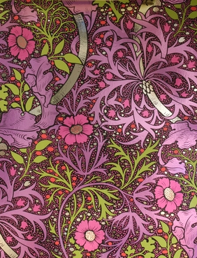
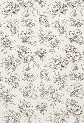
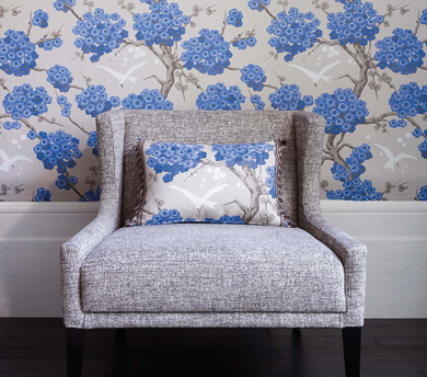
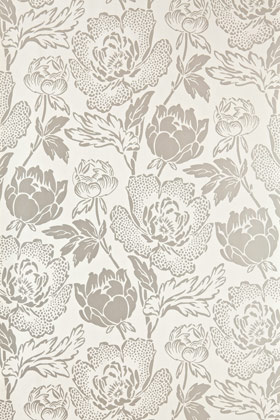
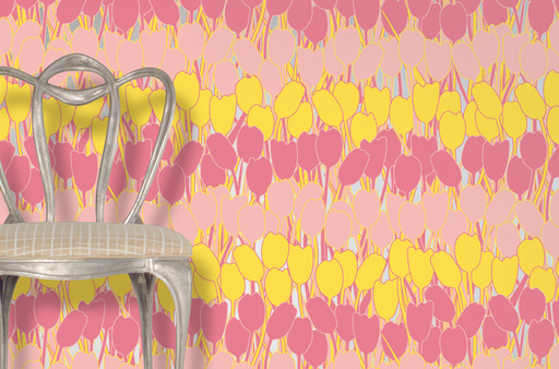
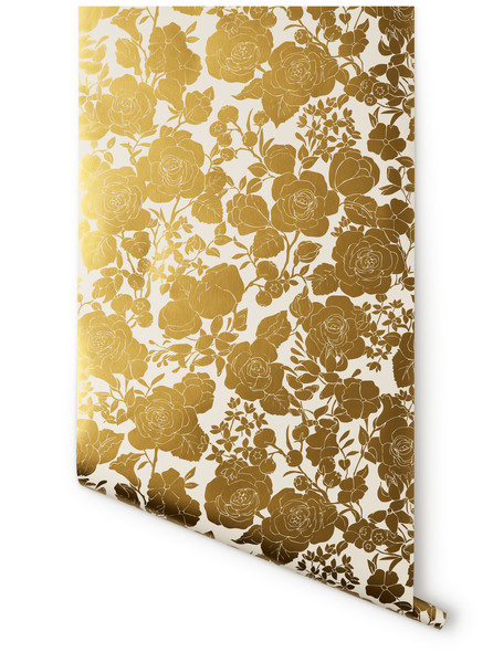
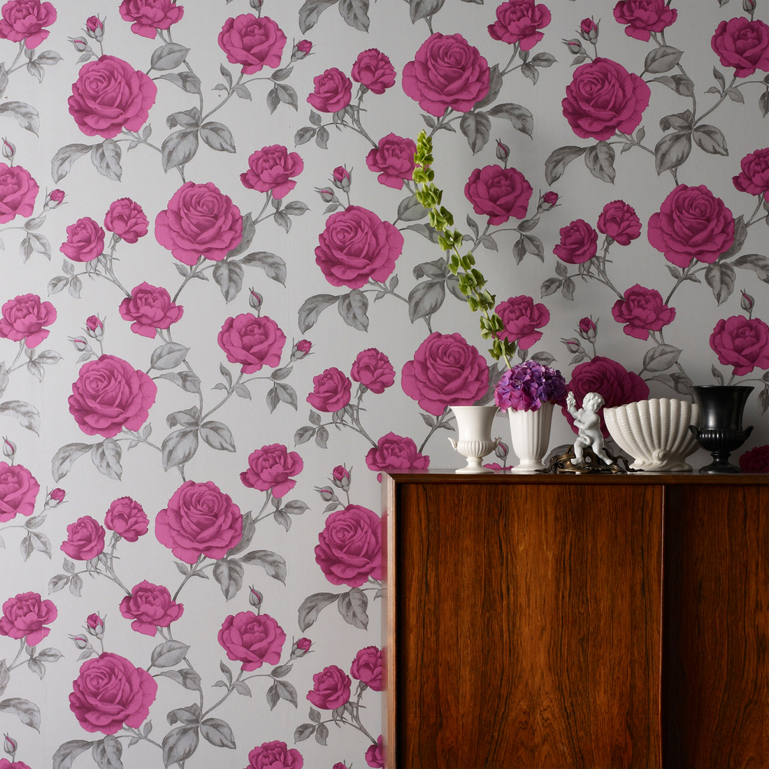
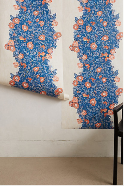
 Noticing a pattern? The weather on Tuesday was such a tease. Maybe if I double down continuing on the floral theme, Mother Nature will be beneficent. So! Using florals indoors via wallpaper. Floral patterns are great because they can run the gamut from chintz, to vintage, to modern and feel so different. They mix well with stripes, checks, ethnic patterns, and obviously solids. Some florals, like Oh Joy's pattern for Hygge & West, you've probably seen in lots of online magazines and blogger's houses. You may remember this lovely vintage paper from a previous post. Here are a bunch of really fun florals, mostly on the more graphic, medium-to-large scale side. The scale of course also plays a big part in how traditional or modern a pattern can read. How do you like your florals?
images via designers guild, flavor paper, twenty2, schumacher, hygge & west, osborne & little, graham & brown, farrow & ball, anthropologie Xx a
0 Comments
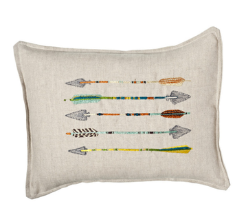 I hope everyone had a wonderful holiday weekend! We had a great time with immediate and extended family celebrating Thanksgiving (several times) and my birthday (also several times!), which was yesterday. I don't put a ton of stock in horoscopes, but I am a pretty true-to-form Sagittarius. I've always been interested in the imagery of the bow and arrow. When I was younger, I had a necklace with an arrow on it, and now I have a pierced brass cuff bracelet with the Sagittarius constellation. When I turned 30 a couple years ago, I stamped an arrow on the little favor bags full of silly things like candy and fake glasses with noses and mustaches attached. I've even used a modified arrow design for the back of my freelance business cards. I don't seem to be the only one interested in the graphic shape of the arrow, either. Check out these sharp finds: images via coral & tusk, ortolan organic, three potato four, haus interior, urban outfitters, 1st dibs, gretel, mid2mod, neiman marcus 1 & 2, net-a-porter, cavern, sucreshop 1 & 2, toodlesnoodles, spoonflower, john derian, house&hold Xx a 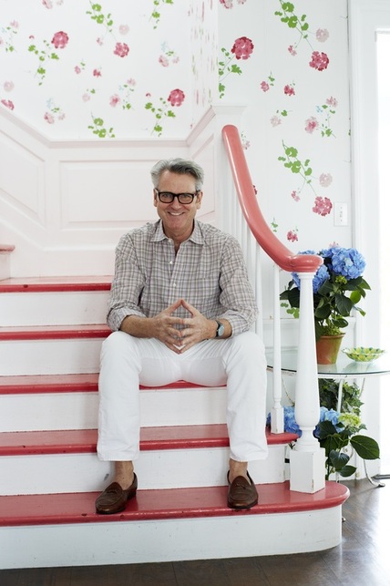 Hope you all had a splendid weekend! For the last week or so, I've been seeing this image pop up on Twitter and elsewhere, because this is New York-based interior designer Tom Scheerer, the subject of the recently-released book Tom Scheerer Decorates, by Mimi Read. I haven't yet had the pleasure of looking through the design book (it's on its way now), but this image struck me for a couple of reasons.
Film-star-spectacles aside, I love how bright and cheerful this stairway and hall are in his family's East Hampton, New York, beach house. If the stairs and handrail weren't lacquered in that coral color, I don't think I would have been as drawn to it as I am. I do like the geranium wallpaper on its own, but if the handrail had remained in a natural wood, I'm not sure I would have spent as much time absorbing the image.
With my reasonably mediocre Photoshop skills, I filled in the coral treads and handrail with black, so I could see what it might look like. It still looked lovely, but the space took on a more serious feel. I also tried a "wood tone;" in my hands it looked a little ridiculous, but it did reinforce how much I think the coral adds to the design, particularly in a beach house where its usually desired to keep things light and airy. Painting these areas in a poppy color that coordinates with the wallpaper elevates the room that much more. I also like that the coral doesn't seem to be an exact match to any color in the paper, but that it references the floral pattern and adds another dimension of interest. I think most stairways could benefit from this kind of treatment (especially including the wallpaper). There are definitely times when natural tones, black, or white, are the right way to go, but where architecturally-interesting railings and banisters are lacking—probably most average houses—a smart paint job is a great way to update and enliven the space. 
Yin and yang. Shadow and light. The infamous Seinfeld black-and-white cookie episode. We're always looking to black and white to provide harmony. Black and white are huge right now, though I think truthfully we can always say that. There is a comfort in the consistency, it's always chic, and the less-confident home decorator is safe in knowing the two colors always go together and with everything else, too.
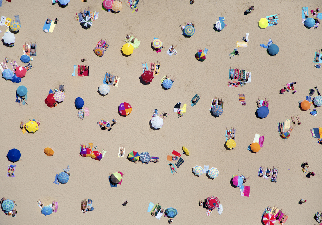
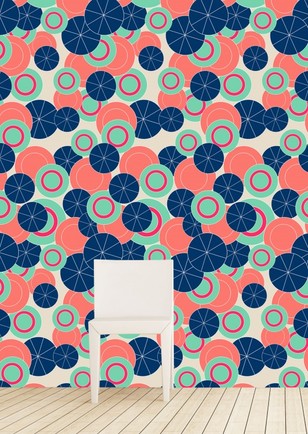
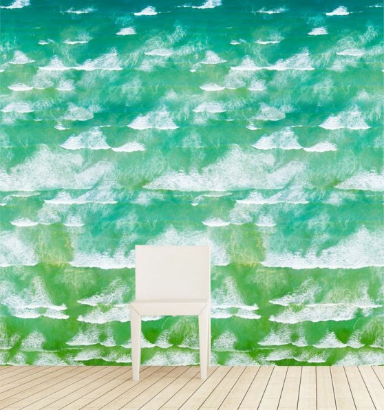
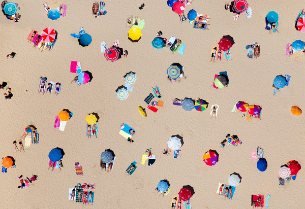 Lisbon Umbrellas In 2011, I was very happy to meet California-based wallpaper designer Tracy Hiner during the Architectural Digest Home Design Show at the Javits Center and chat with her for a while, because her work is amazing. It’s bright, it’s bold, it’s abstract, it’s textural—it’s not for the faint of heart. Tracy’s designs are as much art as they are wall coverings. Specializing in artistic wallpapers and custom wall murals, her company Black Crow Studios thrives on bespoke projects where creativity can run rampant, and patterns have no repeat, at least not in the traditional sense. When Tracy posted a picture of the paper shown above coming off the printer, I immediately wrote her to tell her how much I loved it. I couldn’t wait to share it here. After two chance meetings with a young, talented (and extremely brave!) photographer named Gray Malin, the pair came together to adapt Malin's beautiful images on a large scale as the Gray Malin xo Black Crow Studios collection of designer wallpapers. Tracy has collaborated with designers before, but this latest collection marks the first time she has worked with a photographer. I wish I could say I knew of Malin before two weeks ago, but I will be constantly be coveting his work from now on. He shoots aerial photos of landscapes—beaches, in particular—by hanging out the side of a door-less helicopter to capture these stunning shots. (The idea of this terrifies me.) His work is captivating—I really can't get enough of the saturated colors and the umbrellas, people, and paraphernalia unconsciously creating patterns along the beach.
I love images that relate to pool and beach culture (à la Slim Aarons), so I had to find out more about this gorgeous wallpaper that made me swoon. A select few images from Malin’s À La Plage series, shot from various heights above six continents, have been interpreted into photo-realistic scenes on three different surface materials, including one that is removable. The colors are so vivid I will admit I kept looking for evidence that they were enhanced, but the settings depicted are really just that beautiful. 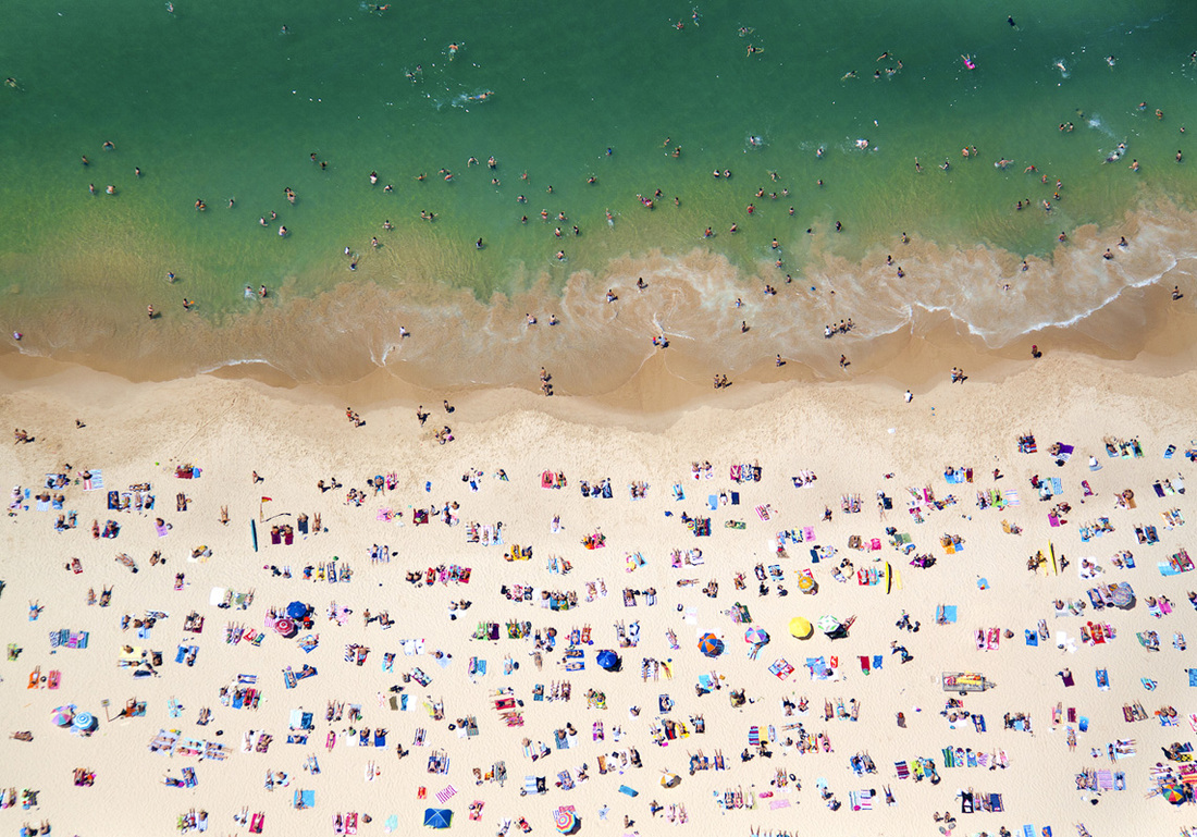 See? This photo taken by Malin above Coogee Beach, Australia. Below, are about half of the styles from the new collection: Another design inspired by an original photo and several of the geometric and striped patterns Malin conceived based on the umbrellas and cabanas always in his lens.
Such artistry does not come cheap, but at least fantasizing is free. (Or you could start small by purchasing prints of Malin's work.)
wallpaper images via black crow studios original photographs via maison gray Xx a |
#checkout this blog with shop-themed puns
archives
August 2014
categories
All
© 2014 | mrkt
|

 RSS Feed