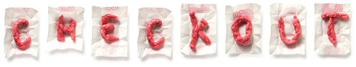
 Happy Halloween! This morning I had my older daughter's preschool parade and party. It's raining here, so the parade moved indoors but it was still adorable and rambunctious. They were extremely excited about all the treats they were getting. Speaking of treats, today I'm excited about candy, too, and not just the kind I not-so-secretly hope there will be leftovers of: Some fun artwork inspired by candy and literally made out of gum, candy, and chocolate. Look at that crazy gum logo I made (above) using yournameingum.com! So fun! Now I'm doing some last minute decorating and handing out candy. I am going to try to add a few more images to this tonight if I can! images via junkculture, artjetset, yournameingum.com (first image and in slideshow), redesign revolution, ann's journals collection
Xx a
0 Comments
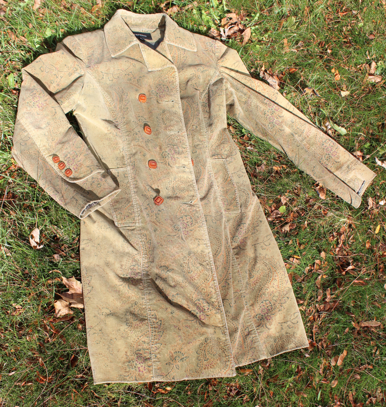
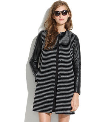
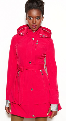 I have this great coat that I wear faithfully each fall. It's well over a decade old now, though I can't quite remember when I bought it. I love the colors of the coat, and it receives a lot of compliments. However, buttons are missing and the lining is torn. I continue to wear it, but it definitely needs some TLC. I'm not ready to replace it completely, but while it worked well in New York, I'm finding it's sometimes a little thin for Syracuse.
I like a coat that stands out in the crowd, and these coats are just the type that would keep me warm and dry in style. 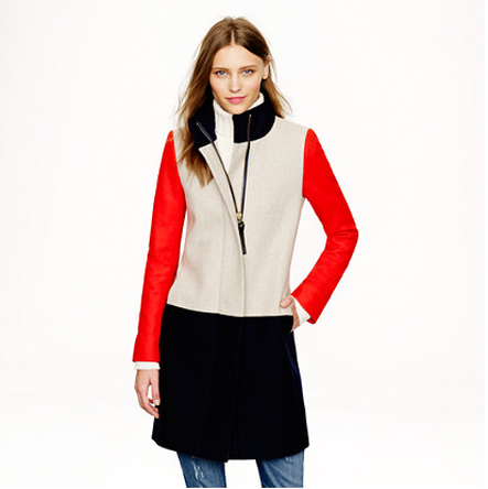 Collarblock Funnelneck coat - J. Crew
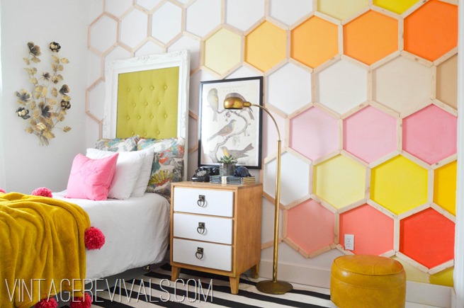 In middle school and high school, I realized that though I was weird, quirky, creative, and some of my closest friends were art kids, I was not an art kid. There was some overlap, and I tried to take more art classes in college, when I could fit them in. But as much as I love visual arts, images, and design, I am better with words.
Similarly, as an adult, I am not an artist, stylist, or designer, but I work with them, write about them, and get to be partially immersed in that world. I'm trying to learn more from them. The creativity is always inspiring me to look at things differently and sparks my own ideas. When this image from Vintage Revivals (above) happened to pop up in my stream on Pinterest, I was very intrigued. 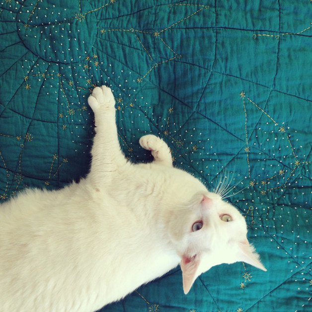
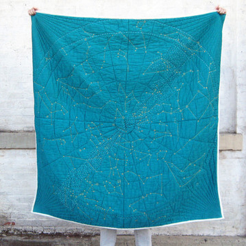
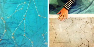
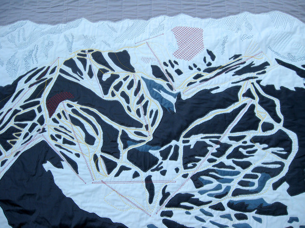
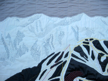
One of the nice things about having this blog is I'm able to feature products or ideas that I wanted to, or tried to, feature in a magazine story but couldn't for whatever reason (time, space, story focus changed, art department was concerned it wouldn't photograph well, etc). Haptic Lab's handmade quilts were one of those products I got super excited about when I first saw them in person and I've been hoping to find a way to showcase them since. The colder weather recently made me think of the quilts again, so I went to the studio's website to see what was new.
Part-craft, part-science, the five-foot-square Constellation Quilt is a hand-embroidered rendering of a swath of October night sky around the 40th parallel in the Northern Hemisphere and features constellations including the Big Dipper, Little Dipper, Orion, Gemini, Leo, and Taurus. Gold stars create the constellations' boundaries while French knots depict the Milky Way diagonally across the quilt. A 14-inch letterpressed star chart is included with each quilt to help you orient yourself. This particular design was made possible by funding through a Kickstarter project. Right now the Constellation Quilt ($279) is available by pre-order to arrive in time for the holidays. The story behind artist/architect/Haptic Lab-founder Emily Fischer's work is interesting: Her work was inspired by her mother who'd begun losing her eyesight due to complications of glaucoma. Fischer began designing the quilts as an "experiment in tactile way-finding." and if you've never seen the city quilts:
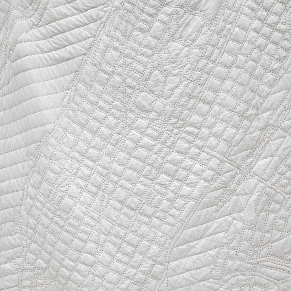
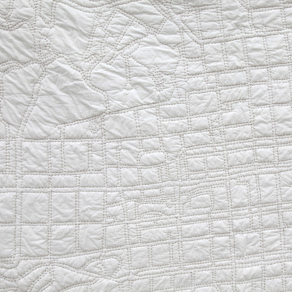
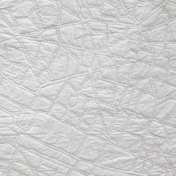
The level of detail is incredible, and these are much larger than the Constellation Quilt. You can just get lost in the maze of streets, alleys, and avenues. LA fans should check out the Los Angeles Burger Quilt. For the truly talented, DIY kits are also available for many more cities and are cute because you can add your own patches or details based on locations or routes that hold personal meaning.
And take a look at the page of the studio's intricate custom work. I'm not a skier, but I love this ski trail map of Telluride, CO.
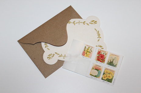
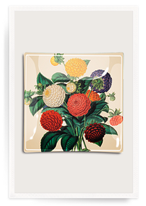
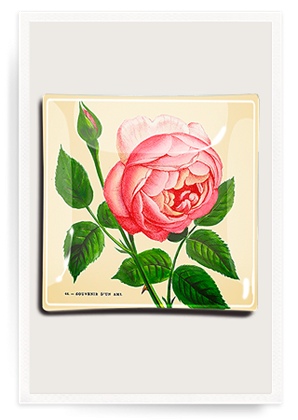
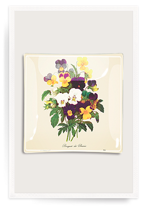
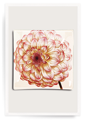
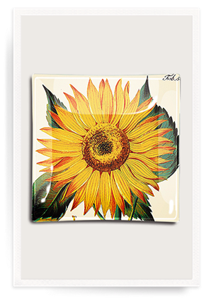
As you know, I love when everyday items are beautiful. I'm a huge stationery fan and I take handwritten notes, thank you notes, party invitations, and holiday cards* very seriously. I also take the stamps very seriously, always bothering the USPS workers to see the Love stamps—which often have some of the more pretty or interesting designs—and whatever other new styles they might have in. I'm almost out of the Vintage Seed Packet stamps I purchased a few months ago, and I noticed they're still available, but I'll probably pick up something new heading into the holidays. However, something as small as a stamp can be inspiration for your home. I've been enjoying the floral burst of color, so it was nice timing that I learned that Ben's Garden had some new découpage trays with imagery very close to that of the stamps. Ben Busko started his business in 1992 at age eight, and has since been featured on Martha Stewart. A selection of holiday designs are now available on the site as well, though I'm partial to the Dahlia pattern (above).
*If you've started thinking about your holiday cards (I know, it feels too early), check out Minted, my go-to for our cards each year. I choose a design and use the yearline style to give our friends and family a snapshot of our year without boring them with a lengthy letter. Their new designs are on sale, and you can buy now and fill in the photos and details later, which is what I do. Click here for a referral discount of $25 off your first purchase of $50 or more! (If you end up ordering, I get a discount for the future, as part of the general referral process - which means you can do it, too. But I always refer people via word of mouth to Minted, regardless of discount. ) top image my own, tray images via ben's garden Xx a 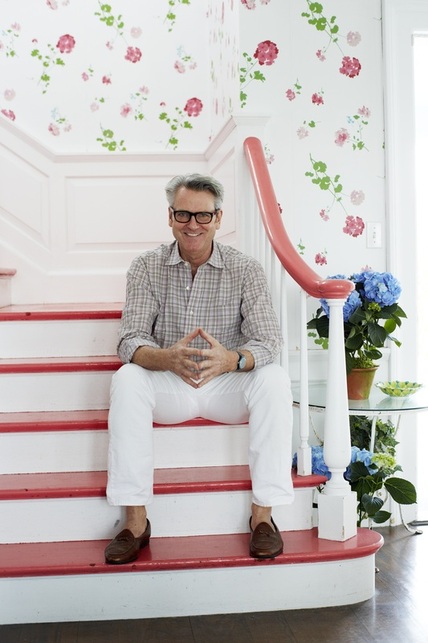 Hope you all had a splendid weekend! For the last week or so, I've been seeing this image pop up on Twitter and elsewhere, because this is New York-based interior designer Tom Scheerer, the subject of the recently-released book Tom Scheerer Decorates, by Mimi Read. I haven't yet had the pleasure of looking through the design book (it's on its way now), but this image struck me for a couple of reasons.
Film-star-spectacles aside, I love how bright and cheerful this stairway and hall are in his family's East Hampton, New York, beach house. If the stairs and handrail weren't lacquered in that coral color, I don't think I would have been as drawn to it as I am. I do like the geranium wallpaper on its own, but if the handrail had remained in a natural wood, I'm not sure I would have spent as much time absorbing the image.
With my reasonably mediocre Photoshop skills, I filled in the coral treads and handrail with black, so I could see what it might look like. It still looked lovely, but the space took on a more serious feel. I also tried a "wood tone;" in my hands it looked a little ridiculous, but it did reinforce how much I think the coral adds to the design, particularly in a beach house where its usually desired to keep things light and airy. Painting these areas in a poppy color that coordinates with the wallpaper elevates the room that much more. I also like that the coral doesn't seem to be an exact match to any color in the paper, but that it references the floral pattern and adds another dimension of interest. I think most stairways could benefit from this kind of treatment (especially including the wallpaper). There are definitely times when natural tones, black, or white, are the right way to go, but where architecturally-interesting railings and banisters are lacking—probably most average houses—a smart paint job is a great way to update and enliven the space. I'm not sure why this week has felt so long, but I'm glad it's Friday! I've decided to publish the Under $50 Friday posts once a month, instead of weekly, and see how that goes, though I will always try to have a balance between inexpensive items and splurges/investment pieces in my everyday posts. 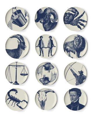 I don't put a lot of stock in horoscopes, but I do like zodiac imagery. Thomas Paul's iteration: traditional zodiac motifs on dishwasher-safe melamine coasters, shown here alphabetically ($48, Home Remedy). I'm a Sag, all the way, in case you were wondering. 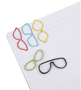 As hard as I try, I'm more of a piler than a filer, so I need to make sure my papers are well-organized within those towering stacks. Large (2-inch) glasses-frame-shaped Specs paper clips ($7 for 10, Umbra) will get the job done in a noticeable, funny way. 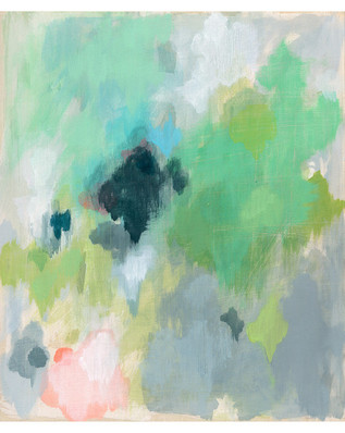 My cramped 1950s kitchen was able to fit very few of the things from our old house. Anything from medium-sized small appliances to all the decorative items are still packed away. But we have two empty walls (literally, no cabinets or anything) next to which my grandparents used to have their kitchen table. We have a table there for extra counter space, but eat in the dining room. As they're some of the only walls in the house not wood-paneled, I'd love to hang art like Australian artist Belinda Marshall's Possibility print ($44, Leif) to bring some life into the room. This is supposed to represent a calm meditative space. My kitchen and I both could benefit from that! 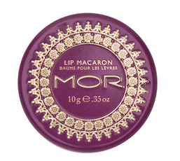 I just felt like sharing my favorite clear lip balm, which is Mor Cosmetics' Lip Macaron in passion flower ($10, beauty.com). I wear it all the time, especially now that the weather is getting chilly. It's light (not sticky), I love the fruity scent, and the little tin feels more special than a regular stick of balm.
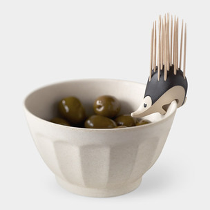
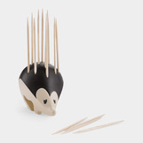
This quirky plastic Kipik hedgehog toothpick holder made me smile; it can either perch on the edge of a bowl or be used freestanding. The little guy comes with 22 picks ($25, MoMA Store).  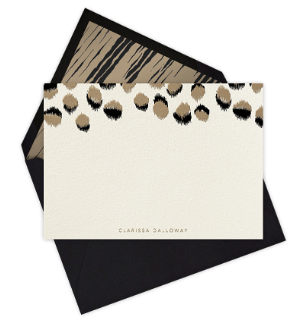
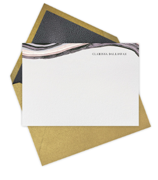
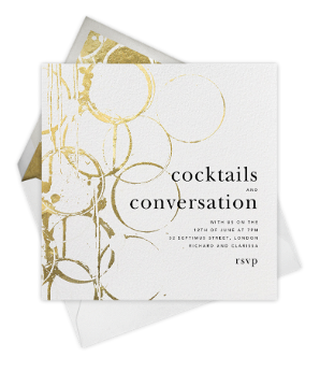
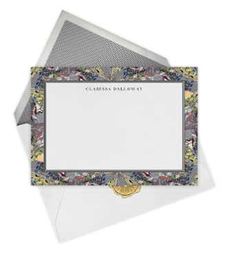
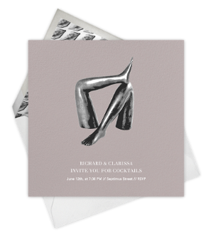
Kelly Wearstler's style is immediately recognizable and endlessly inspiring. Her interiors and objets always feel so swanky—which, frankly, is a word I wish more people would use again. I was just perusing her site the other day in fact, getting lost in some of the color combinations. This week, Wearstler's collaboration with Paperless Post launched and it's as chic as you would expect. Signature animal prints, metallic and stone motifs, drawn details, and wit translated to stationery and showcased throughout 40+ designs give you plenty of options to choose from, whether you're planning a cocktail party with friends or want to send a far-flung loved one a note on the personal stationery. Nearly all of the online styles can be printed on paper, and four of them can be customized further with a photo. A few of my favorites, including Feline-Horizontal (above), which I previously loved as a linen fabric (available through Groundworks/Lee Jofa): 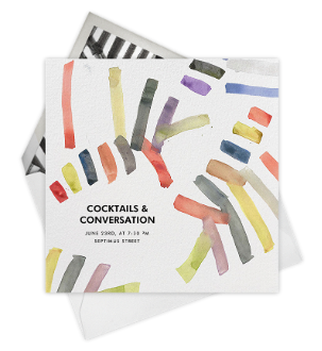
Sonnet
Marbleized - Horizontal
Bottle Shock
Kaleidoscope - Horizontal
Stems
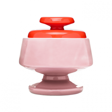
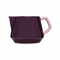
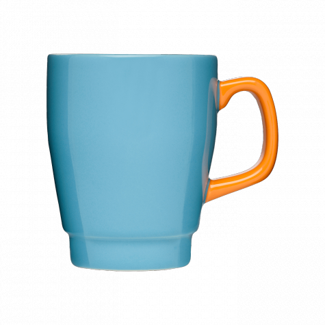
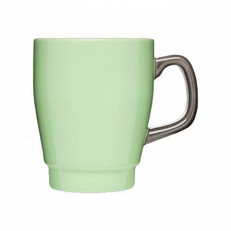
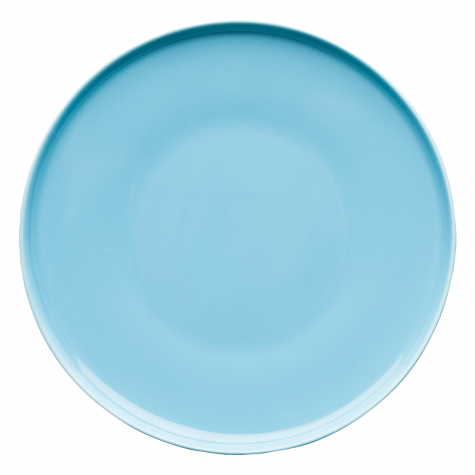
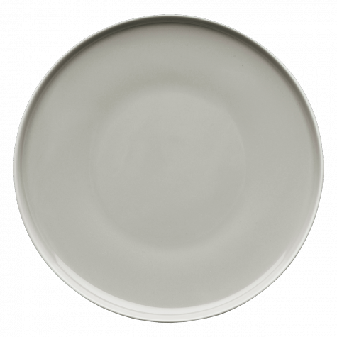
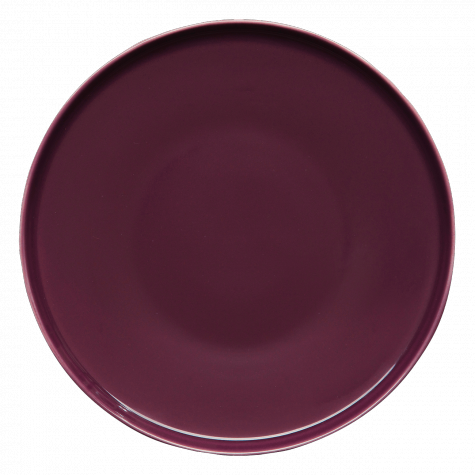
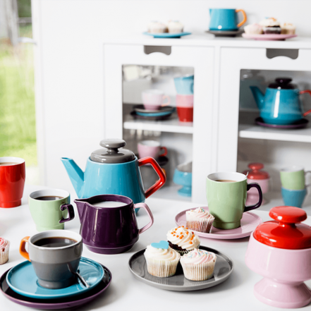 I've never had a cup of coffee. I know that probably sounds incomprehensible to some of you, but as much as I love the smell of coffee beans, I can't bring myself to get past a sip. And I'll admit I'm reluctant to pick up the habit. I do drink tea (usually peppermint), though mostly in the fall and winter. My other cold weather favorites are hot mulled cider and hot cocoa with a ridiculous amount of marshmallows. My husband loves coffee though, and we're big fans of our Keurig Vue, but our collection of coffee mugs is pretty rag tag. We do have a set of tea cups that came with our everyday plates, but they are very shallow. And I'm not even sure that we have a creamer and sugar bowl. I am dying to upgrade to Sagaform's stoneware POP collection. The bright colors are exactly the wake up our kitchen needs and I love the architectural shapes of the pieces. The pink/red and plum pieces are my favorite and I'm definitely putting these on my holiday wish list this year. Click products to see the other colors available.
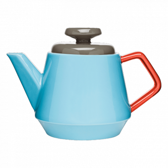 teapot
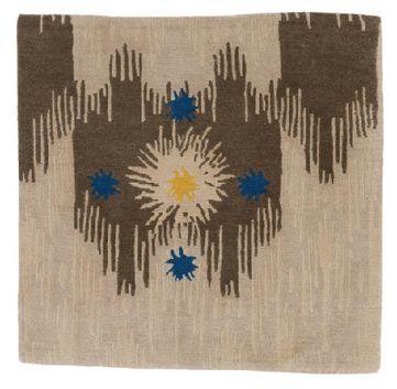
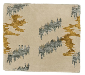
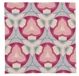
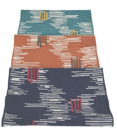
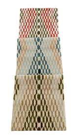
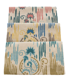
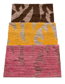
 coffee cup with saucer  One of the things I miss most about working in New York is getting to meet and spend time with interior designers and visit their decorated spaces in person. Viewing an image of a beautiful room is wonderful, and still inspiring of course, but when you're actually in the space, talking with the designer about their choices, seeing the way objects work together, and noticing details that otherwise might be missed—well, it makes a difference. The products they create are also a window into their aesthetic perspective and a chance to own a piece of their style in lieu of hiring them, though working with any of these designers would be amazing: Interiors experts Amanda Nisbet, Katie Ridder, Carrier and Company, and Tilton Fenwick all partnered with Studio Four to design and produce a line of rugs which has just launched. Each designer/design team contributed two designs and with the variety of beautiful colorways, the collection offers a total of 24 luxe options made of New Zealand wool. Some of the offerings are ready to ship and others require a lead time (production times vary). A highlight of the exciting patterns available:
additional patterns:
|
#checkout this blog with shop-themed puns
archives
August 2014
categories
All
© 2014 | mrkt
|


 RSS Feed