I know I've mentioned that one of the definite perks of my career has been getting to meet and work with creative and inspiring interior designers. I love seeing interiors where people take chances with patterns, colors, and mixing styles, because I think most average homeowners don't—but I'd love to be proven wrong! I'm pleased to say that all the designers I've worked with have been such a joy; I'm always so happy for them as they continue to be successful and especially when they branch out into new directions, such as product development. You might remember me mentioning Tilton Fenwick a few months ago, when they were part of a rug collaboration with Studio Four. Now, Anne Maxwell Foster and Suysel DePedro Cunningham have launched their first fabric collection, partnering with Duralee, who continues their tradition of working with fantastic designers producing exciting fabrics.
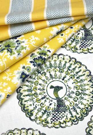
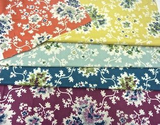
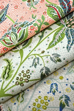
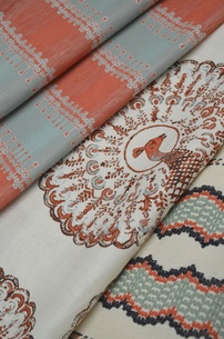
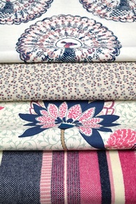
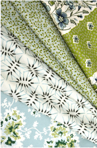
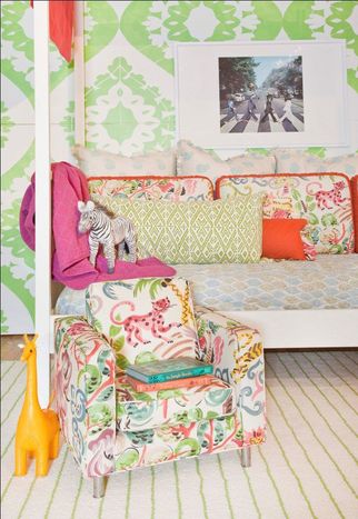
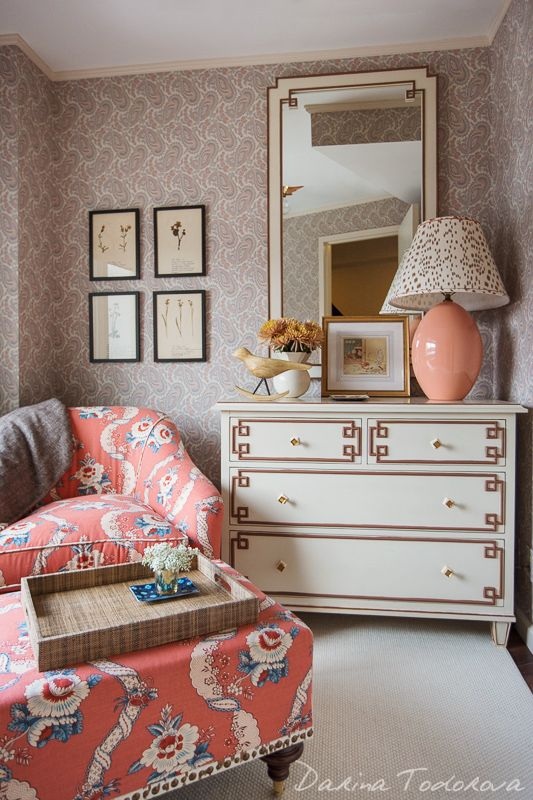
 It's exciting for any designer to be asked to develop a line of products, but I think it speaks volumes about their talent that Anne and Suysel were asked after having only been in business a few short years. The duo are known for their colorful and layered take on traditional. Since being featured as New Trad designers to watch by Traditional Home magazine (where I worked when I met them), they've also designed for showhouses and industry-favorite event Design on a Dime, in addition to their growing client roster. The fabric collection with Duralee is full of bright, happy, versatile designs that work well in a vibrant pattern-rich environment, yet many are restrained enough that they are perfect for someone who prefers a more subdued look. Take a look at these wonderfully rich colors and patterns available in a variety of scales. Stripes, florals, animal prints, and patterns inspired by recent travels work together to create a fresh perspective on traditional themes. The strong peacock pattern is actually Tilton Fenwick's company logo translated into a printed fabric. I can't wait to see some of these patterns on drapes and upholstered chairs and sofas.
If you're not familiar with them, here are a few examples of Tilton Fenwick's exuberant and gorgeous work:
images via duralee, tilton fenwick, and interior photos via michael rodenbush, darina todorova, trevor tondro for the new york times Xx a
0 Comments
Now that we're just under a week away from Christmas (what?!), the holiday cards are starting to roll in. I'm grateful I got the bulk of mine out a few days ago, but I still have a few I want to send. I enjoy receiving holiday cards, seeing the pictures of everyone and hearing how people from our past and present are doing. I like to keep the cards out during the holidays so we can enjoy them and think of the people who thought of us, but sometimes it's hard to find a nice way to display them.
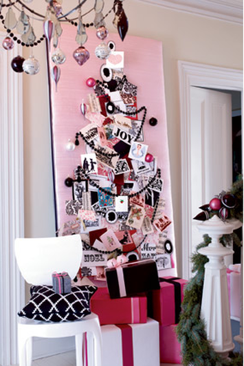
Of course, I've seen them placed along the mantel and I've seen them tied with string or ribbon and hung on a stairway bannister, or randomly pinned up everywhere, but I like something a little more put together. So, in a throwback of sorts--for Thursday, naturally--I wanted to share this idea I've always liked from David Stark. He, being the genius event planner/producer, put this together for O at Home magazine (may it rest in peace) back in 2007 when I worked there; though much to my dismay, I did not get to work on this story. Anyway, he took a piece of solid insulation material, which seems to be available for relatively cheap at the hardware store, and covered it in a beautiful pink dupioni silk. Then he pinned holiday cards to the board in the shape of a tree, adding ornaments, garland, and other fun elements creating something really special and festive. I love this and it's quite customizable because you can choose a fabric that coordinates with a certain room, or if your holiday decor has a specific theme or color scheme, you can match that, as David did here with the palette shown in this part of the story. Here, coordinating packages and ornaments on the bannister and chandelier also speak to the overall theme. I also love this scheme because it uses black, which most people don't think to use at Christmas, but I always endorse a little drama, contrast, and sophistication. My husband didn't understand when I bought black ornaments last year, but ha! If it's good enough for David Stark, it's good enough for me. You can copy the tree design or try a star or any other sort of pattern to hang the cards. And during the off-season, you could select a different fabric and display your children's art or other personal ephemera on it. Do you display your holiday cards in a special way? 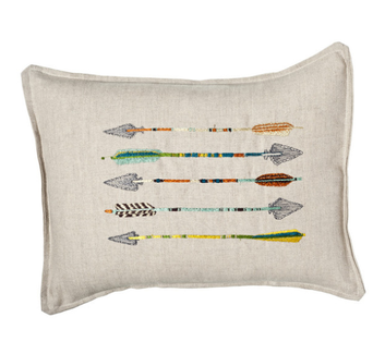 I hope everyone had a wonderful holiday weekend! We had a great time with immediate and extended family celebrating Thanksgiving (several times) and my birthday (also several times!), which was yesterday. I don't put a ton of stock in horoscopes, but I am a pretty true-to-form Sagittarius. I've always been interested in the imagery of the bow and arrow. When I was younger, I had a necklace with an arrow on it, and now I have a pierced brass cuff bracelet with the Sagittarius constellation. When I turned 30 a couple years ago, I stamped an arrow on the little favor bags full of silly things like candy and fake glasses with noses and mustaches attached. I've even used a modified arrow design for the back of my freelance business cards. I don't seem to be the only one interested in the graphic shape of the arrow, either. Check out these sharp finds: images via coral & tusk, ortolan organic, three potato four, haus interior, urban outfitters, 1st dibs, gretel, mid2mod, neiman marcus 1 & 2, net-a-porter, cavern, sucreshop 1 & 2, toodlesnoodles, spoonflower, john derian, house&hold Xx a |
#checkout this blog with shop-themed puns
archives
August 2014
categories
All
© 2014 | mrkt
|

 RSS Feed