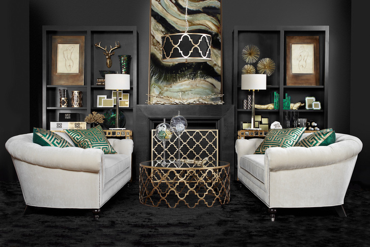
If challenged to choose a handful of only neutral colors and design a room around them, most people would probably not end up with something as moody and glamorous as this. I think we'd see a much lighter room, a lot more creams, browns, tans, greige, maybe some grey, or black, or white—but not this mix and not in this way. This image is actually from ZGallerie's fall look book (which can easily be accessed from their home page or clicking the above photo).
I was immediately drawn to it, not simply because I'm obsessed with moody rooms, but because the concept seems like it shouldn't be too difficult to pull together using an image such as this for inspiration. Essentially, the designers used black, an off-white, green, and a metallic—all of which are neutrals. But the genius is in the pairing. Using more black than white, particularly on the walls, carpeting and mantle creates a very different feeling than if the proportion were the other way around. The sofas balance the darkness and give your eyes a place to rest. The vibrant malachite green acts as an accent color and all of the gold provides additional light and reflection to keep the room from being too heavy and dull. The use of pattern is also fairly restrained, so the mix of shapes and materials is what provides the depth here. Bringing in glass objects, some chrome, and other accessories in these same shades adds interest to the room, and I love the large format framed canvas on the mantle which ties it all together seamlessly. This is also a good example of using a trendy color (emerald) but in a way that's easy to move around if you're someone who likes to switch out accents each season or as trends come and go. Another nice point of balance is the use of a round coffee table and curved sofas in front of the symmetrical very square/rectangular built-ins. I think it all came together brilliantly. What do you think of this room? Does it work for you? image via zgallerie Xx a
0 Comments

Yin and yang. Shadow and light. The infamous Seinfeld black-and-white cookie episode. We're always looking to black and white to provide harmony. Black and white are huge right now, though I think truthfully we can always say that. There is a comfort in the consistency, it's always chic, and the less-confident home decorator is safe in knowing the two colors always go together and with everything else, too.
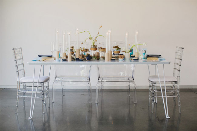 Well, today was a lot of things, but let's just say today was a Monday. One thing did go well, which was a quick meeting with the event coordinator regarding our vow renewal. I looked at some options for where we can have the brief ceremony if the weather is nice enough to hold it outside. I also chose the tablecloth and napkin colors, now that I have a tentative plan in place for the decorations. It's going to be pretty low key, because I am going to try and do it myself (party decor I tend to do DIY, that's about the only thing). Since I'm still going to be really busy between now and October fourth, I'm getting a little stressed about fitting it all in. Some days I catch myself calling it "the wedding" and I'm trying to find a balance between having enough decoration that it looks pretty and not so many that it looks like I am trying to recreate the big day. I am using a slightly more grown up version of our original color palette and I modeled the invitation after our original. But most of our wedding decor was floral, and we just don't have the budget for that. So I'm going to try a few things and hope they work out. If they do, I'll post them. Here is a 10-year vow renewal I came across today from Green Wedding Shoes. It's more "done" than ours will be; of course, they had an event planner and photographer. I can't afford to rent the fancy chairs or put up a big backdrop but I do want to make sure it feels special and pretty. And apparently, this site is like a secret weapon for engaged girls: Cloud Parade, which is probably the most dangerous thing to happen to me right now. Someone hide my wallet. 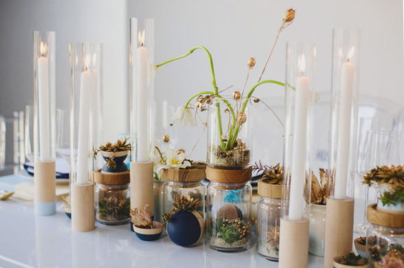 pretty centerpiece with mixed heights and materials 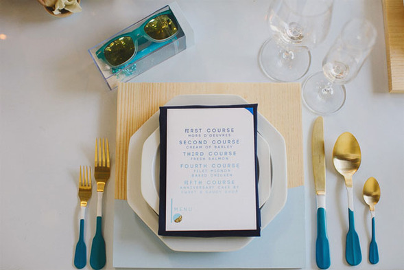 I'm still into the dipped trend, so I like the flatware and charger, and the little detail at the bottom of the menu 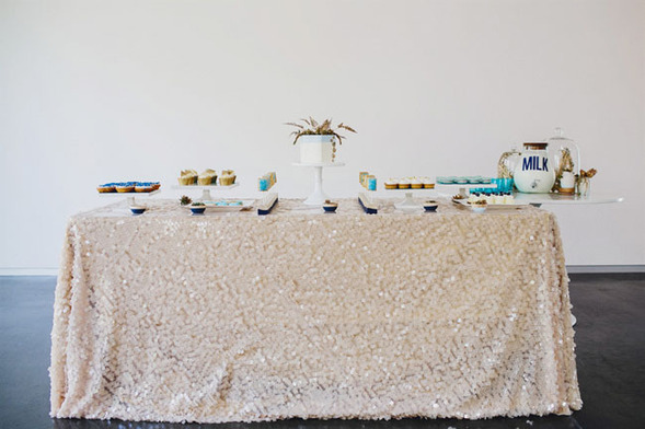 a dessert bar, my sweet-toothed husband would love this
One of the best things about summer is that it's peach season. Here are some sweet goodies, inspired by the colors of my favorite fruit. 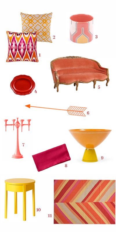
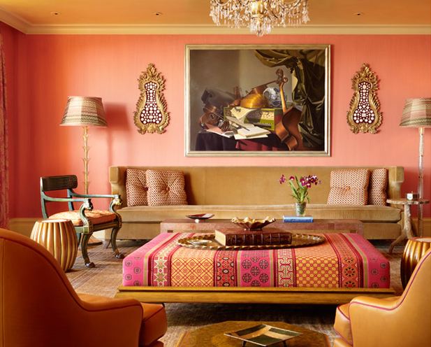
a warm living room in peachy tones
Xx a |
#checkout this blog with shop-themed puns
archives
August 2014
categories
All
© 2014 | mrkt
|

 RSS Feed