|
Earth, Fire, Wind, Water, Heart! Sorry, I was thinking of the power of the elements and had a Captain Planet moment. Actually, I saw a video [see below] on Facebook this morning that really interested me. Water can be really calm and serene or it can be angry and scary and strong. And it can kind of be both at the same time. Hawaiian photographer Clark Little jumps into gigantic waves with his camera and shoots these incredible shore breaks. Some of the breaks are so big, I want to scold him for not wearing a life jacket (such a mom). He captures these amazing shots while he is completely enveloped and surrounded by the powerful water and the images are truly beautiful. Check out the video in which Little talks about his process and you can see more of his work.
0 Comments
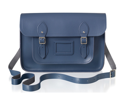
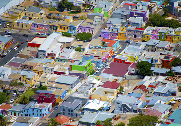
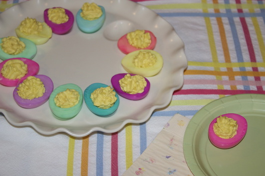
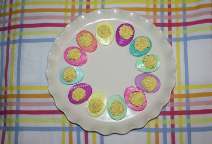
'Tis the season for limited-edition collaborations! If you read shelter magazines regularly, you know that Farrow & Ball is the high-end paint brand widely favored by magazine editors and interior designers. And if you read fashion magazines, you've likely seen the handbags by The Cambridge Satchel Company in both classic and neon colors. Now the two British companies have joined forces on a small collection of exclusive bags that has just launched. 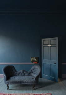 I think it's almost always a no-brainer for great fashion and home brands to match up and offer a tactile combo of both their strong suits. With this partnership, you get the benefit of the exceptional craftsmanship that is a hallmark of both brands: a chic durable leather bag in a bespoke shade formulated by color experts. One of Farrow & Ball's latest colors, Stiffkey Blue is inspired by the remarkable color of mud found at the beach in the hamlet of Stiffkey on the north coast of Norfolk in England. I would love to know what makes the mud this unique shade! The nautical/beachy background of the color makes the satchel perfect for summer and beyond. The shade is a bit moody, which you know I love, and it will go well with other neutrals, metallics, and brights as well. The bags are handmade in England and will be available in four sizes as a limited edition of 200; each piece will be embossed with a number inside. As I spend time looking at local neighborhoods and perusing online real estate listings, I'm thinking a lot about exterior paint color combinations. In the majority of neighborhoods in the US (at least all the ones I've ever been in), houses are generally painted in variations of brown, gray, white, green, yellow, blue, and red. But the colors are always pretty muted: the reds are more brick reds, the yellows like butter, and the greens olive or forest. (But it seems like there's always one blue house that is a weirdly electric color and stands out like a sore thumb.)  Wouldn't it be amazing if our neighborhoods were as vibrant as these blocks in Cape Town, as photographed by Gray Malin? Those blue houses would be right at home among the lavenders and oranges and limes and other saturated colors. I can't imagine how fun it would be to live in a technicolor neighborhood and see where everyone took their house color-wise. I think I would be insanely happy every time I walked on my street. Of the standard colors, I've always gravitated toward gray houses, and my last house was light gray, but lately I've seen a few houses around town that are purple. Subtle though—the purples have gray or brown undertones and they look really nice. Something like this color, left (Cabernet, 2116-30 Benjamin Moore). So maybe I should go in that direction for something a little less typical? If you could paint your house any color--neighborhood associations and judgmental neighbors be damned--what color would you choose? Or for more inspiration, check out my exteriors board. Last year, we ended up coloring eggs that were meant for a deviled egg hors d'oeuvre and I loved how it came out so much that I wanted to do it again this year. Plus, I like deviled eggs better than plain hard-boiled eggs, so this way, we can enjoy the fun of coloring the eggs and I'm more likely to eat them after. Recipe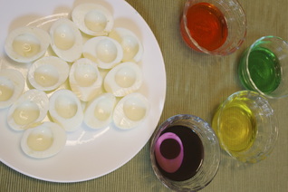 Hard boil eggs and remove the shells. Halve hard-boiled eggs lengthwise. Remove yolks and mash them (if you have a ricer, it makes the filling smoother, but using any masher or fork will do). For 6 eggs, use: -1/4 cup mayonnaise -1 teaspoon vinegar -1 teaspoon mustard, -and salt and pepper to taste To fill the eggs, we put the mixture in a cookie press with an accent tip on it; it gives them a light and ruffled look, but you can also use a piping bag (or a plastic storage bag with a corner cut off). We usually top them with paprika, but you can also garnish with parsley, chopped onions or chives, crumbled crispy bacon, or horseradish. The coloring process is the same as eggs still in the shell: food coloring + water + time = colored eggs. The color won't take to the eggs as uniformly as they do on the shells, but as long as you're okay with that, you should be pretty happy with the results. I haven't tried to do ombre or anything more advanced than combining two or three colors on the same egg, because it takes a while for the color to saturate into the egg white. We're actually doing another batch of eggs next week when my sister comes to town, so I might try to experiment a little. images my own
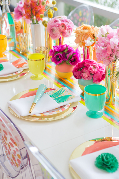
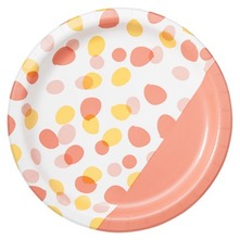
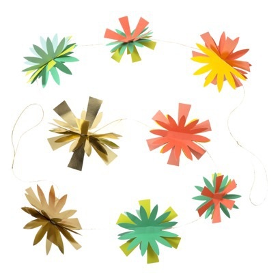
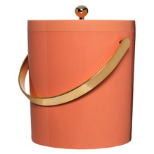
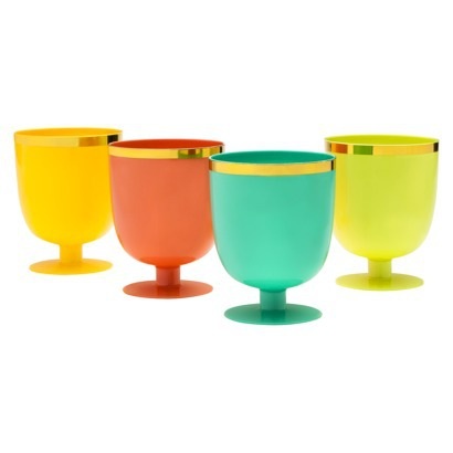
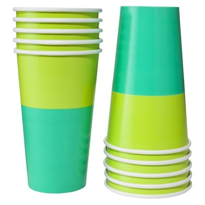
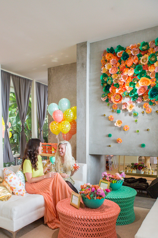
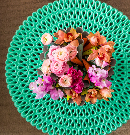
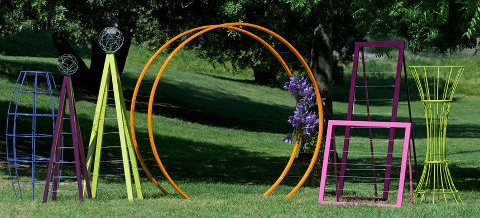
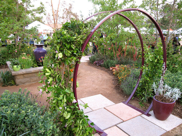
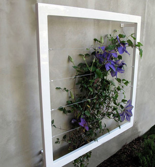
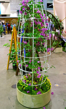
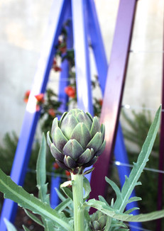
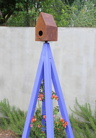
Xx a I'm not the first person to be excited about Oh Joy!'s collection for Target, which just launched, and I certainly won't be the last. I have to say in all honesty, that Joy Cho is probably my favorite blogger of all right now (I even bought her book on my Kindle so I could learn more about blogging as a business, now if I could just find time to read it). In addition to having an insanely attractive family (I want to have a playdate with our daughters), her taste is fabulous, and she seems so down-to-earth and real; she's very positive, but she isn't afraid to peel back the layers and share her hectic reality. Somehow it was comforting to know that Joy struggles with a lot of the same things I do; you always know other parents feel the same way but it's reassuring to hear it anyway. Her collection for Target is really lovely and feels very much "her"—as much as you can know someone from reading their blog, it feels like an accurate translation of who she is and her style. The products are very cheerful and feminine, and the shots from her LA launch party have so many great entertaining ideas and decor moments in them. The paper goods are adorable, but I especially love the entertaining pieces that have more longevity. The collection includes more paper goods, cutlery, decor items, cake toppers, and balloons. The launch party in LA was intended to be an outdoor garden party, but rain drove them inside. I don't think the party lost much of anything by being indoors. There are so many great and easy entertaining ideas that I'm actually planning to blog about them tomorrow for my other job at the event planning company. But decor-wise, here's something I loved. We've seen this cocktail table around for years, but it's always in white. How fresh does it look in color? I love how they painted the tables to coordinate with the collection. As I was perusing gardens, backyard and otherwise, yesterday, I came across TerraTrellis products. I really don't have a green thumb, but I like the idea of adding some geometric shapes to the more freeform flowers and plants. It always interested me how plants adapt to a trellis and take it over, winding their way in and around it. The colors these trellises come in seem to complement the hues of the flowers really well, too (see the image below with the artichoke).
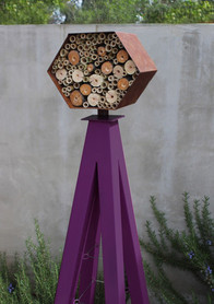
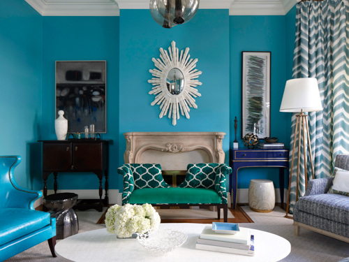
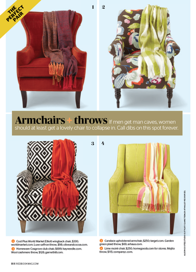
The powder-coated frames are built and painted by hand and come in seven colors. I'm more of a fan of the general trellis pieces but if you're also a bird lover, a selection of the pieces are topped with a birdhouse. A bee nest (for the brave, I think), is also available, which encourages pollination throughout your garden. The pieces are functional art and bring a different, modern, element to a garden in addition to the practical application of adding support and structure. I'm a little late in sharing, but the March issue of Redbook magazine features two stories I worked on. For tips from top interior designers on decorating with a little and a lot of color, see the slideshow from the article, featuring the room above, designed by Melissa Warner Rothblum of Massucco Warner Miller. I'm a little obsessed with that royal blue console in the corner. The other story is a cute matchup of great, totally affordable armchairs and throws I found. This isn't online but it's the back page of the issue. Hope you like! images via redbook, photographs by philip harvey and alison gootee
Xx a Life's been a little crazy lately and I feel the blog has gotten the short end of the stick for sure, so thanks for hanging in with me even though there've been a lot of days without posts. I decided to do another throwback-style post today and share something I worked on three years ago.
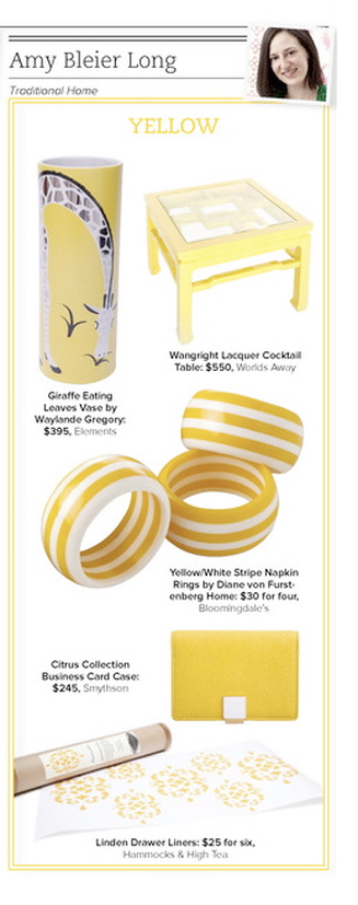
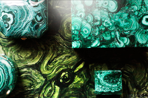
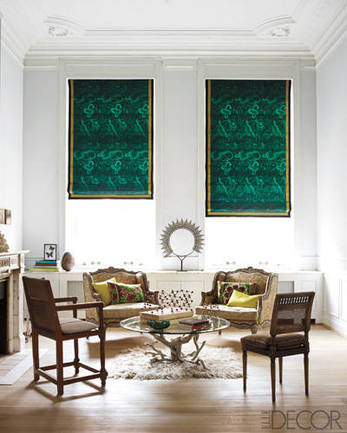
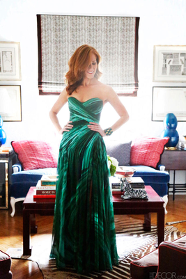
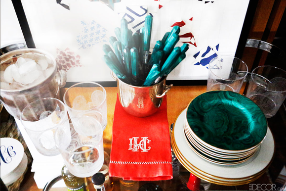
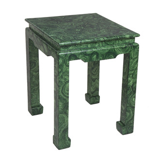
Trad Home, Traditional Home's digital magazine was still under wraps and being produced during the early months of 2011. There was a lot of industry buzz around the issue and it was a very exciting time. We were really trying to turn people's notion of "traditional" on its head. At the time, I was also producing my first major trend feature story completely on my own (plus a bunch of other stories) for the print mag, so I actually didn't have a lot to do with the digital version, but this was my contribution. Each editor had to select a color and source several products for the premier issue. The thing I like about this story—aside from the sorely-needed shot of sunshine it's providing—is that I would absolutely choose all of these products again. None of them seem dated; they're all as classic and relevant as they were three years ago. And not only would I choose them all again for the editorial, I would actually choose each of them in my own life. Sadly, DVF Home no longer exists. I really liked a lot of their tabletop and bedding pieces, so that's a shame. Another thing this does is illustrate that even if you're afraid of a lot of bold color, there are small-scale ways to bring in some brights in order to add interest without overwhelming yourself. I'm a bold color girl, but I can appreciate that some might like to keep their house toned down. (A little surprise here and there never hurt anyone, though.) A bright yellow business card holder, aside from being chic, is practical, too, for finding-it-in-the-abyss-of-your-purse purposes. In addition, you get to see what I look like with a blow-out and my head tipped at an angle, so there's that, too. photo: my own Xx a Last night, someone whom I've been working with on a story sent me the link to this Elle Decor piece about interior designer Lindsey Coral Harper's malachite collection. We've bonded over our love of interior decorating, and she had previously told me about her malachite/Tony Duquette-inspired Christmas tablescapes, which were really great. As a thank-you for the story, she gifted me a small L'Objet malachite dish, which I adore. I've been crushing on these malachite roman shades (from the Belgian home of the Casamidy founders) for years: But, back to Lindsay Coral Harper. So, malachite is one of her favorite things and she collects new and mostly vintage pieces. The article/slideshow refers to it as her trend obsession, but I think it's reached an emotional level that surpasses being a trend, and has become a beloved collection. Using the word trend makes it seem a little more fleeting, though malachite has been big for a couple years now; Harper's pieces are classic enough to stand the test of time. Trends are certainly an excellent way to become familiar with different patterns, looks, and styles. It's hard to deny the hotness of her Monique Lhuillier gown: She mixes the malachite pieces throughout her house, as seen here on her bar cart and boxes of various sizes in different vignettes (top image). Having favorite pieces sprinkled throughout and used often is a nice alternative to a collection that is for display only. Also, I can't believe she found the flatware on Etsy… I need to spend more time on there and find some treasures like these. I met Lindsey several years ago at the NY gift show when her company Lamshop was brand new. Lamshop offers this lovely piece, so you know her love for the deep green stone pattern runs deep.
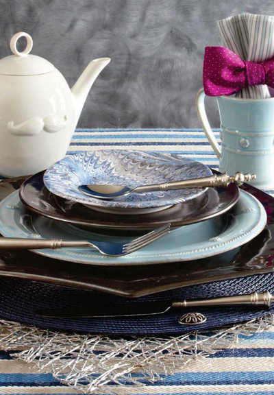
I'm working on an article that's due Friday about the house of a local interior decorator who has a fashion background. So I've had the interplay of fashion and home decor in my head for a few weeks. I happened to be checking TradHome last night to see if there was a new issue I might have missed (there wasn't, but I hope there will be one soon), and came across this menswear-inspired tabletop scheme.
The marbled cocktail plate and the flatware with sculptural handles immediately caught my eye. I think the mix of varied shades of blue and gray is so lovely and sophisticated. The combination of the blues with the pewter stoneware charger and plate, and the patterns on the cocktail plate, fabric (acting as tablecloth) and napkin… all I can think of is Stacy and Clinton from What Not to Wear (who I miss dearly): color, pattern, texture, shine. This has it all. You know I love clever details and a touch of humor, so of course to me, the mustachioed Jonathan Adler teapot and the fabulous punchy purple bow tie used as a napkin ring around a shirt stripe-patterned cloth napkin are just the right notes to make this sing. As with fashion, it's all about layering and the details. The plates, navy placemat, mug, and napkin are all Juliska and the flatware Mikasa. I don't know what that gray background is, but I really love it. I can't stop looking at the marbled plate against that backdrop. Adore. image via traditional home Xx a |
#checkout this blog with shop-themed puns
archives
August 2014
categories
All
© 2014 | mrkt
|




 RSS Feed