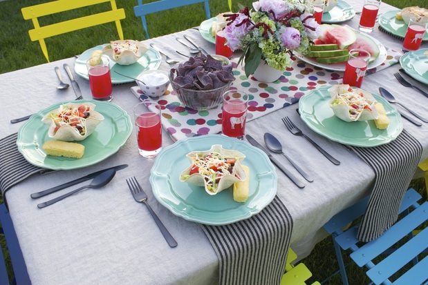
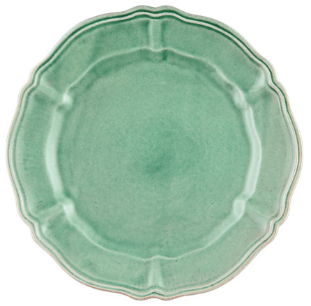
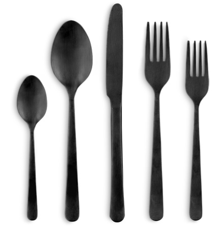
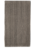
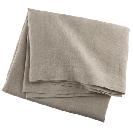
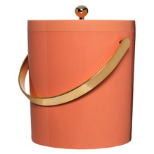
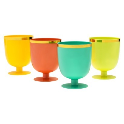
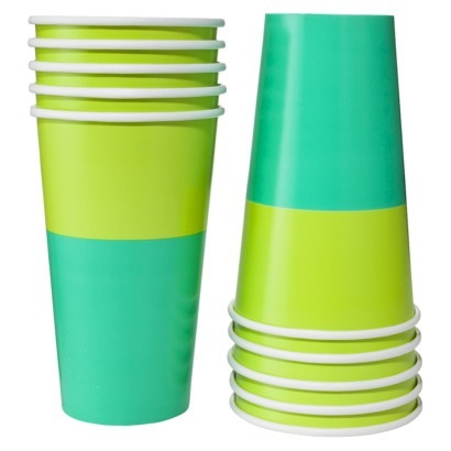
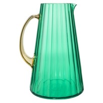
Well, it seems like a million years since I had a chance to last post, but I can finally share one of the reasons I've been so busy. I was totally caught off-guard and flattered when Arhaus Furniture asked me to be the first guest blogger on their blog, Greenhaus. I've worked with Arhaus for years on editorial stories and it's always been a pleasure and I remember how fun it was to get a preview of their Manhattan flagship store before it opened. It actually took a long time for me to figure out what I should write about for the post. I was trying to think of some grand theme I should try to create but finally it occurred to me to talk about what I know, dinners with my family, and make it look exactly like it would if I were buying it for myself with no online attention. I knew I wanted something bright and fun, something that would make me smile, and even though I was stressing out until the very last second, I think it came out well and somehow from my brain translated to the table exactly how I wanted it to.
This was the first "full-scale" shoot I've done since I moved and let me tell you, it was as fun as I remember but so much harder! For a typical magazine shoot, you put your concept together but you can order lots of options to choose what works best together. I couldn't do that so I just had to hope that my idea would come out right and make me look like I know a little about what I'm doing and not criminally insane. I really love the pieces I chose and I can't wait to keep using them in different ways. I had a great time digging through my own things and finding a few new pieces (can't get enough of these zebra glasses) to pair with them. If you read the post, let me know what you think! full disclosure: I was allowed to keep the products that I selected to photograph for my post, but all opinions are my own.
Xx a
0 Comments
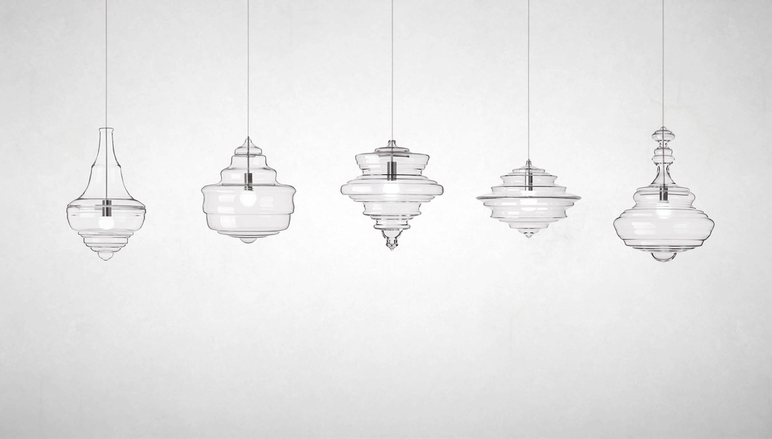
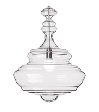
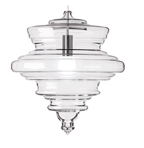
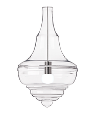
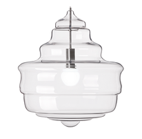
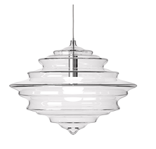
One of the things I miss about New York is easy access to the zillions of great shops with modern and cool home goods (everything here leans pretty conservative). The Conran Shop, now closed, was one of those shops I liked to take a spin through, especially their lighting department. So occasionally I check out the website of the original London shop. You can't find pieces like these beautiful glass pendants here (though, luckily, you can find them in New York). Designed by Czech partners Jan Plechách and Henry Wielgus for Lasvit, these handblown crystal glass lampshades are directly inspired by the grand chandeliers found in opera houses worldwide. There are five designs of the Neverending Glory collection:
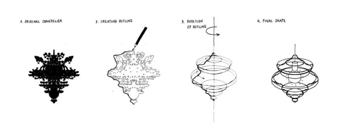
Designer Plechách said, "We wanted to create just a ghost of the original chandeliers, or just the soul, the shadow, the shine of the original ones. If you imagine the grand, original chandeliers in these opera houses, they’re glorious, and the ‘neverending’ part relates to the profiles and the idea of infinite rotation—a neverending glory." I love the sketches below showing the process of translating the original design to the modern interpretation. 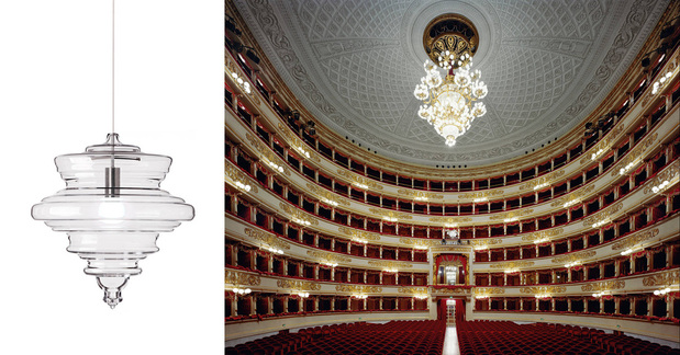
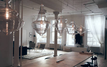 Another thing I love about these pieces is the scale of them. Each is between two and three feet high. I think every house needs a statement light fixture. Each light certainly holds its own, but they look quite striking together in a row. I'm not sure which is my favorite though I'm leaning toward either La Scala, or probably not surprisingly, Metropolitan Opera. Which is your favorite? 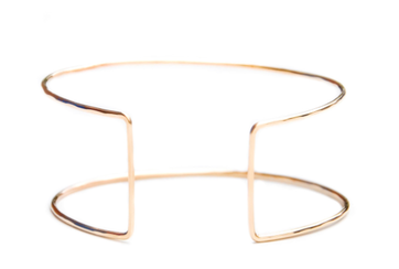
Have I mentioned how much I love cuff bracelets? Probably. I think it stems from a superhero power band place (in high school and college I used to cut the tops off tube socks and wear them like power bands on my wrists). I pretty much like them all, whether they're big and chunky or elegant and minimal, like this 'Eileen Gray' cuff. Handmade in the USA, the cuff is adjustable so it can fit on any wrist. The shape is very simple and architectural. If you aren't familiar with designer Eileen Gray, this is the iconic table she is so well-known for. You can see the direct inspiration between her design and the cuff. 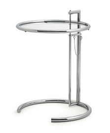
Eileen Gray was an Irish designer who lived in Paris and worked as an interior designer, architect, and furniture designer throughout her career. This table was created by Gray and her partner Jean Badovici for a home in Roquebrune, France. They placed it bedside, but the table is often more likely seen now next to chairs and sofas.
Since we moved nearly two years ago, we've been on the hunt for the right house. Spending all this time searching has taught me at least one thing: People really, really need help taking photos for their listings. I have no intention of shaming anyone (because frankly these photos below are not the only ones out there), but I feel like I need to share what not to do. A house is a big-ticket item and you want it to look its best so it can move off the market quickly. Listing photos are supposed to draw people in and make them want your house, not make them laugh or run scared. (PS: Realtors, when I see you've posted a listing with questionable photos, it makes me question your attention to detail and quality as a professional.) I won't lie, it can be hard to get good pictures when you've just found out or decided you're moving and haven't packed up yet and there's clutter all around. But try your best to remove distracting and overly personal items. When we were moving from our first apartment to our house, we had a lot of papers, miscellaneous decor, and photos. But we spent a couple days, packed all that stuff up and brought it to a storage space that was running a two-month special. It made a huge difference in the amount of stuff in the apartment, which I then staged for the photos and showings. The apartment sold within 24 hours of being listed. Granted, it was in a highly desirable area and it was before the economy tanked, but I have no doubt that the cleared-out space helped. We even removed all photos of family and friends, save one wedding picture where you couldn't see our faces. People want to see themselves in your house, so even if it feels weird to you, try to depersonalize your house when you put it on the market. This advice is not new, but it seems people don't take it to heart: 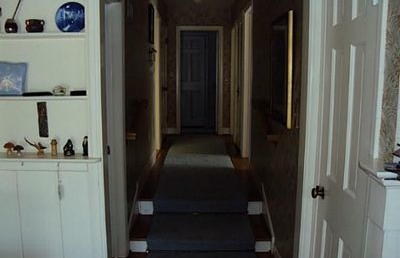
Turn on the lights
I can barely see this hallway. Is it painted, is that wallpaper? Where is this leading? Aside from the lights being on, I think the door at the end of the hall should have been opened. People want a sense of how the house flows. 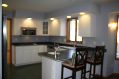
Make sure the photo is in focus
In the digital age there is no excuse for posting a blurry photo like this. I can't see the details clearly. Is that a tiled backsplash or simply a gajillion outlets all along the wall? Take a minute to scroll through the images on your camera display and see if all the important details look clear. 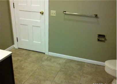
Show the most important parts of the room
It's safe to assume every bathroom has a place for towels and toilet paper, so I don't really need to see that. I'd rather see what the vanity and lighting look like and how many sinks there are. Powder rooms and half baths can be hard to shoot, but at least show me all of something. Showing me fractions and corners of multiple things doesn't help me visualize the room. 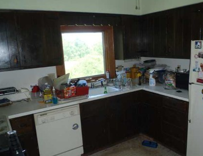
Clean up, or at least hide, the messes
I'm the first to admit that on any given day I have a stack of laundry and school papers somewhere. But I wouldn't show them to you in my listing photos. You want your house to look its most attractive when you're trying to sell it, so straighten up and put away dishes and cleaning supplies. People want to see how much counter space a kitchen has, keeping it cluttered is not appealing. 
What is happening here?
I'm not a plumber or an electrician and I don't know what this is but it looks like a hot mess. And probably not code. I'm not sure why this was included in the listing photos; is this supposed to entice me to want to see more of the house? This makes me want to call Mike Holmes to do a full house inspection. 
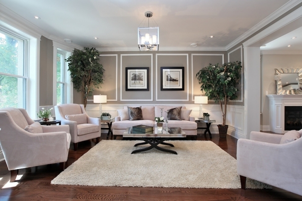
Now, let's look at this beautifully finished room again. This is a good example of what I would like to see in a listing photo. Obviously it's a professional image so I don't expect a listing photo to be this high quality or the average room to be this well decorated, but here's what this photo has going for it and what you should strive for: -The picture is clear and in focus, is not taken from any funny angles, and shows the approximate depth of the room. Because I can see the whole room, I'm not left wondering what I can't see. -It gives an idea of how the house flows because you can see into the next room. -The lights are on and the windows are letting in natural light so you get a sense of how the room looks during the day and you can see everything in it. -The furniture is nicely arranged and the room is lightly accessorized but there are no personal items, photos, toys, or other kinds of clutter. This room absolutely makes me want to see more of the house. When I see the bad images, sometimes I can look past the poor photos if it seems like the house is in good shape. But if the pictures are blurry, make the rooms look small, or if the rooms are a mess, it makes me wonder what state the house is in and whether it's worth my time to see the house in person. I can generally tell within 3-5 pictures whether I'm going to want to see a house in person or not. If everyone is judging your house by the photos, don't you think it's imperative to have the best possible selection of images for prospective buyers? 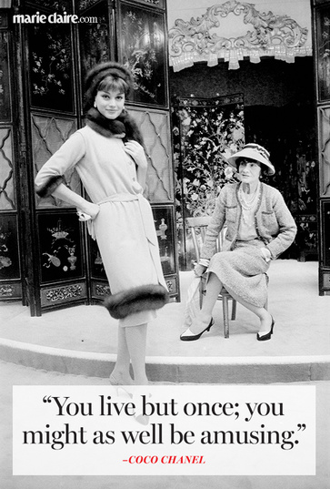
This week, as part of my part-time job, I'm attending a local conference called the WISE Symposium. WISE stands for Women Igniting the Spirit of Entrepreneurship. All day tomorrow I'll be tweeting and posting from the conference and I'm excited to hear the speakers who have been successful in starting their own businesses, attend the panels all related to starting and running a business, and learning more about local businesses who will part of the expo section.
The company I work for is a small business founded and run by a woman. My mother-in-law is an entrepreneur and I don't think of myself as an entrepreneur, but going out on a limb and working freelance as opposed to being on staff is a direction I wasn't ever sure I could succeed in. Marie Claire posted 11 of Coco Chanel's best quotes and they seemed especially appropriate this week. The one above is my favorite as it's pretty close to my philosophy on life and decorating (to some extent). Check out the rest of the inspiring quotes here. 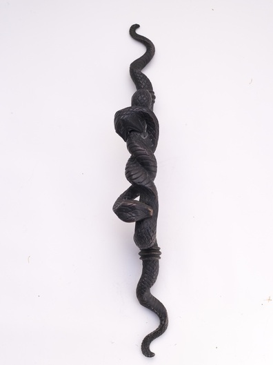
 I'm not the type of person who looks for products (or anything really) that is exactly like what everyone else has or things that will blend in unnoticed. If I like it and it's popular, oh well, what matters most is my feelings about it, but in general, I'd rather have decor that is different from others'. This works out because most of my family and friends have very different taste. Finding unique items can be hard, but when you find the right thing, it can make a serious statement.
Can you imagine entering a room with this double head snake handle on the door? It suggests there may be even more interesting things inside and says a lot about the personality of the person dwelling there. Someone bold, wild, sexy? The handle, designed by interior designer Lisa Jarvis, is two feet long, so it can be used on a door, or perhaps a larger cabinet. It's not for the faint of heart and I love the idea of having one on my front door (I'd have to have a separate mechanism to lock the door, but I'm not thinking about practicality right now)—what a statement that would make. 
In one of many procrastination breaks late last night (I'm on deadline again), I finally signed up for Instagram. I've had the app on my phone for probably two years, but never registered. It wasn't that I didn't find the app interesting or valuable, it's just that sometimes I get overwhelmed by how many things there are to register for and sign up for. Websites that you have to register with to see the content kind of drive me crazy. Does that happen to you? Thank god for password keeper apps. I was the same way when I had to go from Friendster > MySpace > Facebook. I really resisted Facebook. I was good about limiting my time on there in the beginning. Now I'm checking my feed pretty often. I'm not sure how consistent a Intagrammer I'll be, but I definitely want the infusion of inspiration. So that's where you come in: What's your favorite Instagram account to follow? Leave it in the comments!Help a girl by leaving your own account or your favorite accounts to follow, and I'll check them out. And if you follow me, I'll try to keep it interesting! Find me at instagram.com/xxabl - I'll start posting as soon as I finish my article.
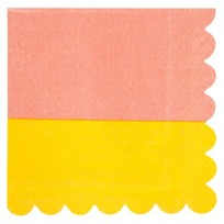
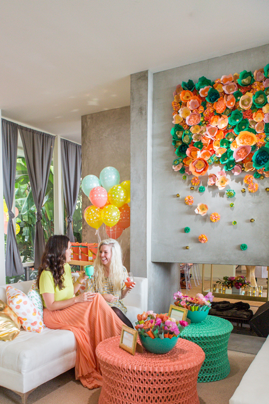
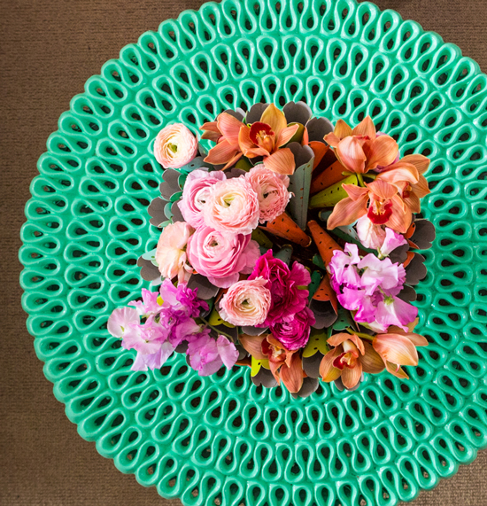
image via thepatterns.info Xx a 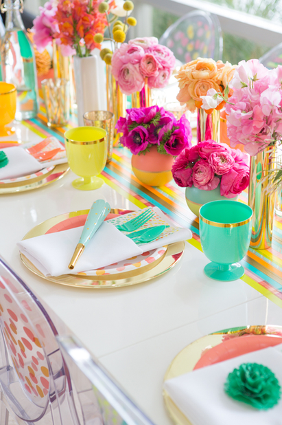 I'm not the first person to be excited about Oh Joy!'s collection for Target, which just launched, and I certainly won't be the last. I have to say in all honesty, that Joy Cho is probably my favorite blogger of all right now (I even bought her book on my Kindle so I could learn more about blogging as a business, now if I could just find time to read it). In addition to having an insanely attractive family (I want to have a playdate with our daughters), her taste is fabulous, and she seems so down-to-earth and real; she's very positive, but she isn't afraid to peel back the layers and share her hectic reality. Somehow it was comforting to know that Joy struggles with a lot of the same things I do; you always know other parents feel the same way but it's reassuring to hear it anyway. Her collection for Target is really lovely and feels very much "her"—as much as you can know someone from reading their blog, it feels like an accurate translation of who she is and her style. The products are very cheerful and feminine, and the shots from her LA launch party have so many great entertaining ideas and decor moments in them. The paper goods are adorable, but I especially love the entertaining pieces that have more longevity. The collection includes more paper goods, cutlery, decor items, cake toppers, and balloons.
The launch party in LA was intended to be an outdoor garden party, but rain drove them inside. I don't think the party lost much of anything by being indoors. There are so many great and easy entertaining ideas that I'm actually planning to blog about them tomorrow for my other job at the event planning company. But decor-wise, here's something I loved. We've seen this cocktail table around for years, but it's always in white. How fresh does it look in color? I love how they painted the tables to coordinate with the collection.
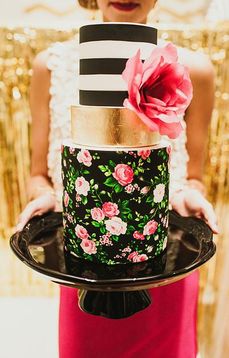
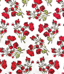
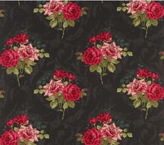
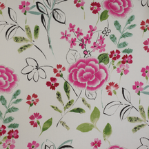
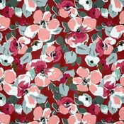 I'm not sure if I shared this already, but on top of freelancing, I've also been working part-time on social media and marketing for a local events company and the brand new loft-style event venue the company's owners are building (part of why my posting here has been less frequent). As you might expect, in addition to corporate and social events, galas, and bashes, the company plans and designs a lot of weddings. I've always loved weddings, not just because I'm a romantic, but because of all the insanely great decorating ideas, stationery, and fashion. I've reached the age where most of my friends are married so I'm not attending a lot of weddings. Being at this job gives me even more of an excuse to fritter my time away on Pinterest (as if we needed more excuses for that, right?) and look at pretty ideas, which is how I came across this gorgeous cake. The thing about this cake is that it is fashion-forward and could easily inspire both an outfit and decor, mixing stripes and floral with hits of gold. I know it's probably over by now since everyone did it years ago, but I still want to paint an entryway with vertical black and white stripes. I was supposed to do this in my last house, but as you may have gathered by now, I didn't pull the trigger on too many decorating projects, mostly for financial reasons. The plan was black and white stripes, a floral-upholstered bench, and I bought these great red coat hooks from Anthropologie. I really love this Hana floral pattern from Kenzo/Lelievre which I first saw several years ago when we used it in another colorway for a Traditional Home story. I couldn't decide on a colorway and now I'm worried that it's been discontinued. So the search continues. But it's not like good floral elements are scarce: How about a classic Cecil Beaton fabric? I actually really like florals on a black ground, like this fabric from Osborne & Little. Or another print from Manuel Canovas with more of a hand-drawn quality. These could each work well with a bold stripe and metallic accents.
Do you have a favorite floral?
images via pinterest 1 & 2, aitch interiors, osborne & little, cowtan & tout Xx a 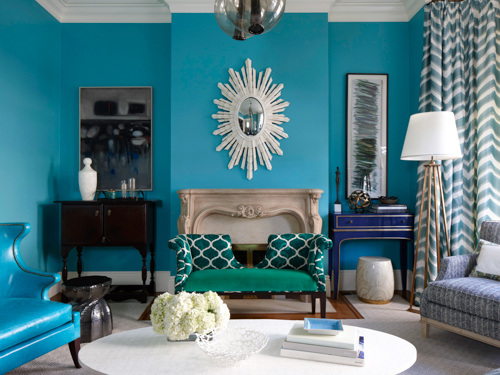
I'm a little late in sharing, but the March issue of Redbook magazine features two stories I worked on. For tips from top interior designers on decorating with a little and a lot of color, see the slideshow from the article, featuring the room above, designed by Melissa Warner Rothblum of Massucco Warner Miller. I'm a little obsessed with that royal blue console in the corner. The other story is a cute matchup of great, totally affordable armchairs and throws I found. This isn't online but it's the back page of the issue. Hope you like! 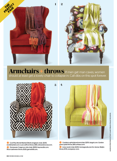
images via redbook, photographs by philip harvey and alison gootee
Xx a |
#checkout this blog with shop-themed puns
archives
August 2014
categories
All
© 2014 | mrkt
|
 RSS Feed