 We had a fun afternoon Sunday at the local Parade of Homes. We toured eight houses, each from different area builders, and I think it was a successful show. It's always amusing listening to all the other people touring the houses to see who likes what. For the most part, I think everyone played it pretty safe design-wise. These showhouses generally aren't about trends or pushing the envelope, so I didn't see any extremely bold colors, patterns, or off-beat design choices, but I saw a lot that I liked that would appeal to the average homeowner. There were a few things that weren't necessarily my taste, sure, but nothing that really turned me off—that has happened in the past. I wanted to share the elements and ideas I liked best that, for the most part, anyone could do.
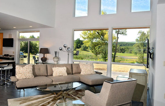
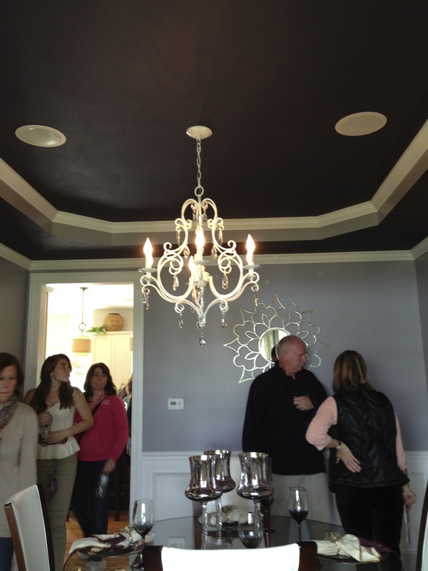
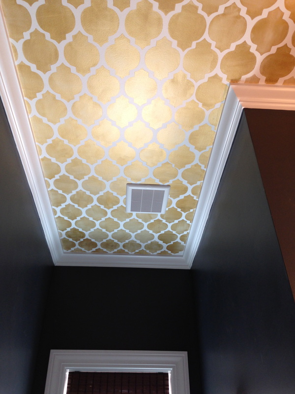
I was taking these photos on my phone, so the colors didn't come out quite true, but in this dining room (left), the walls above the chair rail were a pale silvery purple, and on the ceiling a darker purple. I liked the use of the two shades together, and that the darker purple was used on the ceiling as opposed to an accent wall, which I feel like I'm over, personally. Do other people feel that way? In the same house, the first floor powder room (right) was painted a very dark blue and featured a painted gold Moroccan lattice-patterned ceiling. It's always good to see pattern on the ceiling, use of metallic colors (they're a neutral, don't forget!), and a small space painted in a dark color—all ideas that people shouldn't be afraid of. 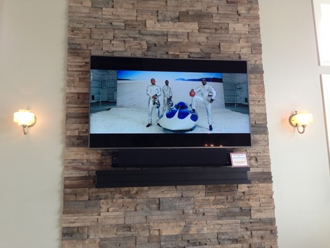 The local AV shops always install impressive media set-ups, and this year was no exception. I took a picture of this, not only because the picture and color were so clear and crisp, but because the TV was frameless, and several designers followed suit. I prefer this look to having a plastic frame around the screen. 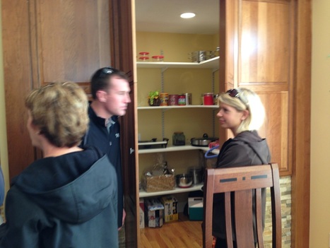 They must have saved a lot space here and there, because the second house had one of the largest walk-in pantries I've ever been in. The doors were disguised to look like regular kitchen cabinet fronts. This house also had a massive home theater downstairs complete with a stage area and curtains that closed and opened with the push of a button. I'm sure my extremely theatrical preschooler would have field day with a set up like that. I'd be curious to know how the person who bought the house will use that stage, if at all.  I thought the third house would be my favorite because it was extremely modern. It may be the first time they've ever had a modern house in the parade, though I did miss many years while living in New York. But of those I've attended or heard about, the houses are nearly always Colonial or Craftsman styles. It didn't end up being my overall favorite but there were a lot of things I did like: open plan living space, lots of floor to ceiling windows, and the fact that it was not Colonial or Craftsman. I have nothing against either style, it's just that it sometimes feels like that's all I see. The interior was not decorated in a cold ultra-modern way, but there were some elements that were cool and sleek, especially in the downstairs level, which was the main living space. In a way, I wish the interior was decorated in a more transitional or eclectic way, to show the house's versatility and maybe encourage more interest in this style of architecture. 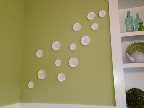 From the fourth house: it's good to break away from rigid framed photos and art to choose a wall piece that has movement and dimension. 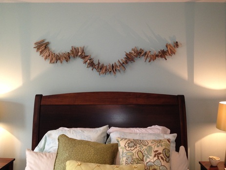 Does this remind you of something? This driftwood installation, another example of fluidity and depth, reminds me of the design detail I shared in last week's post about Carrier and Company's Florida project.  The parade always showcases some pretty impressive bathrooms and this year was no exception. I particularly liked this color palette in this master bath. 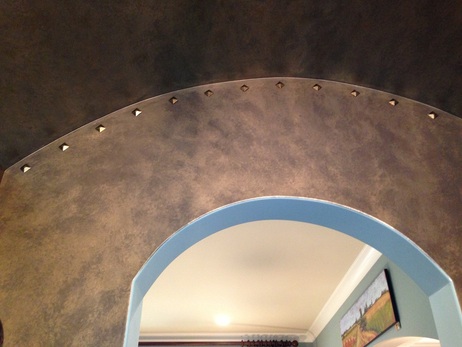 One of the bolder choices: In the fifth house, a very dark entryway with pyramid studded detail. I'm not sure if it was fashion inspired or where the idea came from but I'd be curious to know. The entryway did feel a little too dark to be welcoming, and didn't quite set the tone for the house since I didn't find the rest of the house to share this mood. In fact it had some very light (literally) and playful elements: 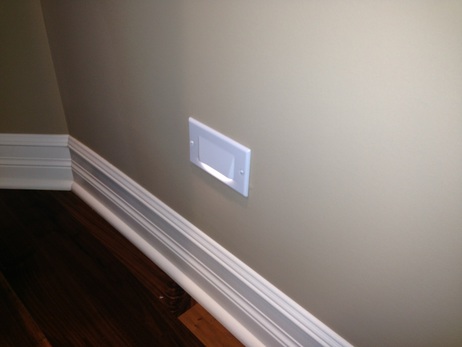 This might be hard to retrofit into an existing house, as far as electrical work goes, but we all really liked these nightlight panels that were placed every few feet on both sides of the upstairs hallway. A great idea to light your way, especially to help children and guests find the bathroom at night.
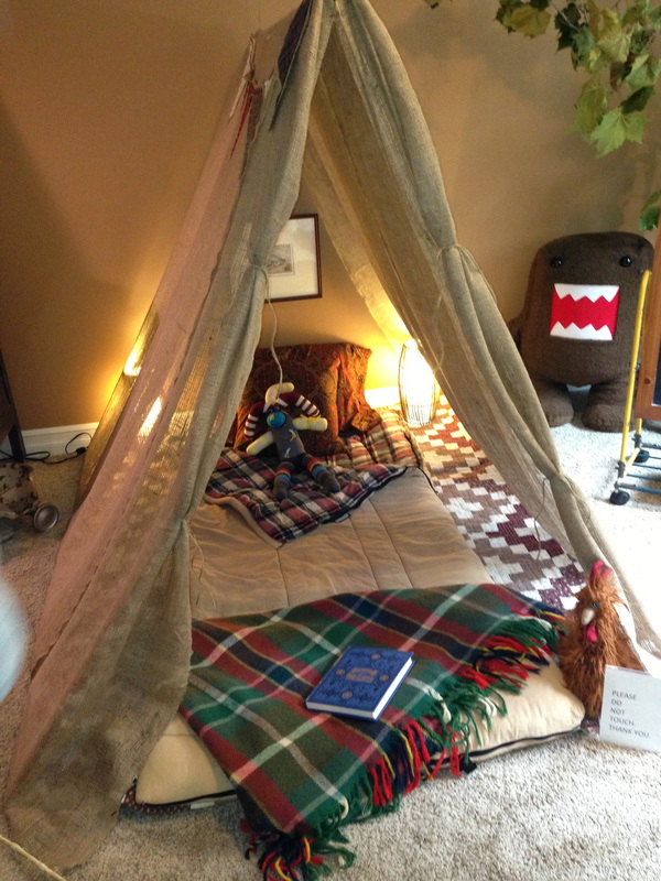
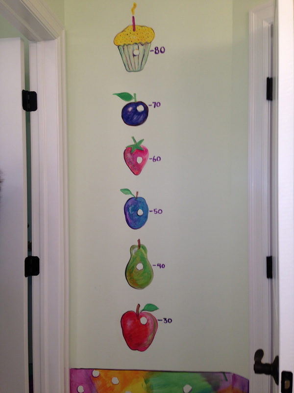
Some really cute ideas for kids' spaces: A camp-themed room with a burlap tent-covered floor mat for a bed would be great for a toddler or young child. The children's bath was The Very Hungry Caterpillar-themed with various hand-painted details, but the fruit-and-cupcake growth chart behind the door was my favorite. 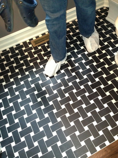 All the houses utilized a wide range of tile flooring; I liked this basketweave pattern. 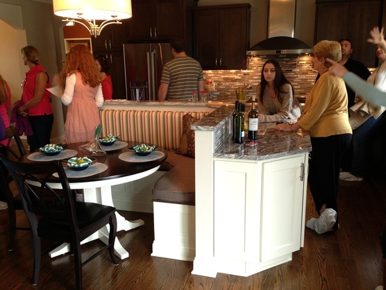 In the seventh house—I'm sure it's been done before but it was a refreshing change to see a built in-banquette with table and chairs at the counter, instead of a breakfast bar with clunky bar stools. The table and seating effectively became the center of attention. I've seen banquettes of course, but this may be the first or only second time I've seen one in the middle of the room as opposed to against a wall or window. You can also see they used two different colors of cabinetry here (above). The white cabinets were around the gourmet island and banquette, and the rest of the kitchen featured darker wood cabinets with what seemed like a gray wash. It was interesting, but it didn't feel jarring. 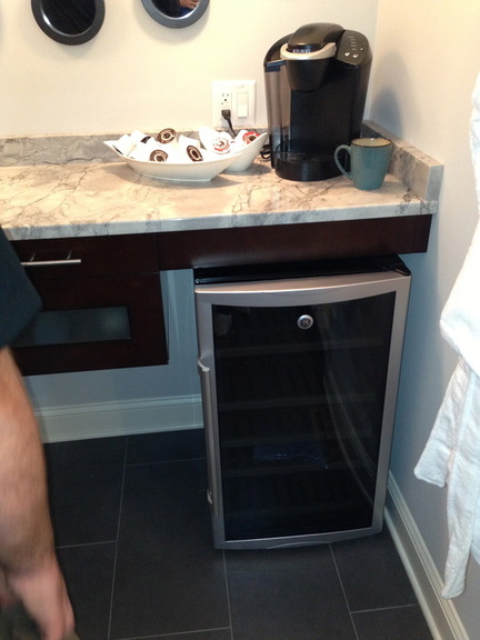 This master bath was extremely luxurious and included a modern freestanding soaking tub. The bathroom also had a wet bar with Keurig for coffee, a wine fridge, and a small sink, separate from the vanity sinks. If you have the space in your room/bathroom/walk-in closet, it's practical to have your coffee at hand when getting ready in the morning, and it would be quite an indulgence to have your wine nearby for a relaxing bath. 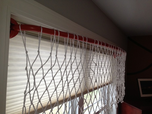 On the opposite side of the second floor were two sports-themed kids' room with an adjoining bathroom in between. This idea may actually be my favorite because I think it's extremely clever and so easy. The designer took a curved shower curtain rod, painted it orange, and hung a net for a basketball hoop valance. The bathroom had black and white vertical stripes which are really common, but here were reminiscent of a referee jersey and so they were both trendy and supportive of the theme.
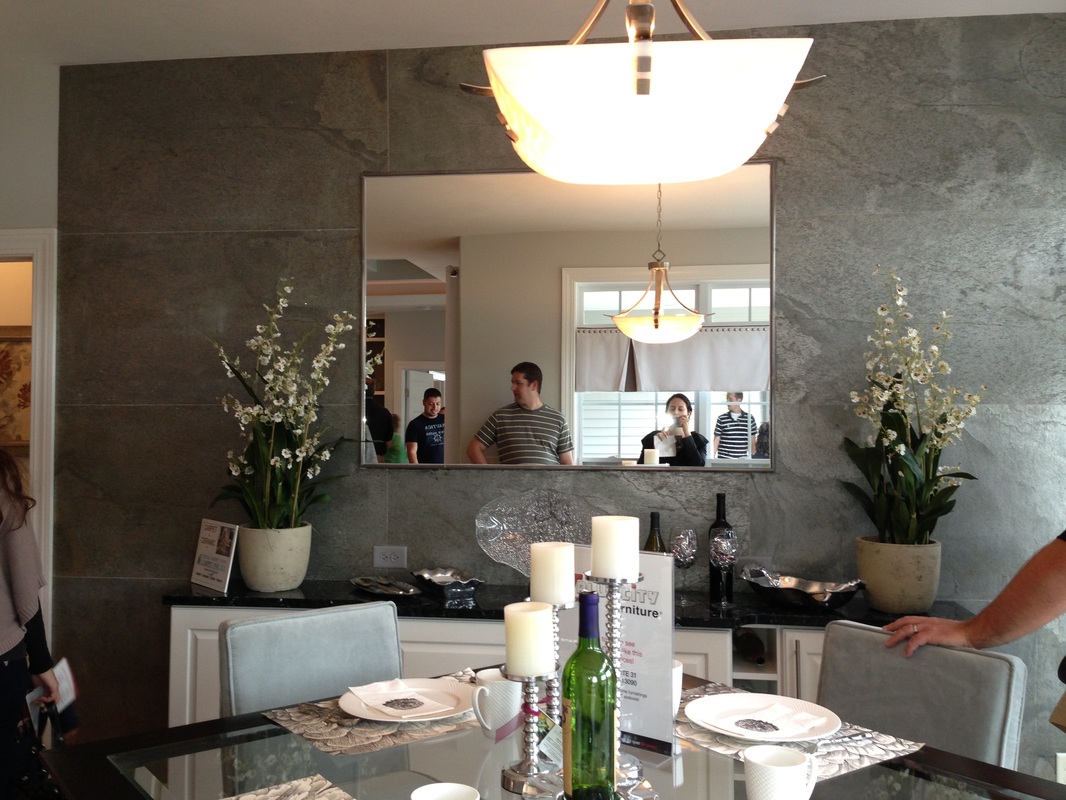
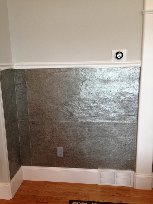
In the final house, which I think was my favorite overall, large metallic slate tiles were installed on several walls. My husband liked that several of the houses, including this one, had Nest smart thermostats (seen above right), which are his new-ish tech obsession.  I have a personal thing against grout, so I loved these tight-fitting porcelain tiles with no visible grout that brought movement and the texture to the kitchen. Additionally, several of the houses had the laundry on the second floor; this seems to finally be catching on. I had this in my old house and I don't want to ever go back. We're renting a ranch right now, so it's sort of the same idea, but I can't imagine lugging laundry up and down stairs. I know everyone does it, but why?
A couple space-saving ideas: In house two's master suite, the designer featured a useful take on jewelry storage. A wall-mounted and a free-standing unit both had a near-full length mirror that slid to the side to reveal the jewelry. In the modern house, although I didn't fully love the execution, I did like the idea of utilizing a very wide hallway to double as workspaces for kids. Against one wall there were high counters with storage cabinets underneath. If you're in the Syracuse area, the parade goes until the 22nd in Lafayette. What is the best idea you've seen at a show house—or someone else's house—and implemented in your own? first image via syracuse.com, all other images my own Xx a
0 Comments
Your comment will be posted after it is approved.
Leave a Reply. |
#checkout this blog with shop-themed puns
archives
August 2014
categories
All
© 2014 | mrkt
|
 RSS Feed