|
This seemed like a very long week to me (though I'm thrilled to report the baby slept through the night again, so I'm not as tired as yesterday). On Sunday we'll be attending the local Parade of Homes, which is like a showhouse tour to promote area builders. Local interior designers, stagers, and sometimes the builders themselves decorate the houses, so I'll be looking for new ideas and inspiration. I'm looking forward to it, as I do every year, but more so this year because there is finally (finally!) going to be a contemporary style model, as in one that is not Colonial or Craftsman. I'm hoping to see enough good design to be able to write about it for Monday. But first, some under $50 fun! Nothing spooky for Friday the 13th. I'll wait for Halloween, my favorite holiday of all. 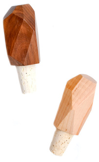 Faceted Wood bottle stoppers How pretty are these delicate wood bottle stoppers ($22 each) from Leif? 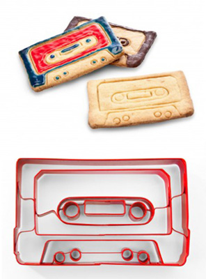 Cassette Tape cookie cutter 80s kids and mix tape lovers, this cookie cutter ($16) from Annie's Blue Ribbon General Store has you covered. Now you just have to decide what angsty name to frost on each cookie. 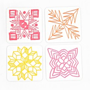 Mixed Square coaster set A bright set of letterpress coasters by Thimblepress ($8 for set of 5; green pattern not pictured) from Brika. The set is usually $10, but is currently discounted because it just launched on the site. 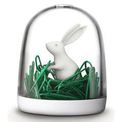 Paperclip Holder - bunny Adorable paperclip holder ($14.75) from Maxiga. I love how it looks like he's in tall grass! They also have a deer, polar bear, and swan. (paperclips not included) 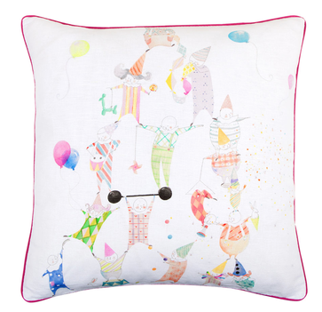 Kids Pyramid pillow Balloons and so-cute clowns and circus folk adorn this kids' pillow ($42.80 with cushion filler) from Zara Home. Missed last week's under $50 picks? Click each image for details.
0 Comments
 Italian designer Paola Navone's highly-anticipated collection for Crate and Barrel debuted in select stores and online today; the line will roll out to all stores by the end of the week. It is the first of three planned collections and includes nearly 150 pieces of tabletop, furniture, textiles, lighting, and decorative accents. Paola Navone is a renowned talent with her hand in architecture, interior design, product design, and set design.
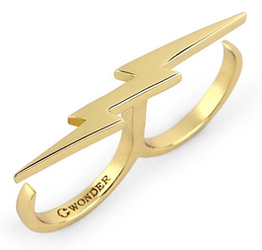
Organic shapes and a mix of materials all evoke the Mediterranean inspiration that threads itself through much of the well-traveled designer's work.  Lightning Bolt Double Knuckle Ring 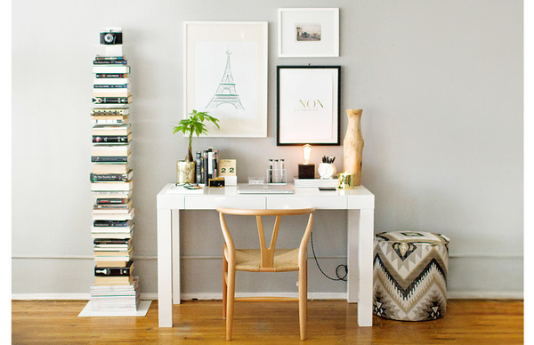
still not my place
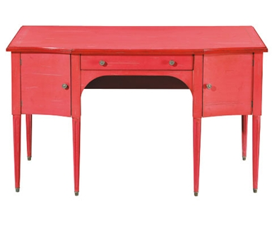
Better late than never. I've been busy this week on deadline, and then we went out to dinner with my father-in-law, who has been in town for a few days. We haven't seen him in a year and he just finally got to meet the baby, who turned 10 months today. When I bought my desk--the ubiquitous white lacquer Parsons desk from West Elm--it wasn't quite as, well, ubiquitous, as it is today. I still adore it, but sometimes I wish I had something off-beat, a little different from everyone else. The nice thing about the Parsons is that it's a great blank canvas; there are so many ways it can be styled. I am still trying to decide if I want to do brights or neutrals. Above, from The Everygirl, is a lovely neutral approach. I could easily go in this direction, and not simply because I also have the Sapien bookcase that is to the left of the desk. Maybe someday I'll go with a different style. I also love the idea of a big table as a desk. 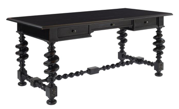
Thalia Writing Desk by Century Furniture
I think I would pair the Thalia with a few modern elements to keep it from feeling too serious. Love the ornate legs and support strut, it definitely catches the eye. 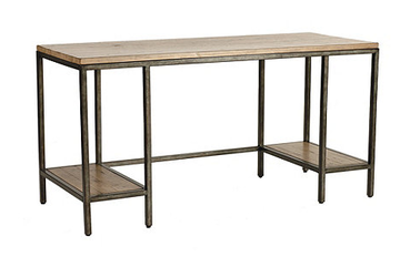
Durham Desk by Ballard Designs
The Durham has a more industrial look, with a mix of wood and aged steel. I have a Mac, but if you were someone who had a tower for your computer, it would fit nicely on one of the lower shelves so it could be kept off the floor and out of the way. 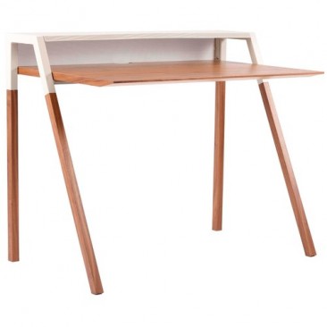
Cant Desk by Blu Dot
The cool slim silhouette of the Cant is warmed by the walnut and grey finish. This would be great for someone with a small space, or who works on a laptop so they can utilize the upper shelf for storage and decorative objects. My monitor would obscure the whole thing.
Grange's traditional, feminine Ermitage has been a favorite of mine for a few years. The piece is available in 20 paint colors and 3 distress levels. I'm not really into distressing personally, so I would choose the least distressed finish, called classique. All of their colors are great, but I always find myself drawn to the purples, so I'd pick prune for the desk. Although, this fall, Grange is debuting seven new color finishes, so I could change my mind.
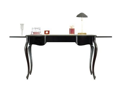
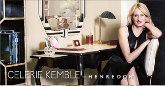
Super-talented and super down-to-earth designer Celerie Kemble designed a collection for Henredon, which includes this desk, the One Forty Five. This desk is so luxe, made of Philippine mahogany with a creme leather inlay on the main surface and two pull-out shelves. The cabriole legs add to the effect; it's a really beautiful piece. You can see the leather better in the image with Celerie. Also, that black and white mirror behind the desk is amazing! interior image via The Everygirl
desk images via Century Furniture, Ballard Designs, Blu Dot, Grange, Henredon Xx a 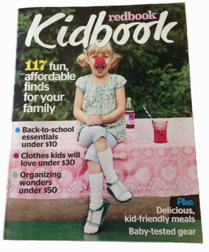
During late spring/early summer, I worked on my first project with Redbook magazine, a supplement to their September issue called Kidbook. It came out a few weeks ago, but it had limited exposure because it only went to subscribers.
I did all the market work from Syracuse, which was a first for me; but it worked out really well, thanks to my amazing pr contacts/friends and the editor who worked with me. I produced two stories: One piece was about organizing kid clutter and the other was a cute bath decor story. I think both stories have a lot of really fun, useful products, and I'm excited to share them with you! 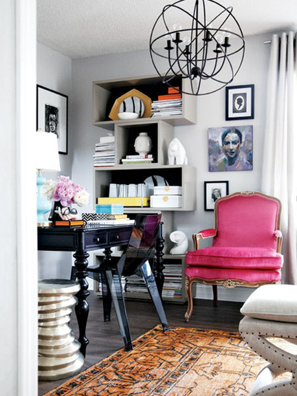 not my place Now that I work out of my house full-time, and most of the house is chock full of kids' goodies, I have to be very conscious of my workspace and try to stay as organized as possible. My space is part of the living room and there are shelves, but they're not yet dedicated solely to my work. I purchased a couple new magazine files (Nate Berkus for Target, not available online) but, it never seems like I have enough, between the magazines I keep for my portfolio and the ones I read for work/pleasure. Unfortunately, there are never as many of one style as I need at the store when I'm shopping, so my mag file boxes are a bit mismatched.  Assorted Dots by See Jane Work for Office Depot I've liked these from Office Depot for a while now, I've been really feeling the little polka dots lately, especially in black & white, which I know is big right now (when isn't it?).
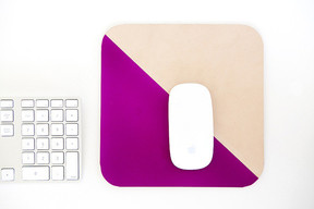
I happen to have a memo mousepad from Galison, not this design though. I started with two and I've somehow made them last for a long time, even though I do rely on their convenience quite often. If you need to jot something down quickly, like a phone number or a time and place, it's right there. When you run out of sheets, a soft foam mousepad remains. If I didn't write on my mousepad, I would upgrade to a beautiful handmade leather mousepad from Susan at Freshly Picked. 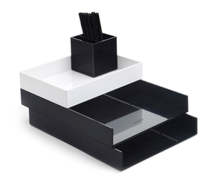 Black Desktop set by Poppin Poppin's desktop set is great for separating notes, research, and business receipts. The accessory tray could hold the recorder I use for in-person interviews and my washi tape. 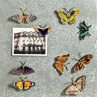 Set of 9 Handpainted Butterfly Magnets by Ballard Designs I just bought a white board calendar with a magnetic surface, but it only came with two magnets. I really like the colors and detailing on these hand-painted butterfly magnets from Ballard Designs. Ballard often has great magnets and pushpins, so even though they're not really an office store, they're always a great place to check for accessories like that.
Because it sometimes feels like all the cardboard storage boxes are the same, I like these tromp l'oeil containers carried by ModCloth. They fold flat when they're not in use, and of course, hide papers, product samples, and, sure, even toys when they are in use. interior image via gold and gray
images via office depot, galison, freshly picked/Heather Mildenstein, poppin, ballard designs, modcloth Xx a At least we can take comfort in the fact that there is one more week of (official) summer. But if summer must end, why not take advantage and save up on seasonal finds from some favorite shops. See each site for end dates and details.    West Elm 15% off upholstered seating 15% off mirrors & shelving 20% off laundry & cleaning essentials extra 30% off rug markdowns   
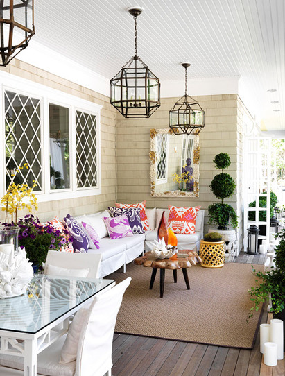
I love this open porch off the kitchen of one of Traditional Home's Hampton Designer Showhouses. I admit, it's from a few years ago, but it certainly doesn't seem dated in any way. The feel of this outdoor room epitomizes my idea of the perfect place to start a summer day.
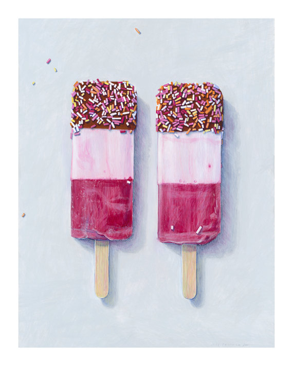
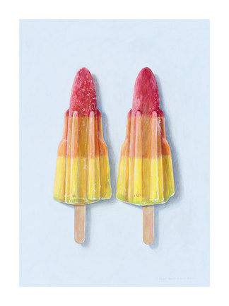
Interior designer Nancy Pearson mixed materials, styles, and colors in a way that makes the space feel so breezy and light, but thankfully, not in the traditional beach house color scheme—which is often executed well, but is predictable, and doesn't interest me as much as this. Low-slung seating topped with bright patterned pillows create a comfortable space to catch up on a good book, or just to have morning coffee (juice, in my case) and read the paper. Or, again in my case, scroll through Twitter and news sites online (sorry!). The antiqued zinc finish on the hanging lanterns is a nice departure from the polished nickel usually seen. A natural-edge cocktail table, flowers, and topiary add natural elements, while the shell-and-antique fragment mirror gives a nod to the house’s setting. The yellow garden stool references the lattice windows, and the lovely dark floor is an unexpected detail. I also really appreciate that while there are shells present, we’re not being beaten over the head with a shell/nautical theme. Because of the bright palette, the fish-patterned magenta pillow coordinates well with the silk ikat pillows. The whole space feels so relaxed and refreshing, like its very own getaway. image via Traditional Home Xx a 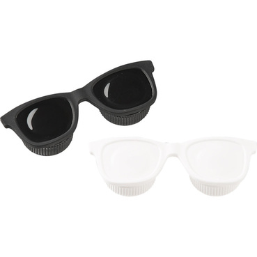 This lovely little product is exactly the kind of thing I'm talking about when I say I want even my utilitarian items to be interesting. Funny, functional, and adorable, the u-lens contact case from CB2 does the job with style. I've been wearing contacts since 8th grade, so I always need a case or two handy for traveling, or if my eyes get tired and I have to switch to glasses. This baby is under $5 and has the added bonus of getting Corey Hart's classic "Sunglasses at Night" stuck in my head. And now, yours, too. You're welcome.  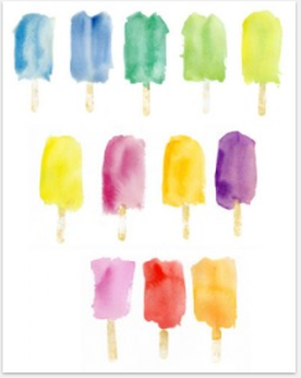 print of an original watercolor by Madeline Longstreet I know I mentioned nostalgia when talking about the bicycle bells in my first post, but maybe even more universal for triggering memories is the ice cream truck. “Do Your Ears Hang Low” is forever linked with popsicles of ice cream molded into the likenesses of cartoon characters’ heads complete with gumball eyes (especially the Teenage Mutant Ninja Turtles). And last spring, before I moved from New York to Syracuse, my friends (my Real Simple home department co-workers) and I went on an afternoon hunt for Mr. Softee—no substitute would do—but he had moved on to another block and we wandered from 50th St. to 49th and back up 6th Ave, only to return to the office empty-handed. At the first Kips Bay showhouse I attended, in 2010, the dining room decorated by interior designers Cullman and Kravis, had a 21" sculpture of a blue ice cream pop on the mantle. The next year, when I did an edit test for a job I was interviewing for, I pitched a DIY version of the sculpture as a craft idea. Probably the one and only time I've had a good idea for a craft project that wasn't an invitation to a party or some sort of decoration for a party. I'm not so DIY. 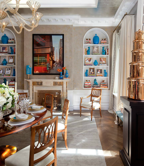 popsicle sculpture on left side of mantle, artist unknown So I’ve had popsicle art on the brain for a while. Then last year at the gift show, I saw this print in Longstreet Collection’s booth:
So I took a little look around and found some other really great popsicle pieces:
These are limited edition giclée prints (above), available in two sizes from UK artist Joël Penkman.  "Ice Cream III"  "Popsicle Rainbow" 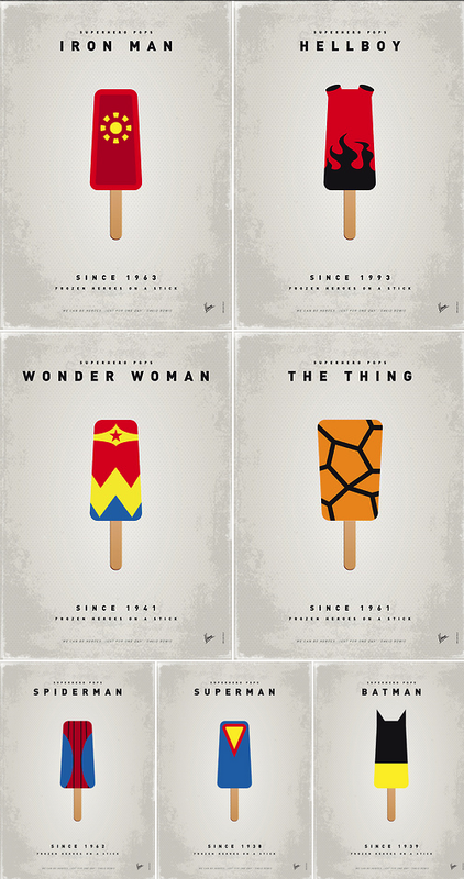 "Superhero Ice Pops" And to take it in another direction: Dutch artist Vincent Vermeij (aka Chungkong) reinterprets superheroes in the series "My SUPERHERO ICE POPS UNIVERSE," available through society6. Thanks to geeksugar, where I first saw these. Okay, who's hungry? art images via Longstreet Collection, Joel Penkman, Society6, imagekind, chungkong.nl interiors image via Cullman & Kravis Xx a |
#checkout this blog with shop-themed puns
archives
August 2014
categories
All
© 2014 | mrkt
|

 RSS Feed