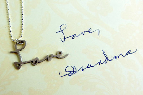
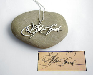
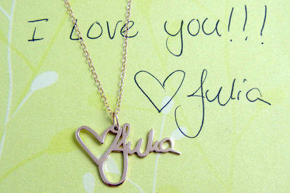
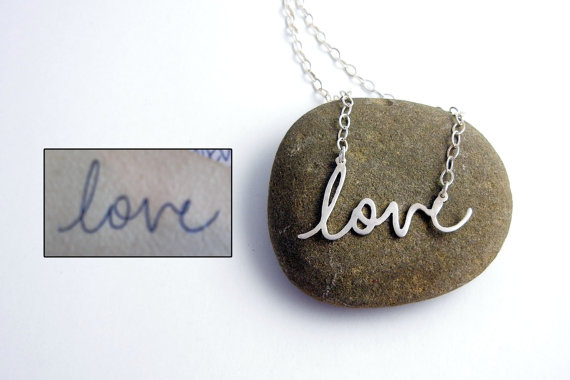
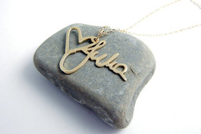
I've always had a bit of a fascination with handwriting. Of course, there are the analyses of the slant and what certain loops and strokes say about your personality. And somehow there are always girls that have that same (it seems) super feminine, rounded, bubbly lettering. My writing, which admittedly has become much less lovely due to all the typing I do, is a full mix of print and cursive. Also, how can they stop teaching cursive in schools?! But, I digress. Really, handwriting is pretty unique and often seeing an old card or letter written in someone's hand can bring back memories or powerful feelings. That connection is the impetus behind the custom handwriting necklaces by BrittanyLeighJewelry on Etsy. Jewelry designer Brittany Isenberg started fabricating these pieces after creating one as a meaningful gift for her mother following the death of her grandmother. The 14k gold version is available in polished yellow or white gold, or you can select polished or matte sterling silver (shown above); bracelets and keychains are also options. At the end of the year and during the holidays people naturally spend a lot of time thinking about loved ones. This is a simple, pretty way of keeping someone you love close, whether that person is truly gone or just lives far away.
0 Comments
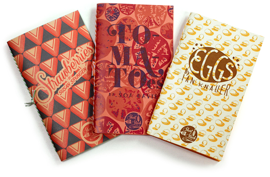
There seems to be an inherited Bleier family trait for finding something we love and then obsessing over it ad nauseam, whether it’s a TV show, a song, or some other thing we have to continually consume—at least until the next shiny object catches our attention. I think the Short Stack cookbooks might be the foodie version of this feeling. Each edition is passionately dedicated to a specific food; they celebrate the simplicity and complexity of one specific ingredient and every recipe within incorporates that item. The diminutive size and retro graphic covers give the hand-bound (with baker's twine!) volumes a special feel, and I love the idea of having an arsenal of recipes, from drinks to desserts, featuring a favorite ingredient. The recipes come from established chefs and food experts and the collection is published by Nick Fauchald who raised money for this project through Kickstarter. 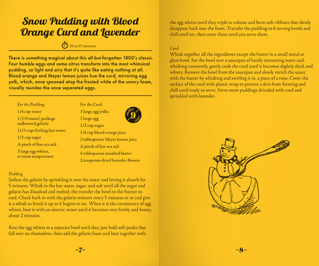
recipes have been thoroughly tested and are accompanied by adorable illustrations
Some of the delicious-sounding recipes included are: Egg Drop Soup with Edamame, Red Chile, and Scallions, Portuguese Egg Tarts with Burnt Marshmallow Frosting, Curried Tomato-Lamb Stew, Tomato Tart Tatin with Caramel, Roasted Strawberry Frozen Yogurt, and Strawberry Sangria. The cookbooks are sold individually or in sets. Eggs, Tomatoes, and Strawberries are already available, and Buttermilk, Grits, and Sweet Potatoes will be out any day but can be ordered in advance. 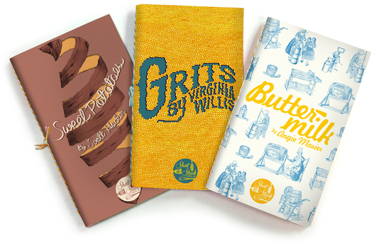
coming soon
Short Stack cookbooks, $12 each, $35 for three, or $70 for six, shortstackeditions.com
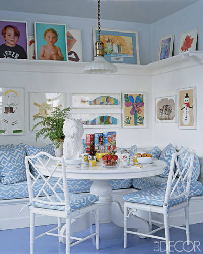
When piles of projects come home from school, it can be a little overwhelming to figure out what to do with them. Save? Toss? Display? Aerin Lauder, of Estée Lauder and Aerin, has a beautiful and simple solution to display the art and really enjoy it every day. This shot from an old Elle Decor story shows how Lauder wonderfully incorporated her children and their creative masterpieces in this cozy kitchen nook at her East Hampton house. I'm kind of dying to jump into this picture to have juice and a parfait at that banquette. I like that the art and her children's super adorable portraits, offset by pale blue walls above the shelf, are mixed with a Jeff Koons vase. Even though the vase is high end, its shaggy puppy shape is fun and feels right in this room. Don't be afraid to have adult and kid things in the same space. As someone currently living in a house where four generations of my family have now lived, I'm a fan of how Lauder carried on (but updated) the house's blue-and-white palette—honoring her grandmother Estée, whose house and favorite color combo these were. Speaking of this house and kids, our double-header birthday parties for the girls are tomorrow so we're off to pick up supplies, treats, clean the house, and decorate. It should be a lot of fun and we're looking forward to it. Hope everyone has a great weekend! 
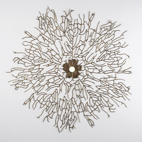
Not too long ago, I would have eschewed ceiling medallions, but now I think they're quite a nice accent in the right environment. I don't think there are too many innovations in this area, save a few stencils or DIY takes, but I've never seen another ceiling medallion like this. Lindsey Adelman, of her eponymous studio known best for its light fixtures, designed the Marina Ceiling Medallion. Available in three sizes, the large (above, seen from a worm's eye view) is certainly the most striking and if you want it, well, it's what I like to call a major investment piece. But it is over four feet in diameter (52 in) of solid brass. While it appears most retailers are only offering the brass versions, Adelman's own site mentions that less expensive options in polymer with custom color-matched finishes are available. Each size is the foundation for the next size up, with the solid small beginning to show a hint of the branches creeping out organically. I think these look best with an attractive bare bulb, but they can be outfitted with a shade as Adelman displayed at the International Contemporary Furniture Fair. And, as you'll see in my picture below (which I didn't realize I had until after I started this post) the pieces can be wall-mounted and look just as dramatic as on the ceiling. 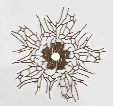
medium - 26 in
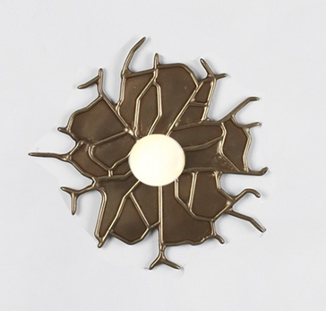
small - 8 in
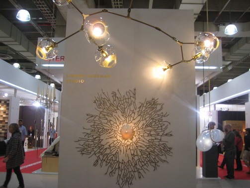
wall mounted with a shade at ICFF
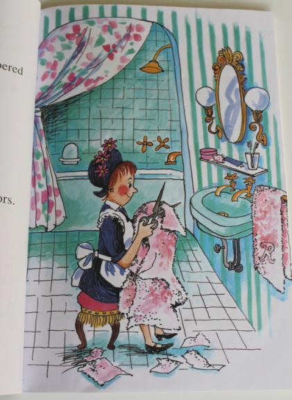 As a result of my work, I find myself noticing interiors in atypical places such as my daughters' books. Every time I read Goodnight Moon, I wonder if the color scheme of that bedroom would translate well in reality. I think this bathroom, from the original Amelia Bedelia book, still looks fresh, though I would skip the green tile and sink in favor of white versions.
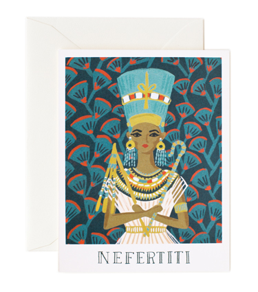
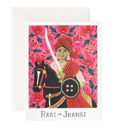
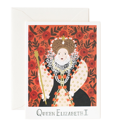
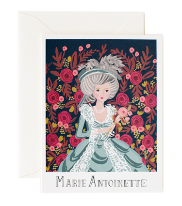
The mixed patterns of stripe and floral are a classic combination and the room could go traditional or modern depending on the patterns, fixtures, and accessories chosen. I couldn't help but take a look for ways to bring this room to life (after the jump). I can't decide if I would keep the sink and shower fixtures gold/brass; what do you think? 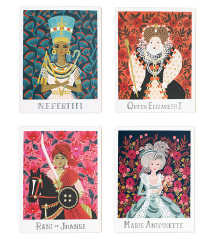 Today is my older daughter's fourth birthday and I don't think it has fully sunk in yet. I still have a bunch to do before her party this weekend. Actually, two parties: My baby turned one exactly a week ago and we're ambitiously trying to have both birthday parties in the same day—one right after the other—since there is so much guest overlap. We've shortened the parties to two hours instead of our usual three and will have a half-hour "intermission" in between where we'll switch the decor from sunshine and rainbows (for our one year old, because she's our Sunshine) to pink princess (four year old). Cupcake is fully enamored with all things princess, though thankfully, she still likes trains, building towers, coloring, and is getting into the idea of sports. But design-wise it's queens, rather than princesses, who seem to have the better style reputation. Case in point: these gorgeous illustrated cards from Rifle Paper Co. Four iconic queens get the royal treatment, each with her own coordinating floral background drawn in Anna Bond's signature whimsical style. I love the saturated colors, the details on all of the dresses, and how regal each woman looks, even though Bond's drawing style is so sweet. I think I would choose Nefertiti for myself, how about you?
The cards are available as boxed sets of 8, single cards, or as an assorted set of 8 (2 of each design).
images via rifle paper co. Xx a 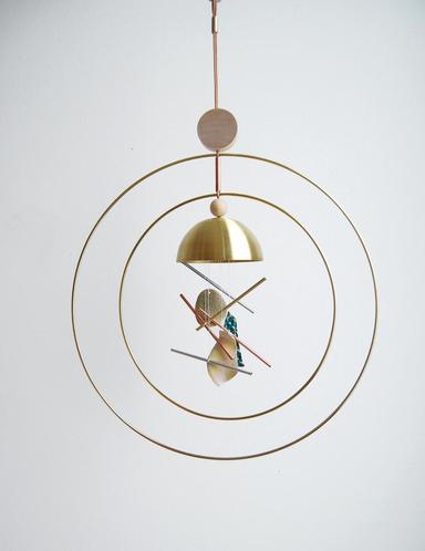
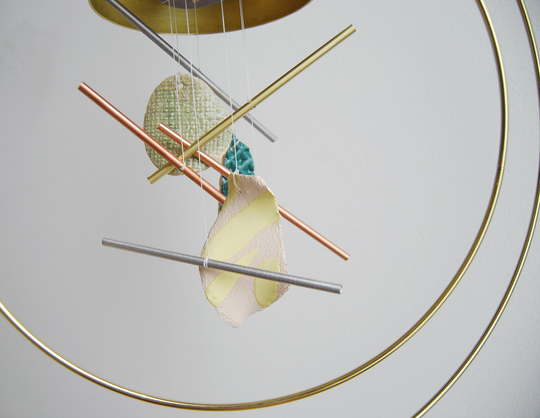
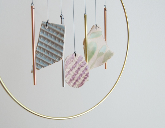
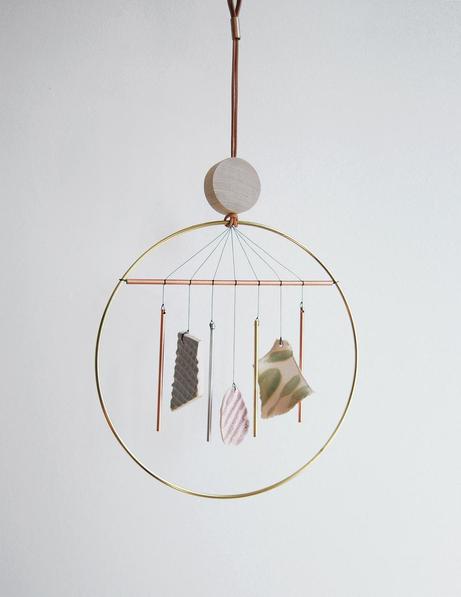
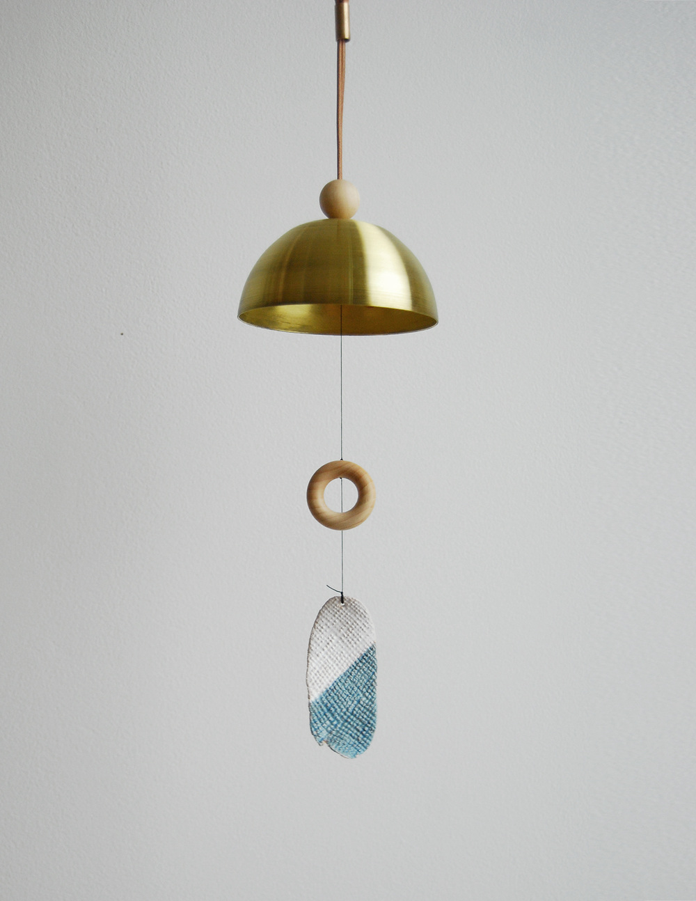
A change of month and a change in the wind have all but assured me that—though Friday was actually quite beautiful and warm—I will probably not see too many more above-50˚F days. This past weekend's frigid temps and this morning's frost remind me of a bit of a verse from "April Come She Will," by Simon & Garfunkel: "The autumn winds blow chilly and cold." Perhaps these winds have led me to the Aura Chimes at Ladies & Gentlemen Studio. The wind chimes feature a mix of materials: brass bells, wooden shapes, leather, and metal tubes all fabricated by Ladies & Gentlemen and paired with unique ceramic pieces crafted by Nicholas Nyland, a Seattle-based artist. Each wind chime is handmade so no two will be exactly alike. The chimes are for use indoors or outdoors under cover and there are three versions, but the single ring style comes in two sizes. They are striking little works of art, even when they're not tinkling with faint metallic vibrations.

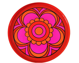
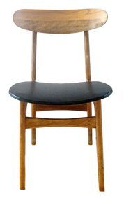
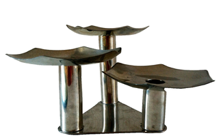
This weekend You & Yours Fine Vintage store in Williamsburg, Brooklyn celebrates its grand opening. Owner Allegra Muzzillo grew up around antiques, learning to scout and training her eye at the side of her dealer/collector mother. She's most drawn to mid-century pieces, which you'll notice by her inventory featuring furniture, decorative accessories, and tabletop predominantly from the 1950s-1970s. Allegra started out selling at the Brooklyn Flea in 2011, which she continues to maintain (booth B30), but will now expand with her brick-and-mortar shop. Her favorite personal scores have been vintage Nambê bowls and platters and a pair of decrepit (now happily rehabbed) Saarinen Armless Executive chairs she found on the street in front of an old grammar school. "I see mid-century pieces as truly timeless and I think they can mix with absolutely anything. The furniture is so simple and clean looking, but built to last, and for tabletop, it's the pieces' cheekiness, sense of fun, and use of color that I love." Allegra says. So it's no surprise that at her shop you'll find a Pucci-esque tray, a sculptural geometric candelabra, or 1920s/30s mini planter shaped like an elephant, mixed in among mirrors, lighting, and mid-century furniture.
As a freelance journalist who built her career writing and editing at shelter magazines (we worked together at Real Simple), Allegra has made You & Yours editor-friendly. The shop also caters to designers and stylists who will enjoy a 15% industry discount. But her completely affordable pieces will make everyone—especially small-space dwellers—happy.
Art and furniture are available for in-store pickup only at this time and the website features a small selection, so be sure to stop in and see what other treasures Allegra has uncovered: You & Yours Fine Vintage 240 Kent Avenue, unit #9 Brooklyn, NY 11249 917-482-4071 Open Wednesday through Sunday, 1p-7p and by appointment 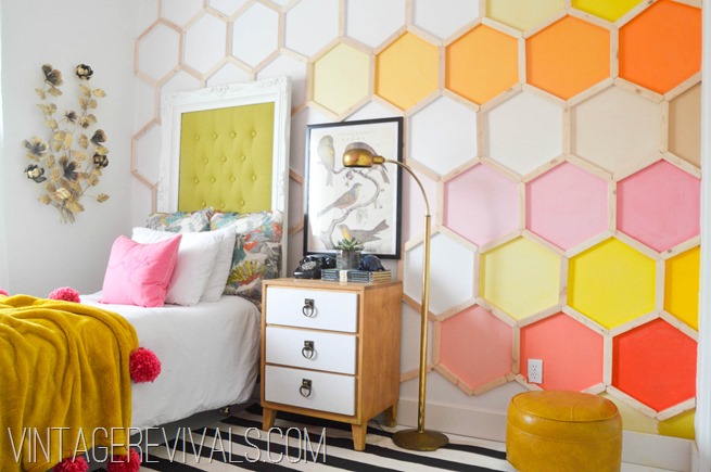 In middle school and high school, I realized that though I was weird, quirky, creative, and some of my closest friends were art kids, I was not an art kid. There was some overlap, and I tried to take more art classes in college, when I could fit them in. But as much as I love visual arts, images, and design, I am better with words.
Similarly, as an adult, I am not an artist, stylist, or designer, but I work with them, write about them, and get to be partially immersed in that world. I'm trying to learn more from them. The creativity is always inspiring me to look at things differently and sparks my own ideas. When this image from Vintage Revivals (above) happened to pop up in my stream on Pinterest, I was very intrigued. 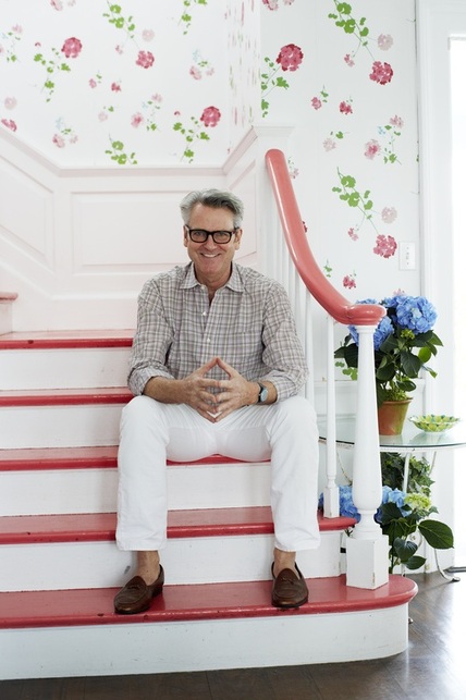 Hope you all had a splendid weekend! For the last week or so, I've been seeing this image pop up on Twitter and elsewhere, because this is New York-based interior designer Tom Scheerer, the subject of the recently-released book Tom Scheerer Decorates, by Mimi Read. I haven't yet had the pleasure of looking through the design book (it's on its way now), but this image struck me for a couple of reasons.
Film-star-spectacles aside, I love how bright and cheerful this stairway and hall are in his family's East Hampton, New York, beach house. If the stairs and handrail weren't lacquered in that coral color, I don't think I would have been as drawn to it as I am. I do like the geranium wallpaper on its own, but if the handrail had remained in a natural wood, I'm not sure I would have spent as much time absorbing the image.
With my reasonably mediocre Photoshop skills, I filled in the coral treads and handrail with black, so I could see what it might look like. It still looked lovely, but the space took on a more serious feel. I also tried a "wood tone;" in my hands it looked a little ridiculous, but it did reinforce how much I think the coral adds to the design, particularly in a beach house where its usually desired to keep things light and airy. Painting these areas in a poppy color that coordinates with the wallpaper elevates the room that much more. I also like that the coral doesn't seem to be an exact match to any color in the paper, but that it references the floral pattern and adds another dimension of interest. I think most stairways could benefit from this kind of treatment (especially including the wallpaper). There are definitely times when natural tones, black, or white, are the right way to go, but where architecturally-interesting railings and banisters are lacking—probably most average houses—a smart paint job is a great way to update and enliven the space. |
#checkout this blog with shop-themed puns
archives
August 2014
categories
All
© 2014 | mrkt
|

 RSS Feed