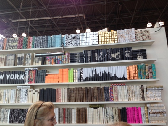
decorative books, including a set with the NY skyline
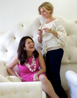
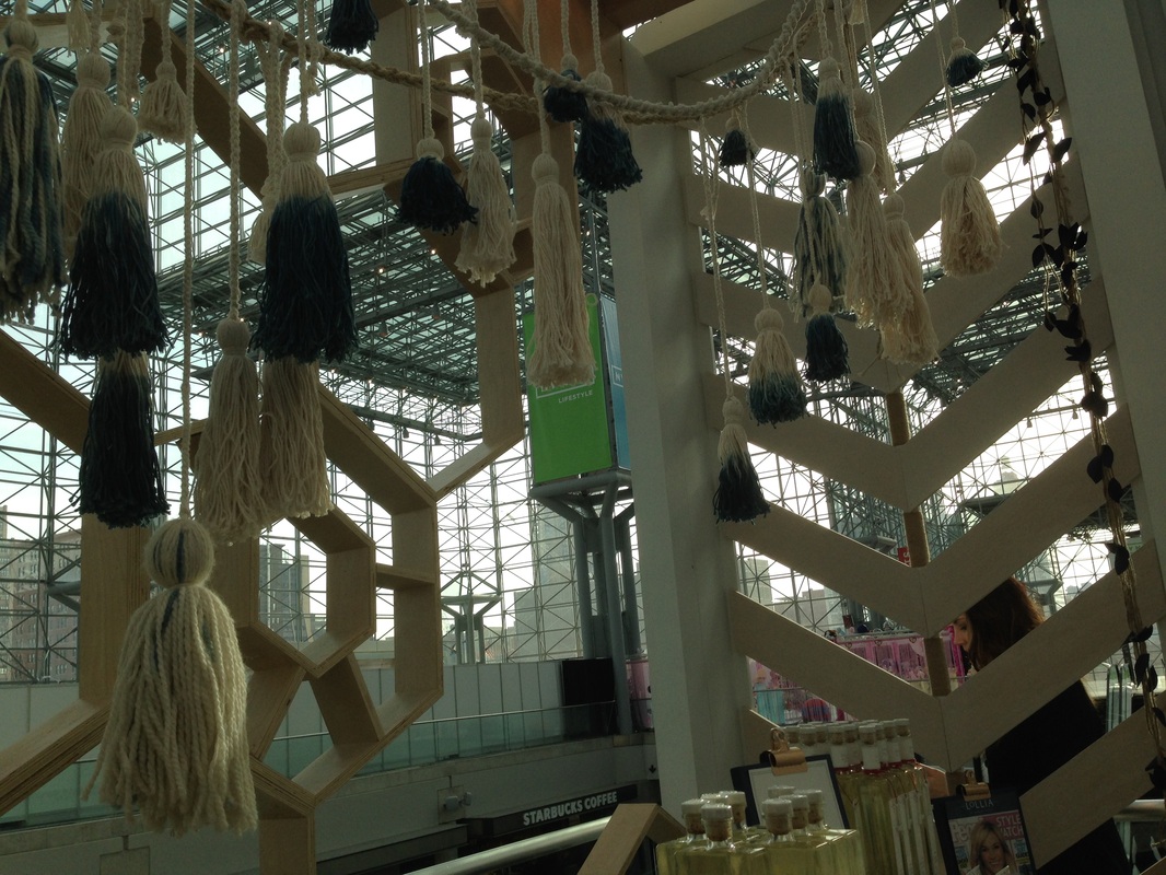
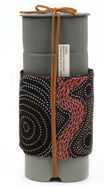
Hope everyone is staying warm and lifting with their knees when they shovel, it's crazy out there lately. I drove down to New York last Friday to attend NYNOW, formerly NYIGF, the gift show at the Javits Center. In two and a half days—and 2700+ pictures later—I walked every single aisle of the show and saw some great products. Mostly, I was really excited to be back in New York and to see a lot of the vendors I haven't seen in a while, since I missed the last three shows (not sure how that time flew so quickly). It was great to catch up with people and this was my first time experiencing the show since they changed the format and rebranded. I think it worked out well to have all the home companies under one roof, though as I walked the show, I realized there were several brands that I didn't see. I'm hoping they'll be there in August. At any rate, I'm looking forward to sharing the things that I saw over the next weeks and months. In addition to new and interesting products, the booths themselves are often styled creatively. Here are just a few fun things I noticed:
Xx a
0 Comments
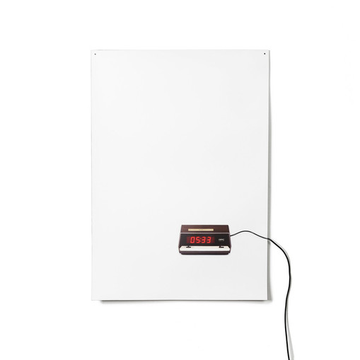
Since this is the time of year where people are pledging to get up earlier, go to bed earlier, or spend more time doing various noble pursuits, I was thinking about time itself and clocks. I came across the Flat Life clock, which is a few months old, and while it's probably more than I would spend for a wall clock, I really like the concept. A familiar retro-looking alarm clock image is printed on a very thin piece of plastic and by way of a power cord, the piece makes the transition from two-dimensional image to three-dimensional product that actually functions (though it doesn't have alarm settings). I love the humor, originality, and simplicity of this design and the way the cord trails off, bleeding out of the image and into real life. If you like it, too, you can also check out the Flat Life light by the same designer: 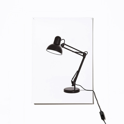
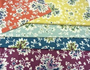
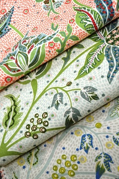
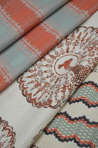
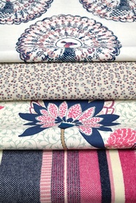
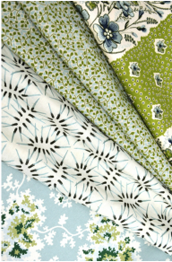
I know I've mentioned that one of the definite perks of my career has been getting to meet and work with creative and inspiring interior designers. I love seeing interiors where people take chances with patterns, colors, and mixing styles, because I think most average homeowners don't—but I'd love to be proven wrong! I'm pleased to say that all the designers I've worked with have been such a joy; I'm always so happy for them as they continue to be successful and especially when they branch out into new directions, such as product development. You might remember me mentioning Tilton Fenwick a few months ago, when they were part of a rug collaboration with Studio Four. Now, Anne Maxwell Foster and Suysel DePedro Cunningham have launched their first fabric collection, partnering with Duralee, who continues their tradition of working with fantastic designers producing exciting fabrics.
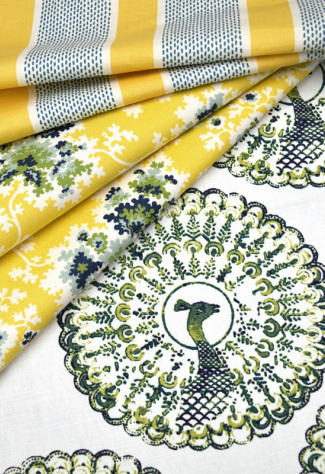
 It's exciting for any designer to be asked to develop a line of products, but I think it speaks volumes about their talent that Anne and Suysel were asked after having only been in business a few short years. The duo are known for their colorful and layered take on traditional. Since being featured as New Trad designers to watch by Traditional Home magazine (where I worked when I met them), they've also designed for showhouses and industry-favorite event Design on a Dime, in addition to their growing client roster. The fabric collection with Duralee is full of bright, happy, versatile designs that work well in a vibrant pattern-rich environment, yet many are restrained enough that they are perfect for someone who prefers a more subdued look. Take a look at these wonderfully rich colors and patterns available in a variety of scales. Stripes, florals, animal prints, and patterns inspired by recent travels work together to create a fresh perspective on traditional themes. The strong peacock pattern is actually Tilton Fenwick's company logo translated into a printed fabric. I can't wait to see some of these patterns on drapes and upholstered chairs and sofas.
If you're not familiar with them, here are a few examples of Tilton Fenwick's exuberant and gorgeous work:
images via duralee, tilton fenwick, and interior photos via michael rodenbush, darina todorova, trevor tondro for the new york times Xx a These grand room scenes are not renderings, drawings, or embossments. They are made from sheets of paper folded and creased carefully, over and over, by German artist Simon Schubert. Using a technique he developed, he creates these architectural images with great depth and impressive detail. I love the perspective of these pieces and the play of light and shadow. Apparently it takes around a week for him to complete each work; he must have so much patience and I can't imagine how many times I would have to start over to achieve this level of precision. You can see many more examples at his website. 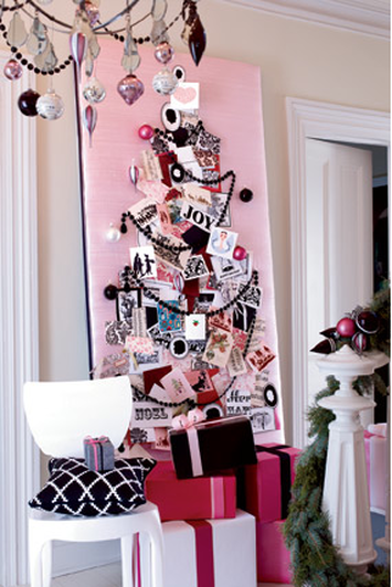
Now that we're just under a week away from Christmas (what?!), the holiday cards are starting to roll in. I'm grateful I got the bulk of mine out a few days ago, but I still have a few I want to send. I enjoy receiving holiday cards, seeing the pictures of everyone and hearing how people from our past and present are doing. I like to keep the cards out during the holidays so we can enjoy them and think of the people who thought of us, but sometimes it's hard to find a nice way to display them.
Of course, I've seen them placed along the mantel and I've seen them tied with string or ribbon and hung on a stairway bannister, or randomly pinned up everywhere, but I like something a little more put together. So, in a throwback of sorts--for Thursday, naturally--I wanted to share this idea I've always liked from David Stark. He, being the genius event planner/producer, put this together for O at Home magazine (may it rest in peace) back in 2007 when I worked there; though much to my dismay, I did not get to work on this story. Anyway, he took a piece of solid insulation material, which seems to be available for relatively cheap at the hardware store, and covered it in a beautiful pink dupioni silk. Then he pinned holiday cards to the board in the shape of a tree, adding ornaments, garland, and other fun elements creating something really special and festive. I love this and it's quite customizable because you can choose a fabric that coordinates with a certain room, or if your holiday decor has a specific theme or color scheme, you can match that, as David did here with the palette shown in this part of the story. Here, coordinating packages and ornaments on the bannister and chandelier also speak to the overall theme. I also love this scheme because it uses black, which most people don't think to use at Christmas, but I always endorse a little drama, contrast, and sophistication. My husband didn't understand when I bought black ornaments last year, but ha! If it's good enough for David Stark, it's good enough for me. You can copy the tree design or try a star or any other sort of pattern to hang the cards. And during the off-season, you could select a different fabric and display your children's art or other personal ephemera on it. Do you display your holiday cards in a special way? 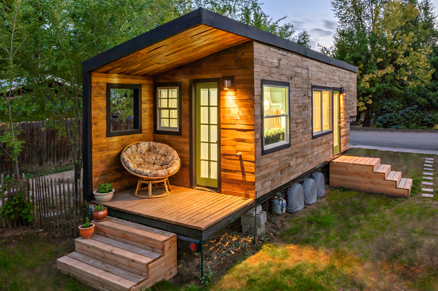
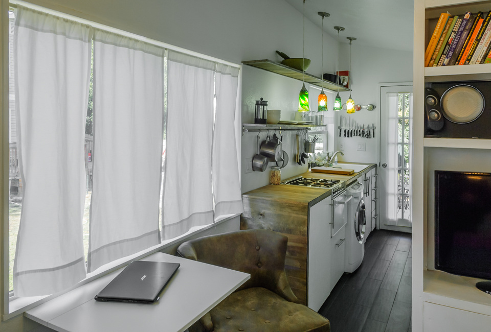
Yesterday I was going to share some beautiful ornaments I've come across over the last couple weeks, but then I got about one hour of sleep because I was up all night with a sick kiddo, so I readjusted my goals for the day. My designation of productivity was avoiding the stomach bug or whatever was at work that night. My daughter is better and as for me, so far so good. So, please look for the ornaments post tomorrow! I am, however, interested in sharing this extremely DIY project because I am in awe of this architect and her Tiny House (found via My Modern Metropolis). Architectural intern Macy Miller of Boise, Idaho, designed and built a house on a 24-foot flatbed trailer (didn't they have something like this on that one random episode of the NCIS: LA spinoff with the special team?). But in all seriousness, she lives in this small space--small being an understatement, as the entire living space is around 200 square feet. Miller had always dreamed of designing and building her own space, and living with only what she truly needed and jettisoning everything else. She also wanted to see if she could build her entire house for a year's worth of rent--about $10,000-$12,000--and teach herself about construction in the process. She was able to save enough money and pay for everything in cash, so she has no mortgage. She has been working on the house for two years, and though nearly complete, still has plans to do a bit more work. As I said, I'm in awe, mostly because I don't think I'm disciplined enough to be able to live in such a small space, though I absolutely would love to able to reduce the amount of stuff I have that isn't meaningful or useful. Maybe if I were single, but somehow I think I'm too sentimental to be able to pare it down to this level. And like anyone who has owned a house in the last several years, in particular, it would be nice to not be beholden to a mortgage payment! Check out her process and other really interesting images at her own blog. She explains the technical choices she made and the challenges she's faced. The house is really cute, modern, and minimal, as it would have to be, but it doesn't seem claustrophobic or too stark. 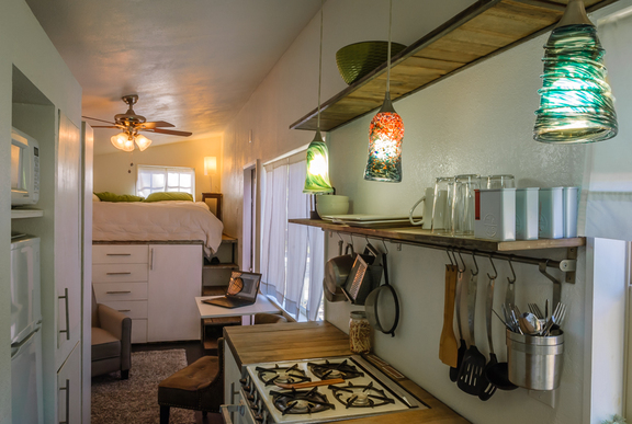
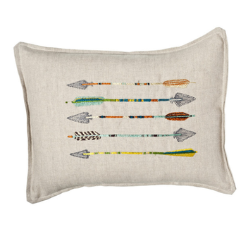 I hope everyone had a wonderful holiday weekend! We had a great time with immediate and extended family celebrating Thanksgiving (several times) and my birthday (also several times!), which was yesterday. I don't put a ton of stock in horoscopes, but I am a pretty true-to-form Sagittarius. I've always been interested in the imagery of the bow and arrow. When I was younger, I had a necklace with an arrow on it, and now I have a pierced brass cuff bracelet with the Sagittarius constellation. When I turned 30 a couple years ago, I stamped an arrow on the little favor bags full of silly things like candy and fake glasses with noses and mustaches attached. I've even used a modified arrow design for the back of my freelance business cards. I don't seem to be the only one interested in the graphic shape of the arrow, either. Check out these sharp finds: images via coral & tusk, ortolan organic, three potato four, haus interior, urban outfitters, 1st dibs, gretel, mid2mod, neiman marcus 1 & 2, net-a-porter, cavern, sucreshop 1 & 2, toodlesnoodles, spoonflower, john derian, house&hold Xx a I just returned from a little shopping trip with my mother-in-law. My birthday is Sunday and she took me to a couple stores so I could try on things; she usually chooses a few items to buy for my birthday and Christmas from the selection of what I try on and like, and today I noticed a significant pattern in what I was pulling. See? 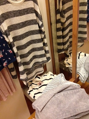 I love brights, but I was just drawn to the black and white and gray pieces. I tried on a few other things, but the fit wasn't right. Also there was a really (disturbingly) large amount of lamé pants and crop tops in one store in particular and I just can't go there. To be honest, I wasn't sure what I felt like posting about today. But when I logged into Pinterest, thanks to the incomparable David Stark, the answer was right in front of me. He must be feeling similarly inspired because he just posted a handful of black & white striped images. So, far be it from me to ignore the signs. Some lovely, classic inspiration to send us off into our holiday. Hope you all have a wonderful Thanksgiving and Happy Hanukkah! Xx a 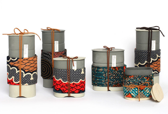
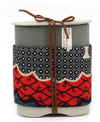
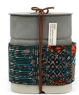
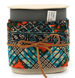
One of the shops I miss most in New York is Michele Varian. She has an incredible mix of product: There are always interesting, quirky and beautiful pieces for home (including pillows by Michele herself) and lovely jewelry; most of the products are made by independent artists. New in her shop are these stunning porcelain containers handmade in Brooklyn by Beetle & Flor. I love the simplicity of the shape paired with the colors and patterns of the African napkin wrapped around each container with a simple leather tie. Safe for food like pastas and rice, these cylindrical boxes would also be amazing containers for bathroom accoutrements like cotton balls and swabs, makeup brushes. I would actually love to get one of the smaller sizes to put on my desk to corral pens, scissors, etc. TONIGHT - trunk show from 6-9pm at Michele Varian, 27 Howard St. NYCTonight is the first Process Series Trunk Show at the shop featuring Beetle & Flor and other designers, brought to you by Michele Varian and Etsy. Michele has curated the trunk shows which feature products from emerging designers and will exhibit photos, tools, and moulds, providing insight into the artists' processes. The work shown will illustrate how each designer takes their inspiration from nature and interprets it differently. The trunk show opening tonight (with Prosecco!) will be up through Sunday.
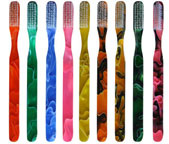
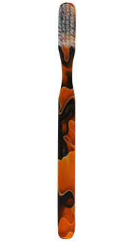
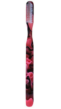
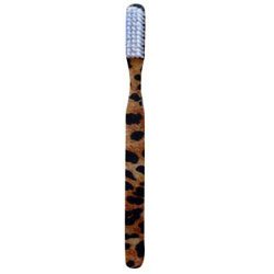
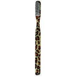
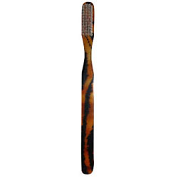
Today's regular dental checkup (cavity-free, hooray!) reminded me of a product I learned about a few months ago. I think we can all agree, toothbrushes aren't especially attractive. A few years back, one of the major toothbrush manufacturers had a designer line that was fairly cute and they had several write-ups in magazines, and probably online. That fizzled out but there are alternatives. I love these designer toothbrushes at AlmandersAlley. They're slightly more expensive than the regular type available at the drug store, but there are so many styles available, so you can find a design that matches your personality. The marble design above, and the animal print, below, are my two favorite styles.
I have a stash of toiletries on hand in my guest bathroom in case visiting friends and family ever forget something. It would be fun to have a handful of these available for those situations, and I like the idea of having something a little different that would make my guests smile.
There are also abstract, floral, plaid, striped, and tropical styles among others. images via almandersalley Xx a |
#checkout this blog with shop-themed puns
archives
August 2014
categories
All
© 2014 | mrkt
|
 RSS Feed