|
Life's been a little crazy lately and I feel the blog has gotten the short end of the stick for sure, so thanks for hanging in with me even though there've been a lot of days without posts. I decided to do another throwback-style post today and share something I worked on three years ago.
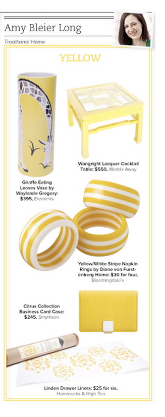
Trad Home, Traditional Home's digital magazine was still under wraps and being produced during the early months of 2011. There was a lot of industry buzz around the issue and it was a very exciting time. We were really trying to turn people's notion of "traditional" on its head. At the time, I was also producing my first major trend feature story completely on my own (plus a bunch of other stories) for the print mag, so I actually didn't have a lot to do with the digital version, but this was my contribution. Each editor had to select a color and source several products for the premier issue. The thing I like about this story—aside from the sorely-needed shot of sunshine it's providing—is that I would absolutely choose all of these products again. None of them seem dated; they're all as classic and relevant as they were three years ago. And not only would I choose them all again for the editorial, I would actually choose each of them in my own life. Sadly, DVF Home no longer exists. I really liked a lot of their tabletop and bedding pieces, so that's a shame. Another thing this does is illustrate that even if you're afraid of a lot of bold color, there are small-scale ways to bring in some brights in order to add interest without overwhelming yourself. I'm a bold color girl, but I can appreciate that some might like to keep their house toned down. (A little surprise here and there never hurt anyone, though.) A bright yellow business card holder, aside from being chic, is practical, too, for finding-it-in-the-abyss-of-your-purse purposes. In addition, you get to see what I look like with a blow-out and my head tipped at an angle, so there's that, too. photo: my own Xx a
0 Comments
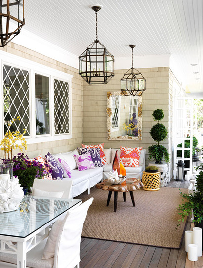
I love this open porch off the kitchen of one of Traditional Home's Hampton Designer Showhouses. I admit, it's from a few years ago, but it certainly doesn't seem dated in any way. The feel of this outdoor room epitomizes my idea of the perfect place to start a summer day.
Interior designer Nancy Pearson mixed materials, styles, and colors in a way that makes the space feel so breezy and light, but thankfully, not in the traditional beach house color scheme—which is often executed well, but is predictable, and doesn't interest me as much as this. Low-slung seating topped with bright patterned pillows create a comfortable space to catch up on a good book, or just to have morning coffee (juice, in my case) and read the paper. Or, again in my case, scroll through Twitter and news sites online (sorry!). The antiqued zinc finish on the hanging lanterns is a nice departure from the polished nickel usually seen. A natural-edge cocktail table, flowers, and topiary add natural elements, while the shell-and-antique fragment mirror gives a nod to the house’s setting. The yellow garden stool references the lattice windows, and the lovely dark floor is an unexpected detail. I also really appreciate that while there are shells present, we’re not being beaten over the head with a shell/nautical theme. Because of the bright palette, the fish-patterned magenta pillow coordinates well with the silk ikat pillows. The whole space feels so relaxed and refreshing, like its very own getaway. image via Traditional Home Xx a |
#checkout this blog with shop-themed puns
archives
August 2014
categories
All
© 2014 | mrkt
|


 RSS Feed