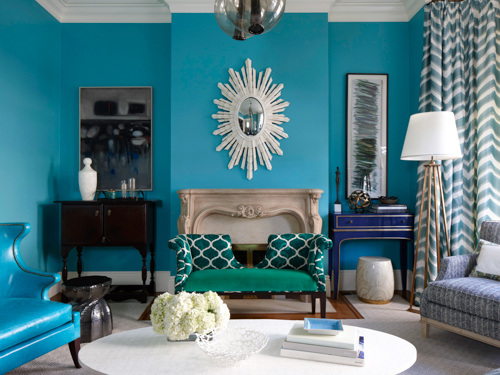
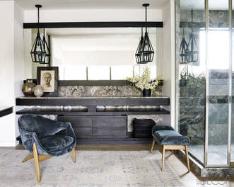
I'm a little late in sharing, but the March issue of Redbook magazine features two stories I worked on. For tips from top interior designers on decorating with a little and a lot of color, see the slideshow from the article, featuring the room above, designed by Melissa Warner Rothblum of Massucco Warner Miller. I'm a little obsessed with that royal blue console in the corner. The other story is a cute matchup of great, totally affordable armchairs and throws I found. This isn't online but it's the back page of the issue. Hope you like! 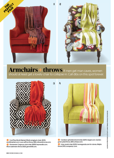
images via redbook, photographs by philip harvey and alison gootee
Xx a
0 Comments
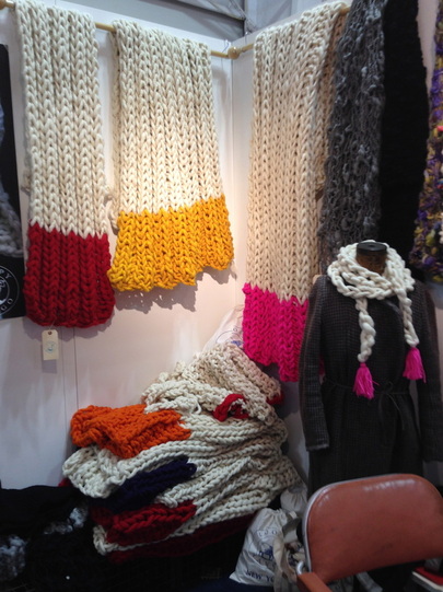
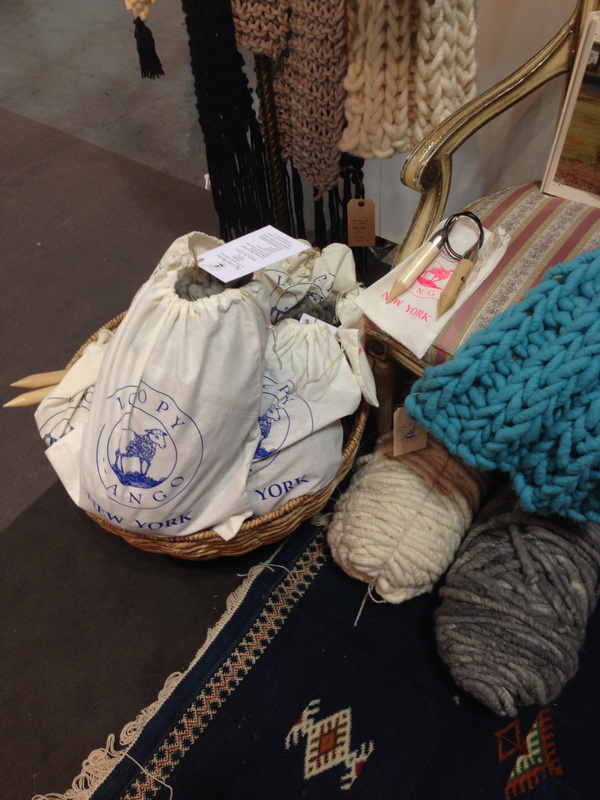
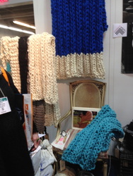
I have this attraction to knit items, things with cable knit patterns, anything chunky and wooly looking. I don't remember if I've mentioned this before, but I'm basically allergic to wool. I can't wear sweaters with wool, even 10% wool content, for more than a miserable hour or two and cashmere is like sandpaper (truly) to my skin. I'm always drawn to clothing and home goods that incorporate chunky, woolen textures—I'm sure there's a psychological term for this. So of course when I saw these big, bright throws, I had to stop. Loopy Mango, which also has a brick-and-mortar shop in Soho, was founded by two women who met at FIT. All the yarn is produced at the company's mill in Massachusetts and all the finished knitted products are handmade in NYC. 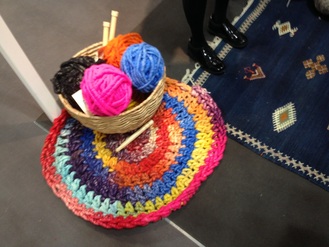 I love the Aspen Crochet Round rug, which unfortunately for me, only seems to come as a DIY kit currently. The kit is available in 20 individual colors but they also sell yarn on their website so you can choose additional hues if you wanted to recreate something something more mult-colored like this rug I saw at the gift show. The solid colored rugs are really chic and gorgeous, though. The super-chunky finished throws come in eight colors, but again, you can buy your own yarn. They also offer custom sizes and designs upon request, so you can likely ask for a throw in any of the colors they offer. In addition to various DIY kits, Loopy Mango also offers several free patterns on their website, in addition to links to their YouTube tutorials.
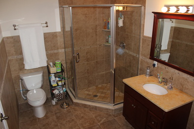
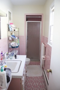
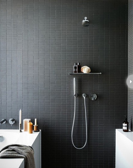
images are my own Xx a 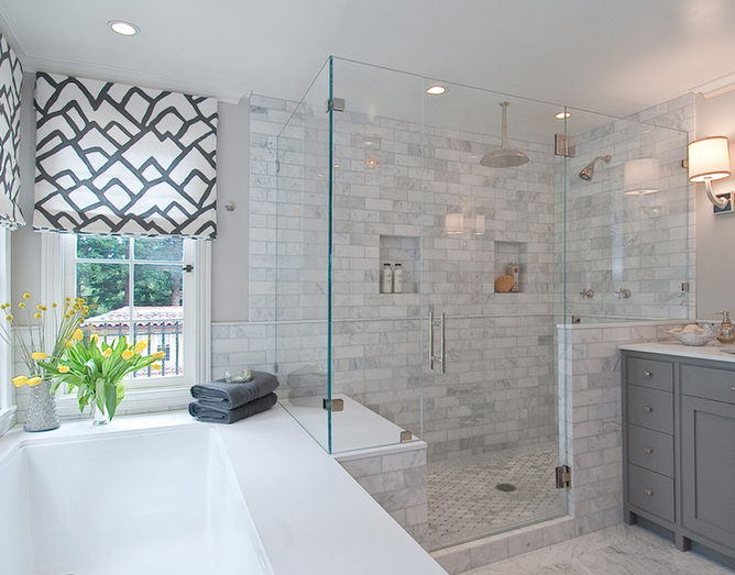 I love this bright open bathroom by Tamara Mack Design. When we moved a year and a half ago, we went from a large master bath to a retro pink wonder that the two of us can barely fit in at the same time:
While we search for a house to buy or try to decide if we should buy this house and renovate it, I can fantasize about a new bathroom with a more modern look and such fancy amenities as a fan or a window that actually opens, and my true dream: double sinks and heated floors. This year's bathroom trends include upgraded fixtures and features, and a move toward greige and pale gray tiles, a trend I am squarely behind. I am obsessed with gray. Wallpaper and hardwood floors are huge for powder rooms, specifically, over other bathrooms. Some remodeling-related bathroom trends for 2014 as determined by Houzz's survey of 7,645 homeowners:
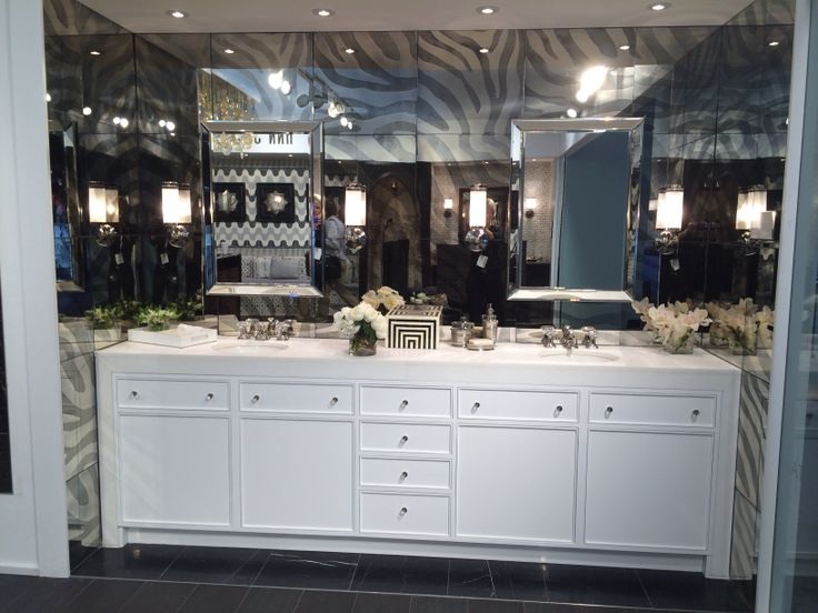
I'm with the more than four on that first point: I had a great big tub in our last house (which you can't see in the above photo because my husband was standing on the ledge of it to get that angle), and in the nearly five years we lived there, I used that tub zero times. I'm just not a bath person, and rarely do I have the time to really enjoy it (though there was this one time I took the most amazing and relaxing bath, but it was at a resort). I'm mixed on the rain shower vs. hand shower, but as long as it's not the chest or stomach level jets, I'm fine. I definitely agree with lots of light; the more natural light the better. A great deal of available natural light ties in with having a glass shower, which I love. The frameless is key, too, because keeping the frame clean was a pain. One quarter of homeowners are enlarging their master bath but three-quarters of them are creating en suite masters. In each home I've owned with my husband, we've had an en suite bathroom, and I prefer the privacy of it. Something that people are split on is having the toilet separated from the rest of the bathroom as opposed to exposed as it is in both bathrooms above. Ideally, my husband and I would love to have the toilet in a separate room. It's more private, and it means the other person can be getting ready for the day or for bed without having to wait. When it comes to cabinetry, white (36%) edged out dark and medium woods which were equal in popularity (21% each). I was a little surprised that lightwood (6%) was so unpopular. I really didn't like how dark the vanity was in our old bathroom, but when it's in a more modern setting, like the Kohler vanity below, I don't mind it as much. Even though gold and brass are gaining in popularity, silver-tone faucets were the clear favorites.
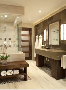
More dreamy bathroom design:
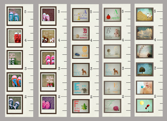
While going through the Handmade section of the gift show, I found Philly area-based Michelle Ciarlo-Hayes, founder of MKC Photography. She offers a variety of products including digital collage prints, pillows, and table runners, but the product that most caught my eye were her growth charts. 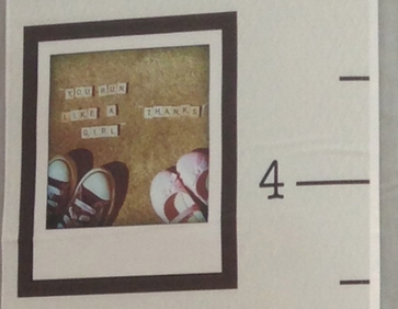 There are five different styles available: boy sneakers, girl sneakers, boy alphabet, girl alphabet, and little poems, which includes whimsical gender-neutral images. Each growth chart is printed on removable and reusable vinyl so if your child changes rooms or you move, you can take the chart with you. Whenever I see other people's growth charts marked in pencil, or lines in someone's door frame discreetly marked, I always feel guilty that we don't have a growth chart. As I wash, fold, and pack away a size of baby clothes now too small, I feel the passing of time and my heart feels a little heavy. I think that's why the chart with the little shoes in ascending sizes hits so close to home. 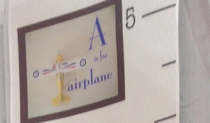 I think it's just one of those times you go through as a parent where it all seems to be going so fast (I know it always seems like that), and it catches you off guard. We're looking into early intervention for Sunshine because she's 15 months and still not standing, cruising, or walking, though she's made a lot of progress in the last two weeks. At the same time, we're starting to register Cupcake for Kindergarten and it seems as though she's the one that just started walking.
These little reminders of the passage of time: the increasing sizes of shoes and shirts, the lines on a growth chart, transitioning from bottles to sippies and utensils, they're tangible markers of the (truly remarkable) changes and progress these little people are making every day, and how they're changing us too. And how we hope our best is good enough. I know being a parent isn't for everyone and I can understand that, but I sure am glad I am one. 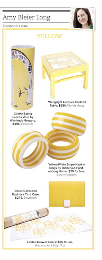 Life's been a little crazy lately and I feel the blog has gotten the short end of the stick for sure, so thanks for hanging in with me even though there've been a lot of days without posts. I decided to do another throwback-style post today and share something I worked on three years ago.
Trad Home, Traditional Home's digital magazine was still under wraps and being produced during the early months of 2011. There was a lot of industry buzz around the issue and it was a very exciting time. We were really trying to turn people's notion of "traditional" on its head. At the time, I was also producing my first major trend feature story completely on my own (plus a bunch of other stories) for the print mag, so I actually didn't have a lot to do with the digital version, but this was my contribution. Each editor had to select a color and source several products for the premier issue. The thing I like about this story—aside from the sorely-needed shot of sunshine it's providing—is that I would absolutely choose all of these products again. None of them seem dated; they're all as classic and relevant as they were three years ago. And not only would I choose them all again for the editorial, I would actually choose each of them in my own life. Sadly, DVF Home no longer exists. I really liked a lot of their tabletop and bedding pieces, so that's a shame. Another thing this does is illustrate that even if you're afraid of a lot of bold color, there are small-scale ways to bring in some brights in order to add interest without overwhelming yourself. I'm a bold color girl, but I can appreciate that some might like to keep their house toned down. (A little surprise here and there never hurt anyone, though.) A bright yellow business card holder, aside from being chic, is practical, too, for finding-it-in-the-abyss-of-your-purse purposes. In addition, you get to see what I look like with a blow-out and my head tipped at an angle, so there's that, too. photo: my own Xx a 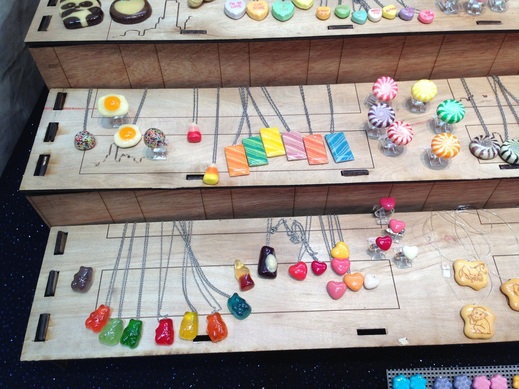
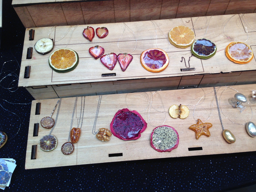
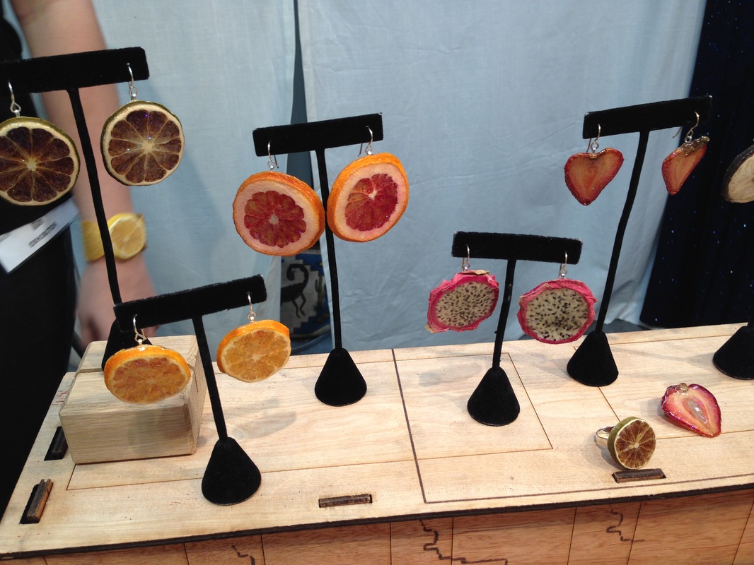
When I was in high school, I really wanted to take the rainbow marshmallows from Lucky Charms, coat them in something clear and make a necklace out of them. Many moons later, someone has done nearly that. Glitterlimes artist Debbie Tuch takes real candy and fruit and encases them in glitter resin. Real gummies, hard candy, chewing gum, and cross-sections of fruit are preserved for wearing pleasure. I love them for the bright colors and nostalgia-factor. They're a bit kitschy but that's what makes them great. The Fruit Stripe gum is really cute and makes you forget that that gum actually tastes really terrible. It might actually taste better covered in glitter resin. Did it always taste terrible? 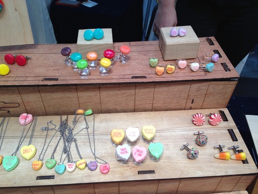
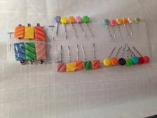 Spree, Conversation Hearts, candy corn, peppermints, sprinkle licorice, and more have all been remained as rings, earrings, necklaces, cufflinks, hair barrettes, and pins. Tuch started with Rock Candy (which was featured in Lady Gaga's Workshop at Barney's) and went from there. In addition to the newer candy pieces, she also works with various fruits, especially citrus, and some nuts, including metallic Jordan almonds. All the different fruits remind me of when my mom was dehydrating oranges and apples for her various crafts back when I was a kid. The dragon fruit slices, in particular, I find so interesting: Their white and black, or purple and black, centers with pink border and the irregular shapes are very eye-catching (left photo, center of the bottom shelf). What do you think of these sweet pieces?
images are my own Xx a 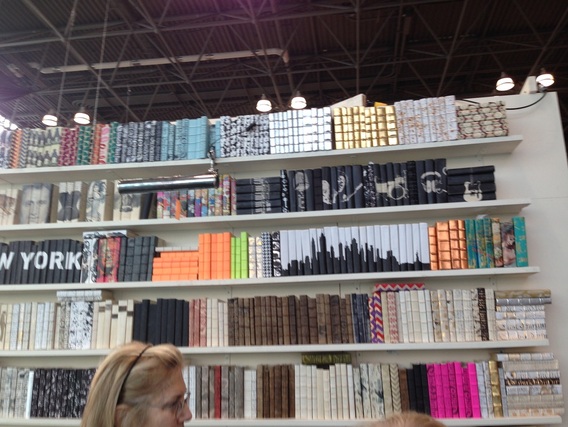
decorative books, including a set with the NY skyline
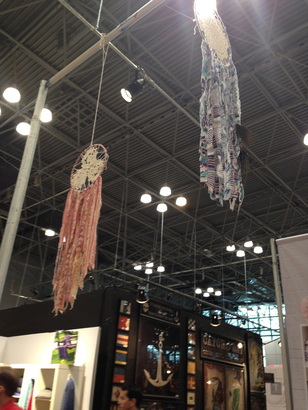
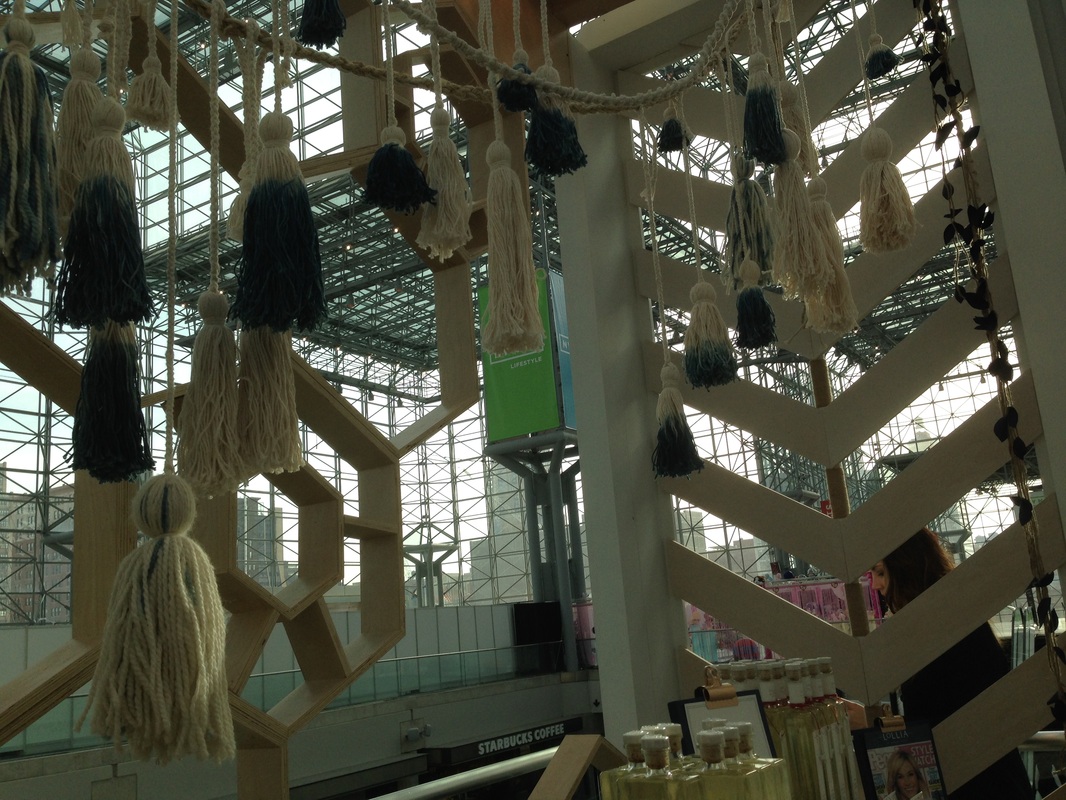
Hope everyone is staying warm and lifting with their knees when they shovel, it's crazy out there lately. I drove down to New York last Friday to attend NYNOW, formerly NYIGF, the gift show at the Javits Center. In two and a half days—and 2700+ pictures later—I walked every single aisle of the show and saw some great products. Mostly, I was really excited to be back in New York and to see a lot of the vendors I haven't seen in a while, since I missed the last three shows (not sure how that time flew so quickly). It was great to catch up with people and this was my first time experiencing the show since they changed the format and rebranded. I think it worked out well to have all the home companies under one roof, though as I walked the show, I realized there were several brands that I didn't see. I'm hoping they'll be there in August. At any rate, I'm looking forward to sharing the things that I saw over the next weeks and months. In addition to new and interesting products, the booths themselves are often styled creatively. Here are just a few fun things I noticed:
Xx a 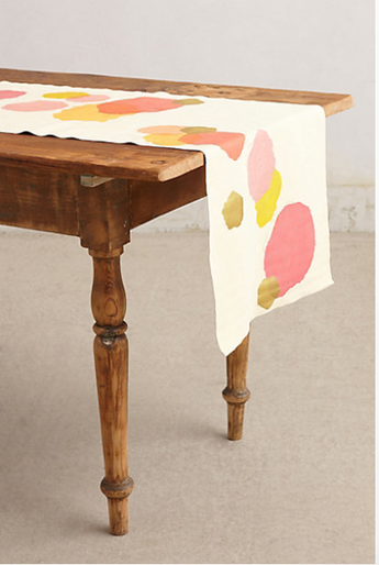 Because my dining table is oval-shaped, it's very hard to find table linens. Rectangular placemats don't sit nicely next to each other if you have more than six people at the table and I can't decide if I should try round ones or those sort of trapezoidal shaped mats. I can't decide if they're weird or practical. And tablecloths: Every time a package says it's oblong, it really means rectangular which of course doesn't look good. So I generally forgo table linens because the table looks good on its own, anyway. But I remain on the hunt. A runner like this might not sit quite right at the ends of the table, but it is so pretty, I think it's worth trying. I don't generally think of myself as a floral person, but I do love these artful blooms, and the color palette is one of my favorites. So bright and happy, and I like the touch of metallic gold, too. The runner is suede, which probably feels wonderful and adds a nice mix of materials when you use it in combination with cloth or linen napkins, and the glassware, plates, and other decor elements. I think I would pair it with striped or dotted napkins, maybe in a pale pink, or a fresh green, or maybe a gray similar to the one that adds the petal detail to the flowers. And it's on sale, which means it's probably on its way out. Too bad the gift card my sister got me from Anthropologie was accidentally not activated by the cashier and she isn't sure where the receipt is, so I can't get it activated. Curses!! Anyone else have oval tables? I'd love to hear your suggestions or solutions! 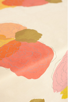 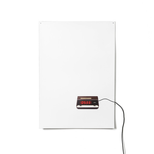
Since this is the time of year where people are pledging to get up earlier, go to bed earlier, or spend more time doing various noble pursuits, I was thinking about time itself and clocks. I came across the Flat Life clock, which is a few months old, and while it's probably more than I would spend for a wall clock, I really like the concept. A familiar retro-looking alarm clock image is printed on a very thin piece of plastic and by way of a power cord, the piece makes the transition from two-dimensional image to three-dimensional product that actually functions (though it doesn't have alarm settings). I love the humor, originality, and simplicity of this design and the way the cord trails off, bleeding out of the image and into real life. If you like it, too, you can also check out the Flat Life light by the same designer: 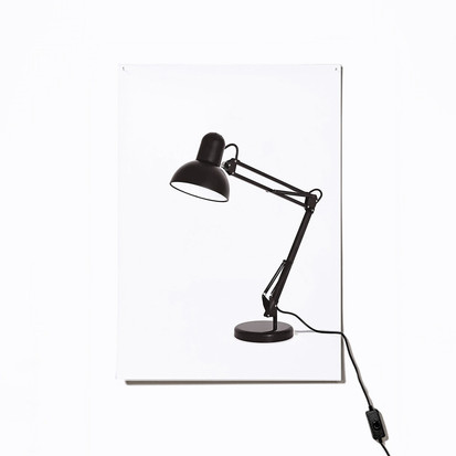
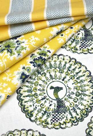
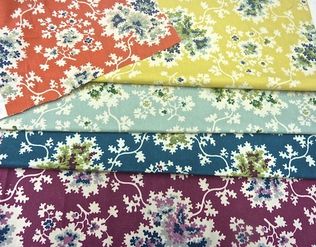
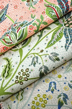
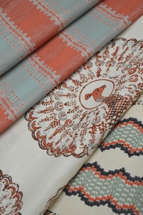
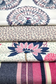
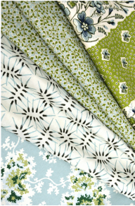
I know I've mentioned that one of the definite perks of my career has been getting to meet and work with creative and inspiring interior designers. I love seeing interiors where people take chances with patterns, colors, and mixing styles, because I think most average homeowners don't—but I'd love to be proven wrong! I'm pleased to say that all the designers I've worked with have been such a joy; I'm always so happy for them as they continue to be successful and especially when they branch out into new directions, such as product development. You might remember me mentioning Tilton Fenwick a few months ago, when they were part of a rug collaboration with Studio Four. Now, Anne Maxwell Foster and Suysel DePedro Cunningham have launched their first fabric collection, partnering with Duralee, who continues their tradition of working with fantastic designers producing exciting fabrics.
 It's exciting for any designer to be asked to develop a line of products, but I think it speaks volumes about their talent that Anne and Suysel were asked after having only been in business a few short years. The duo are known for their colorful and layered take on traditional. Since being featured as New Trad designers to watch by Traditional Home magazine (where I worked when I met them), they've also designed for showhouses and industry-favorite event Design on a Dime, in addition to their growing client roster. The fabric collection with Duralee is full of bright, happy, versatile designs that work well in a vibrant pattern-rich environment, yet many are restrained enough that they are perfect for someone who prefers a more subdued look. Take a look at these wonderfully rich colors and patterns available in a variety of scales. Stripes, florals, animal prints, and patterns inspired by recent travels work together to create a fresh perspective on traditional themes. The strong peacock pattern is actually Tilton Fenwick's company logo translated into a printed fabric. I can't wait to see some of these patterns on drapes and upholstered chairs and sofas.
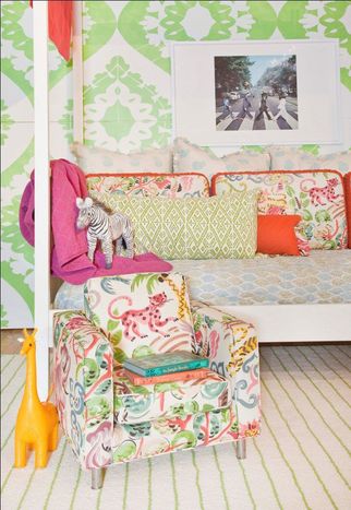
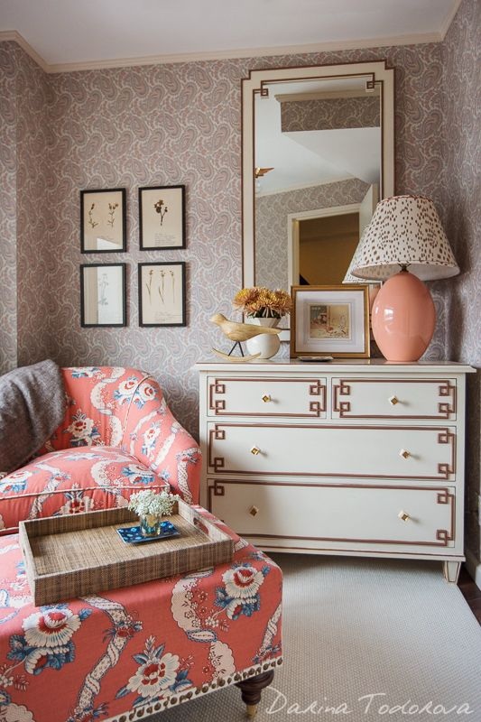
If you're not familiar with them, here are a few examples of Tilton Fenwick's exuberant and gorgeous work:
images via duralee, tilton fenwick, and interior photos via michael rodenbush, darina todorova, trevor tondro for the new york times Xx a |
#checkout this blog with shop-themed puns
archives
August 2014
categories
All
© 2014 | mrkt
|
 RSS Feed