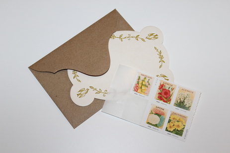
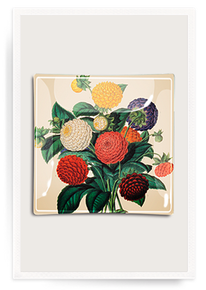
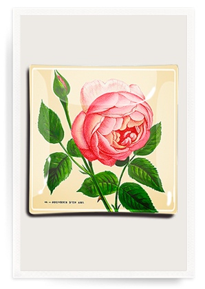
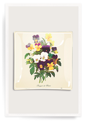
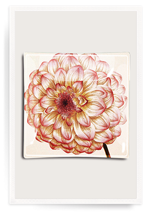
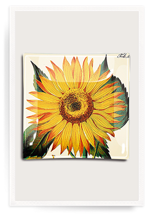
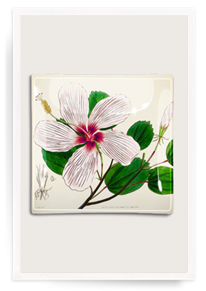
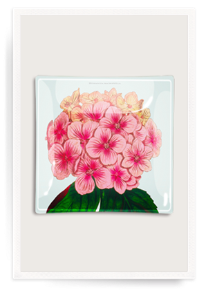
As you know, I love when everyday items are beautiful. I'm a huge stationery fan and I take handwritten notes, thank you notes, party invitations, and holiday cards* very seriously. I also take the stamps very seriously, always bothering the USPS workers to see the Love stamps—which often have some of the more pretty or interesting designs—and whatever other new styles they might have in. I'm almost out of the Vintage Seed Packet stamps I purchased a few months ago, and I noticed they're still available, but I'll probably pick up something new heading into the holidays. However, something as small as a stamp can be inspiration for your home. I've been enjoying the floral burst of color, so it was nice timing that I learned that Ben's Garden had some new découpage trays with imagery very close to that of the stamps. Ben Busko started his business in 1992 at age eight, and has since been featured on Martha Stewart. A selection of holiday designs are now available on the site as well, though I'm partial to the Dahlia pattern (above).
*If you've started thinking about your holiday cards (I know, it feels too early), check out Minted, my go-to for our cards each year. I choose a design and use the yearline style to give our friends and family a snapshot of our year without boring them with a lengthy letter. Their new designs are on sale, and you can buy now and fill in the photos and details later, which is what I do. Click here for a referral discount of $25 off your first purchase of $50 or more! (If you end up ordering, I get a discount for the future, as part of the general referral process - which means you can do it, too. But I always refer people via word of mouth to Minted, regardless of discount. ) top image my own, tray images via ben's garden Xx a
0 Comments
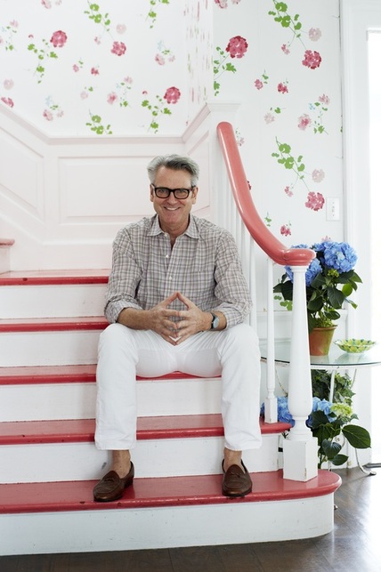 Hope you all had a splendid weekend! For the last week or so, I've been seeing this image pop up on Twitter and elsewhere, because this is New York-based interior designer Tom Scheerer, the subject of the recently-released book Tom Scheerer Decorates, by Mimi Read. I haven't yet had the pleasure of looking through the design book (it's on its way now), but this image struck me for a couple of reasons.
Film-star-spectacles aside, I love how bright and cheerful this stairway and hall are in his family's East Hampton, New York, beach house. If the stairs and handrail weren't lacquered in that coral color, I don't think I would have been as drawn to it as I am. I do like the geranium wallpaper on its own, but if the handrail had remained in a natural wood, I'm not sure I would have spent as much time absorbing the image.
With my reasonably mediocre Photoshop skills, I filled in the coral treads and handrail with black, so I could see what it might look like. It still looked lovely, but the space took on a more serious feel. I also tried a "wood tone;" in my hands it looked a little ridiculous, but it did reinforce how much I think the coral adds to the design, particularly in a beach house where its usually desired to keep things light and airy. Painting these areas in a poppy color that coordinates with the wallpaper elevates the room that much more. I also like that the coral doesn't seem to be an exact match to any color in the paper, but that it references the floral pattern and adds another dimension of interest. I think most stairways could benefit from this kind of treatment (especially including the wallpaper). There are definitely times when natural tones, black, or white, are the right way to go, but where architecturally-interesting railings and banisters are lacking—probably most average houses—a smart paint job is a great way to update and enliven the space. 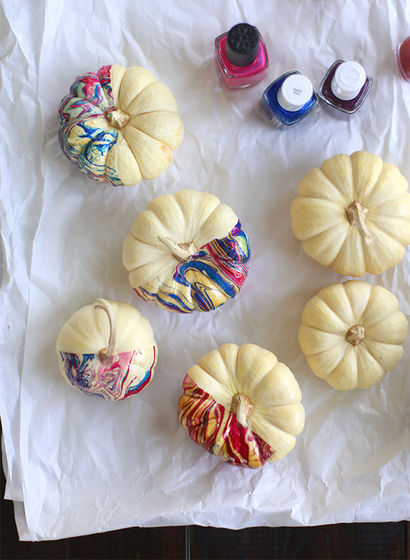
Pumpkins seem to be anything but orange these days. This weekend we're going picking with the girls and my parents, and I've been getting inspired by the pumpkin decorating projects I've seen online. Here are my favorite looks for pumpkins right now: The marbled pumpkins (above) from Say Yes to Hoboken are so sophisticated-looking and grown up, but easy enough to do with kids and a bit of supervision. And options are endless since nail polish colors are more than plentiful. 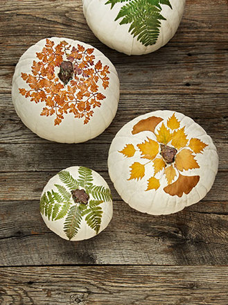
I love the patterns and colors on these decoupaged botanical gourds created by Country Living, especially the one on the top left with the small orange leaves. 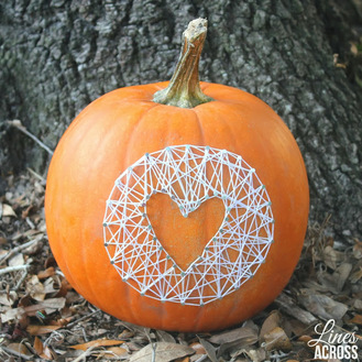
Inspired by this string art pumpkin from Lines Across, I think I'd actually be a little more traditional and use the nails and string to create a large spider web, then glue a plastic spider onto it. I was surprised to find no pictures online of this idea. You could even paint the pumpkin black, apply the white web (or spray it silver before tying), and get a glow-in-the-dark spider.
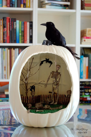
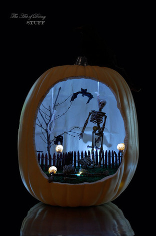
Maybe it's the school nerd in me, but I've always loved dioramas. So it's no surprise that I love the idea of a diorama set up in a hollowed out pumpkin. This scene from The Art of Doing Stuff, definitely captures the spirit of Halloween without being too scary or gory. This is obviously the most time-intensive, but how fun would it be to pick out and arrange all the tiny accessories inside? I like the little skeleton hand creeping out at the bottom! 
I always love a little edge, even on seasonal fruit. A studded pumpkin by Small Shop feels a bit punk inspired and takes very little time to achieve.
images via say yes to hoboken, country living, lines across, the art of doing stuff, small shop Xx a 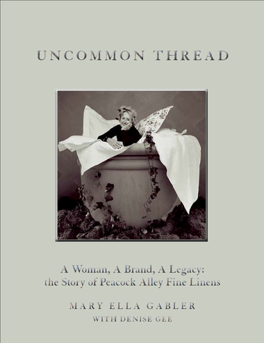 When I decided to write my first book review for checkout, I thought it would be a more abbreviated review—the kind I'm used to giving when I have to sum up an inspiring design book in roughly a column-inch. But this book is inspiring for different reasons. Uncommon Thread: A Woman, A Brand, A Legacy: the Story of Peacock Alley Fine Linens is the autobiography of Mary Ella Gabler, founder and chairman of Peacock Alley, an affordable luxury bedding and bath linens company. The framework of the story, in many ways, is not unfamiliar: A young woman moves with her husband for his career, starts a family, contends with advancement and career change in male-dominated fields (looking to create something for herself but still have the freedom to care for her children), follows her dreams to see success come and go and come again, and builds something that endures. The more remarkable part is that the story begins in the late 60s/early 70s when it was much harder for women to be equals and decision makers in the work environment. Mary Ella operates on a "little black dress" theory in fashion and in her business: Invest in well-made neutral basics and work in texture, color, and pattern thoughtfully. Trusting her instinct to keep it classic has served her well, even when peers and competitors were following fleeting trends. Timeless lessons for business and life emerge organically; they are not written in any organized list. You see them as her story unfolds chronologically, serving as excellent guideposts for those forging their own paths, especially those thinking of starting their own business. I've included some after the jump.
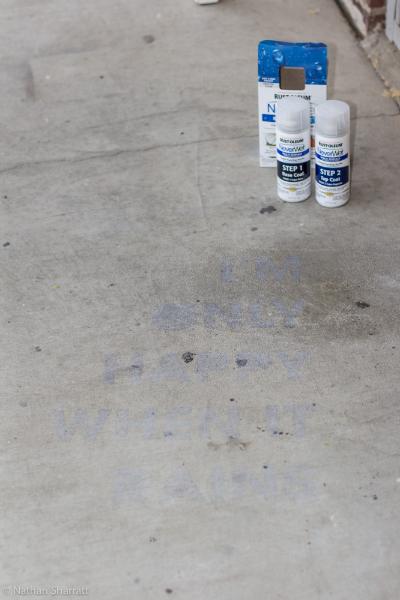
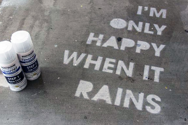
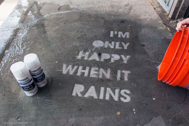
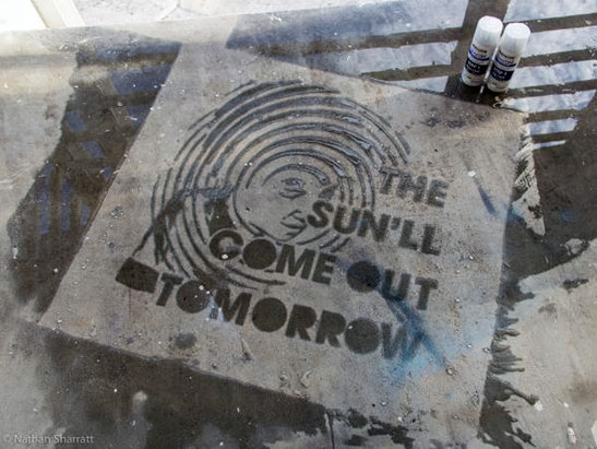 I don't know about where you live, but it's been pouring here in CNY (as it pretty much did all weekend), with a tornado advisory thrown in for fun. Rain can sometimes be a total drag, but I love this creative idea I saw on Brit + Co. It reminds me of the interesting pictures or slogans I'd see spray painted randomly on the sidewalks in New York, but with a sort of Invisible Ink quality. It's a surprise for when you might need an extra smile. Rust-Oleum has a product called NeverWet, which is a two-step moisture repelling system. Introduced as clever Home Depot contest entries (here, with tutorial and here), the idea is to use NeverWet and a stencil to spray your sidewalk, porch, or anywhere really, with a design that will only appear when the rest of the ground is saturated with water. The original idea was to create street art, but if you're feeling less public, it could be a great project to do with kids on a driveway or back patio. Rain puns are an obvious choice, but I wonder what I would stencil. Probably something cryptic and silly to make myself laugh—like the first half of a coded phrase from the original Get Smart: The blue sun melts the red snow.
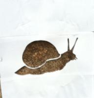
The snail image is adorable. The fun is that it can be as simple or elaborate as you want it to be.
It also occurred to me that if your child is into spy stuff as much as I was (am), you could do something like this as part of a spy-themed party or activity. And if you don't want to keep it forever, when the top coat finally wears off and the water no longer beads you can skip reapplication, or according to Rust-Oleum's site, you can wipe the surface with mineral spirits. What design would you spray on your sidewalk? 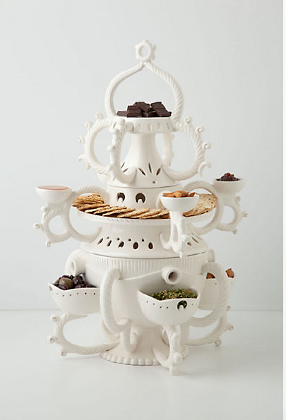
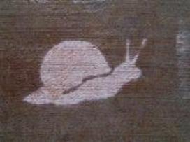
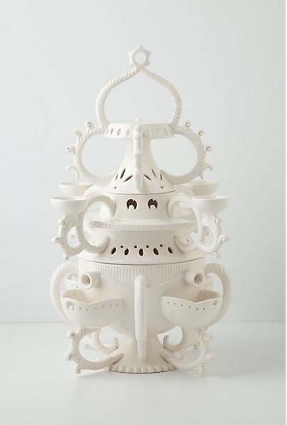
Wow, I want to take a minute to thank everyone who has visited my blog (especially return visitors)! Yesterday's post garnered the most views and likes/shares that I've had so far, and I'm so humbled that anyone even reads this. So thank you from the bottom of my heart for making this first month-and-a-half of blogging worthwhile. Usually Friday is reserved for under $50 finds, but today I decided to share something really fancy, in honor of our big day. Our tenth anniversary is today and our vow renewal is just a few hours away so of course I'm running around like a chicken with her head cut off to decorate and do everything else. Someone remind me to shower. So as a nod to our anniversary and the intimate party we're hosting tonight, I wanted to share this pretty amazing serving piece from Anthropologie. Feeling vaguely nautical and like a courtyard fountain spilling over into itself, the design is inspired by 18th-century British Puzzle Jugs which had holes in the neck of the jug challenging users to pour liquids without spilling them. Thankfully, this stackable server is more user-friendly. The price is a little hefty, but it certainly is a conversation starter!
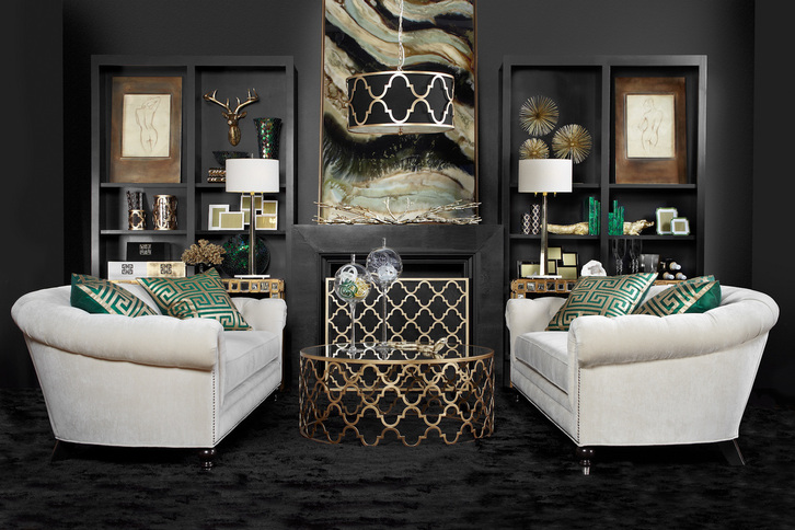
If challenged to choose a handful of only neutral colors and design a room around them, most people would probably not end up with something as moody and glamorous as this. I think we'd see a much lighter room, a lot more creams, browns, tans, greige, maybe some grey, or black, or white—but not this mix and not in this way. This image is actually from ZGallerie's fall look book (which can easily be accessed from their home page or clicking the above photo).
I was immediately drawn to it, not simply because I'm obsessed with moody rooms, but because the concept seems like it shouldn't be too difficult to pull together using an image such as this for inspiration. Essentially, the designers used black, an off-white, green, and a metallic—all of which are neutrals. But the genius is in the pairing. Using more black than white, particularly on the walls, carpeting and mantle creates a very different feeling than if the proportion were the other way around. The sofas balance the darkness and give your eyes a place to rest. The vibrant malachite green acts as an accent color and all of the gold provides additional light and reflection to keep the room from being too heavy and dull. The use of pattern is also fairly restrained, so the mix of shapes and materials is what provides the depth here. Bringing in glass objects, some chrome, and other accessories in these same shades adds interest to the room, and I love the large format framed canvas on the mantle which ties it all together seamlessly. This is also a good example of using a trendy color (emerald) but in a way that's easy to move around if you're someone who likes to switch out accents each season or as trends come and go. Another nice point of balance is the use of a round coffee table and curved sofas in front of the symmetrical very square/rectangular built-ins. I think it all came together brilliantly. What do you think of this room? Does it work for you? image via zgallerie Xx a 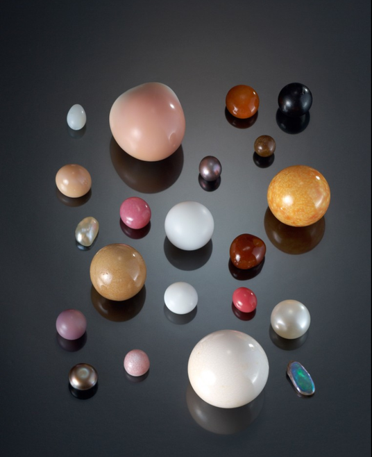 Sometimes we need a mental health day, right? Or a day where we can look at beautiful things, not necessarily to buy, but to slow down, appreciate beauty, nature, and color, to be inspired or feel renewed. I could use a day like that, but in lieu of an entire day, I can't stop looking at this image displaying a rare selection of natural pearls on loan to London's Victoria & Albert Museum from the Qatar Museums Authority Collection for a joint exhibition.
Can you believe these are natural and not man-made? The colors are so gorgeous and the shapes are perfectly imperfect. In a way, I wish you could see pearls like this more often, but then of course, these wouldn't be as rare. Pearls, an exhibition presented by the V&A and the Qatar Museums Authority, is on exhibit at the V&A through January 19, 2014. If you can't make it to London, as I sadly cannot, there is a great deal of information on the museum's website including some history, and additional pictures of art and jewelry that are part of the exhibit. All of the jewelry pieces are fascinating either for their unique settings or the age of the gems, some as old as the Roman Empire. The V&A does have jewelry, books, and more for sale in their museum shop, as well. H/T to W magazine for making me aware of this exhibit. image via w magazine Xx a 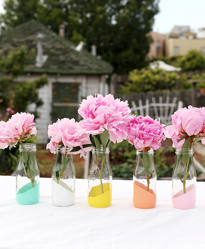 Over the weekend, I finally started working on the decorations for our 10th anniversary vow renewal taking place this Friday. I'm kind of freaking out at how soon all this is happening. I don't feel ready, though a lot of it is falling into place. The weather even looks like it might be nice enough to do the brief ceremony outside. We would really like that since ten years ago it rained until right around when our ceremony ended. We didn't get to have any of the cocktail hour outside, though we did get some great photos because of the overcast sky. Bonus: no squinting! None of the DIY decorations I'm doing are revolutionary, by any means. I'm sure it will look a lot like what you've seen on Pinterest, but I'm limited by time and budget, and it's a small intimate gathering. I know I make it sound like I never do anything DIY, which actually isn't entirely true. It's just that most of what I have done has been stationery related. I did every bit of stationery for our wedding, and spent hours and hours cutting out japanese wrapping paper into small squares to make pockets onto larger squares of card stock. Into these pockets went another square with the name of the table people were sitting at, and the guests' names were written at the top. Also all the names of the tables were named after squares in Manhattan: Madison Square, Washington Square, etc. I was really into the theme... At any rate, we started the table decor and the dipped tealight holder came out pretty well, so taping and spraying the rest is on the agenda today after I work on captions for an article. Speaking of dipped and DIY, I'm glad I'm not the only one still into this trend. Here are three DIY dipped projects that anyone can do. Click the images for the tutorials. 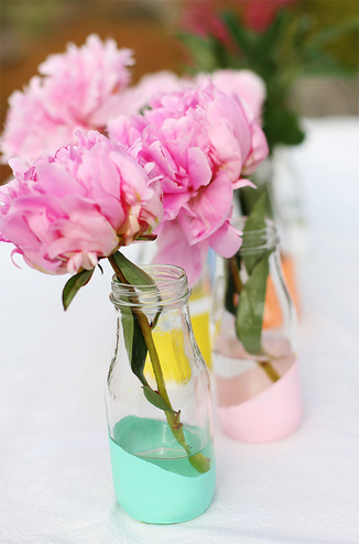 Pastel Dipped Milk Bottle vases These dipped bottles are similar to what I'm doing, but mine are all in gold. I love the palette Liz from Say Yes to Hoboken chose on these. 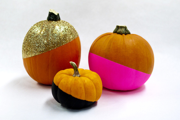 No-Carve Glitzy Color-Dipped pumpkins Carving pumpkins is fun, but this idea from Brit + Co. would really stand out on a stoop or front porch!  SVALBO sideboard hack This project is a little more involved because Emily, of The Sweet Beast, had to remove pre-existing supports for a lower shelf. It's still a really doable project and inexpensive. I love how glossy the finish looks with the Polycrylic coat she applied at the end.

One of the easiest ways to create a look that's truly your own is to include handmade products in your house. The best thing about handmade goods is that they're generally limited in quantity, so few people will have the same pieces as you, and even those that aren't so limited are still special because it's very difficult to achieve uniform precision on each creation. But, I bet artists and designers prefer it that way; the happy accidents and imperceptible mistakes behind each piece may be totally unrecognizable to you but tell the story of their process. The story behind each piece, or more precisely, the story behind the Maker of each piece, is exactly what the site BRIKA is after. How the designers got started, what music they listen to when creating, what inspires them—all of that matters and creates a connection to people all over the country pursuing their passion. One of those people is Karen Young (above), the Brooklyn-based designer behind Hammocks & High Tea. Karen is a joy—I've been lucky enough to work with her in the past—and is just one of dozens of women (mostly) and men featured who've dedicated their lives to the imprecise, but monumentally fulfilling, work of crafting their products by hand. Karen is selling some of her fabulous dopp kits in exclusive patterns for the site. Also, completely randomly, I came across jewelry maker Penelope Rakov who went to my high school, graduating only a few years ahead of me (I remembered her name)! Small world. 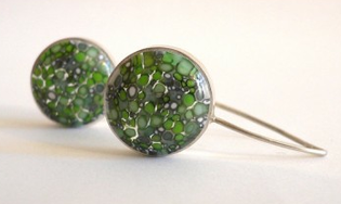
Lillypad earrings, Penelope Rakov
Many of the products featured on BRIKA are modern interpretations of traditional techniques practiced by past craftspeople and artisans, and the founders of the site hope that the pieces bought today will become new heirlooms to be passed down. Here are my favorite products available at BRIKA right now (click the images to purchase or see more): 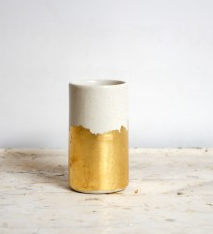
Gold Brushstrokes Vessel vase, The Object Enthusiast
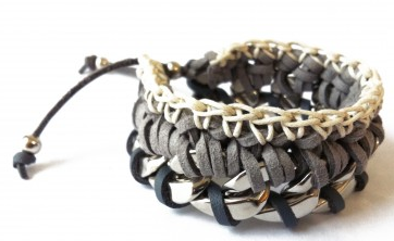
Mitta bracelet, Andrea Bocchio Jewelry
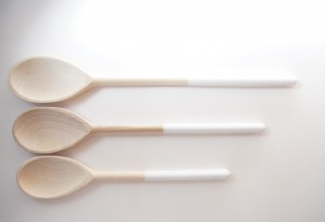
Flake Spoons (set of 3), Wind & Willow
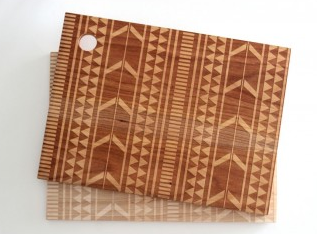
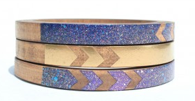
Large Tribal cutting board, Richwood Creations
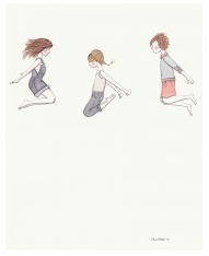
Bounce print, Lisa Chow
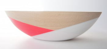
Pink + White 7 inch bowl, Wind & Willow
Bat for Lashes Skinny Bangle set, Voz Collective
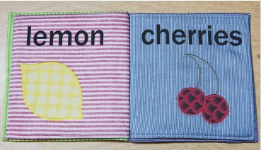
Fruits cloth book, Ex Libris Handmade
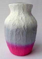
Pink + Gray vase, Carriage Oak Cottage
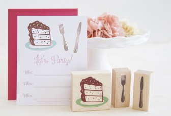
Cake + Fork + Knife stamp set, Brown Pigeon

Grey + Charcoal Joli Bow shoes, Zuzii
Check out the site and let me know which pieces are your favorite! product images via Brika
Xx a |
#checkout this blog with shop-themed puns
archives
August 2014
categories
All
© 2014 | mrkt
|


 RSS Feed