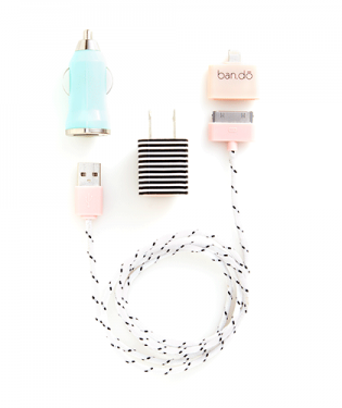
It doesn't get any more functional than the power cord for your phone. And the way our phones have virtually become additional appendages, having an extra charger handy is always a good idea. But why should we be resigned to making do with plain white pieces when these little lovelies exist? Ban.do's Power Trip charger sets (for iPhone 4/4s and 5/5s only) are so cute: one set is soft and feminine and the other is bright and cheery, but both are super stylish. If you currently have the 4/4s, the set includes an adapter so it isn't made obsolete if you upgrade. When you're at the airport around one of those charging stations and everyone's phones are trailing off in identical fashion, yours will be the one that stands out (and I'm always about that). 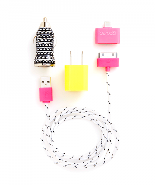
0 Comments
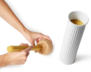
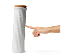
This time of year makes me think a lot about my grandparents: April marks the birth dates and death dates of three of the four—though all of them have been gone a long time—and Mother's and Father's Days will be here soon. I lost my maternal grandmother, Helen, when I was just 4, my paternal grandfather, Marvin, when I was 8, and my other grandmother, Sylvia, and grandfather, Bill, within three days of each other when I was 19. Because we lived a few hours from both sets of grandparents, and because I was so young, I didn't really know grandma Helen at all. My mom's parents lived in Rochester. I distinctly remember hiding in the space between grandma's fridge and the wall, listening as she came down the hall. I would pop out and "surprise" her and she would call me a rascal. That's really the only memory I have of her. Long after she died, we were at my grandfather's house and found a copy of Playgirl that I guess she got from her friends. I really liked thinking of her making jokes with her friends about something like that. She was my only grandparent that wasn't one of five siblings. My grandfather Bill would go to places like AC and bring us back t-shirts with little animals and rainbows on them, super 80s stuff. He would call us Petunia McGillicuddy, which my sister and I loved. His father died of Spanish Influenza when he was around 6 so he had to drop out of school after eighth grade and start working to help take care of his mother, brother, and three sisters. He also was a boxer and apparently there's something about him in the Boxing Hall of Fame, but I haven't seen it yet. He also earned a Purple Heart in WWII. I don't have anything of theirs, though my mom has some things. When I was 8, we moved to Syracuse which is where my dad's parents lived. I recall the time I asked about a little mark or scar near the corner of my grandfather Marvin's mouth. He told me it was from eating red onions on his bagels and lox. I was scared of eating onions for a little while after that. We would celebrate the Jewish holidays at their house. A few years ago, we uncovered a video where they came to visit us when we were young and he's saying something about cherishing the time we have together because they [my grandparents] won't be around forever. It's on VHS but I want to put it on DVD so I can watch it sometimes. My grandmother Sylvia is the one I knew best. She loved swimming and always wore a swim cap. She would just do laps and laps while we splashed nearby. She was funny. After my grandfather died, she would perform in skits at the JCC and have everyone in stitches. She would come over for dinners often and we'd talk on the phone a lot since she and my dad spoke every night. She had clothes left over from the 70s and I wore one specific technicolored shirt and a pair of bellbottoms through out high school and college. When I started driving, I got her car because she was unable to do anything after her stroke. I like that she met my husband (then-boyfriend) at least once before that. The stroke wasn't the end of her life, but I don't think she would call the subsequent years living. Right now my husband and kids and I live in my grandparents house. Four generations have now lived in this house. We're wrestling with whether we should buy the house and try to update it or buy something different. I'm not sure what we'll do, but I like that I had a chance to live here. I wish I had asked more questions of all of them. I wish I had more knowledge of what they were like as young people. I wish I had more pictures and tangible pieces of them. I would share some of the things I have, but I'd have to dig to find them. I decided to write this post on a whim after seeing the wonderful and charming video above, created by animator and illustrator Gemma Green-Hope about her grandmother, Gan-Gan. I love the Roger & Gallet soap and the photos and bits of her life. I wish we could all have something so beautiful to remember each of our loved ones. 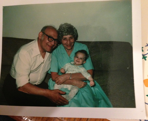 me in 1982, with grandpa Marvin and grandma Sylvia 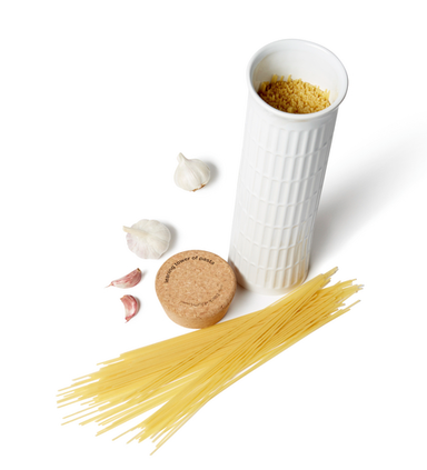 My love for pasta knows no bounds. I even have a shirt that says "Pasta Power" on it and I wore it for years, then framed it so I could still enjoy it. When I came across this adorable ceramic pasta storage container from Black + Blum at the gift show, I knew I had to share it with you. Aside from being a slim and handy way to store spaghetti, it has both a sense of humor in its design and practicality: the underside of the cork lid has a one-, two, and three-serving portion measurement guide so you can ensure you're making the right amount for the number you're serving.
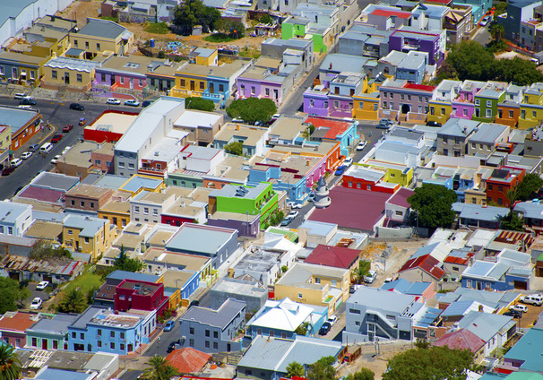
As I spend time looking at local neighborhoods and perusing online real estate listings, I'm thinking a lot about exterior paint color combinations. In the majority of neighborhoods in the US (at least all the ones I've ever been in), houses are generally painted in variations of brown, gray, white, green, yellow, blue, and red. But the colors are always pretty muted: the reds are more brick reds, the yellows like butter, and the greens olive or forest. (But it seems like there's always one blue house that is a weirdly electric color and stands out like a sore thumb.)  Wouldn't it be amazing if our neighborhoods were as vibrant as these blocks in Cape Town, as photographed by Gray Malin? Those blue houses would be right at home among the lavenders and oranges and limes and other saturated colors. I can't imagine how fun it would be to live in a technicolor neighborhood and see where everyone took their house color-wise. I think I would be insanely happy every time I walked on my street. Of the standard colors, I've always gravitated toward gray houses, and my last house was light gray, but lately I've seen a few houses around town that are purple. Subtle though—the purples have gray or brown undertones and they look really nice. Something like this color, left (Cabernet, 2116-30 Benjamin Moore). So maybe I should go in that direction for something a little less typical? If you could paint your house any color--neighborhood associations and judgmental neighbors be damned--what color would you choose? Or for more inspiration, check out my exteriors board. 
This week is Tabletop market in NY and I can't wait to see images of the new introductions. Tabletop market is one of my favorite market events (actually, I love them all), even though I don't get to work on tabletop stories very often. New place settings, serving pieces, glassware, and some giftware are on display both to the press and to retailers who decide what to buy for the upcoming season. Most, but not all, of what you see at Tabletop is high-end so it's fun to create tablescapes using these beautiful pieces. In honor of Tabletop week, I decided to share some of my favorite tabletop pieces from past years at market (see the slideshow above) and these are still available for purchase. Ruche by British bridal designer Bruce Oldfield for Royal Crown Derby is a pattern I fell for right away. The pattern is inspired in part by the way the silks Oldfield works with move and the ruching technique. The yellow accent plate is actually a little more chartreuse in person, and the gold bands on all the pieces are textured. Haviland's Laque de Chine chargers are classic and come in wonderful colors, so they mix with nearly anything. I'm not usually into the sea creature-theme, but I do love these textured plates by Richard Ginori with creatures in relief. Kosta Boda's glass Mine collection is swirly and smoky and fabulous. I adored Juliska's Country Estate collection from the minute I saw it because it has all these wonderful details like little hot air balloons in the scenery. I am pretty much a fan of everything Kelly Wearstler does, including this tabletop she designed for Pickard. I absolutely love John Rocha's Black Cut collection for Waterford. The black crystal with the cut clear crystal is so gorgeous and feels a little mysterious. Nason Moretti's Cliff glasses are another product I was constantly drawn to. The Harcourt glasses are the oldest collection in Baccarat's archive. I love weighty stemware and the hexagonal foot. Saint-Louis' Les Endiablés collection is a major favorite. It's so high end, but I love the colors and the fact that they're both objet and functional glass, and can be used upside down or right side up. The incredibly talented (and lovely) Marcel Wanders designed a line of flatware for Christofle, and the engravings are gorgeous. Lladro is really more of a collector's brand, but the craftsmanship of the pieces is incredible and I love the creativity and whimsy of them. This Clown Lamp is by designer Jaime Hayon. Rosenthal's Studio Line has a bunch of wonderful vases and this is just one of them. If I remember correctly, it was designed by a student. Full admission, the Oberon pattern from Wedgwood is not one I saw at Tabletop initially, though I did see it there once I started attending market. Oberon is actually my own wedding china pattern, but I still love it, so I thought I'd share it. images via royal crown derby, bloomingdales, richard ginori 1735, kosta boda, juliska, pickard, waterford, nason moretti, baccarat, saint-louis, christofle, lladro, rosenthal, wedgwood
Xx a 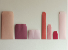
Now that I've (gulp) registered my first-born for kindergarten, I keep thinking about various things that I've been meaning to do with my girls. One thing I've had in mind for a while is to write them letters about this period in their life, what they are like, what they like to do, and so on. I meant to start when Cupcake was born, but even though I've composed these in my head several times, I haven't gotten anything down on paper.
I think her going off to school and beginning this new phase in her life will be the perfect time to put down exactly how I feel about her and who she is at this point in time (and my youngest daughter, too). My idea, in addition to writing the letter about their baby-, toddler-, and preschool-hood, is to also write them letters for different situations like their first breakup or the first time they accomplish a major achievement as an adult. I'd like to think I'll live a long time and be there for them to share my own experiences in person, but the truth is we never really know what will happen, and I'd love to leave something for them to keep, as a part of me, and as something to encourage them when they need to be reminded that they're not alone. Once written, I'll need a place to put the letters so they can read them when they're older. I love this chromatic set of assorted envelopes in one of my favorite color palettes. I can slip the letters in each envelope, label them and keep them safe in a box for the future. A future that will be here before we even know it. 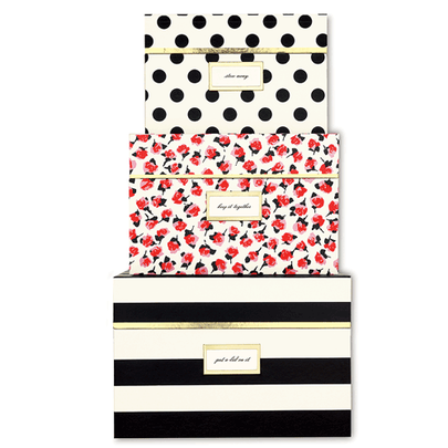
Admittedly, these are a little pricey ($54 for set of three), but I'd be lying if I said I wouldn't buy them if I had the extra cash lying around. I have a bit of an obsession with storage boxes and these are so lovely and feminine and fancy. Either set would make your desk or office look even better, don't you think? 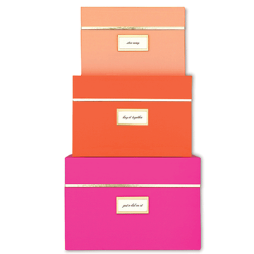
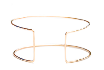
Have I mentioned how much I love cuff bracelets? Probably. I think it stems from a superhero power band place (in high school and college I used to cut the tops off tube socks and wear them like power bands on my wrists). I pretty much like them all, whether they're big and chunky or elegant and minimal, like this 'Eileen Gray' cuff. Handmade in the USA, the cuff is adjustable so it can fit on any wrist. The shape is very simple and architectural. If you aren't familiar with designer Eileen Gray, this is the iconic table she is so well-known for. You can see the direct inspiration between her design and the cuff. 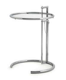
Eileen Gray was an Irish designer who lived in Paris and worked as an interior designer, architect, and furniture designer throughout her career. This table was created by Gray and her partner Jean Badovici for a home in Roquebrune, France. They placed it bedside, but the table is often more likely seen now next to chairs and sofas.
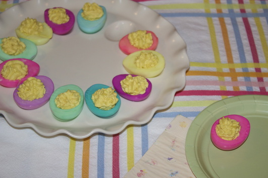
Last year, we ended up coloring eggs that were meant for a deviled egg hors d'oeuvre and I loved how it came out so much that I wanted to do it again this year. Plus, I like deviled eggs better than plain hard-boiled eggs, so this way, we can enjoy the fun of coloring the eggs and I'm more likely to eat them after. Recipe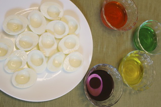 Hard boil eggs and remove the shells. Halve hard-boiled eggs lengthwise. Remove yolks and mash them (if you have a ricer, it makes the filling smoother, but using any masher or fork will do). For 6 eggs, use: -1/4 cup mayonnaise -1 teaspoon vinegar -1 teaspoon mustard, -and salt and pepper to taste To fill the eggs, we put the mixture in a cookie press with an accent tip on it; it gives them a light and ruffled look, but you can also use a piping bag (or a plastic storage bag with a corner cut off). We usually top them with paprika, but you can also garnish with parsley, chopped onions or chives, crumbled crispy bacon, or horseradish. The coloring process is the same as eggs still in the shell: food coloring + water + time = colored eggs. The color won't take to the eggs as uniformly as they do on the shells, but as long as you're okay with that, you should be pretty happy with the results. I haven't tried to do ombre or anything more advanced than combining two or three colors on the same egg, because it takes a while for the color to saturate into the egg white. We're actually doing another batch of eggs next week when my sister comes to town, so I might try to experiment a little. 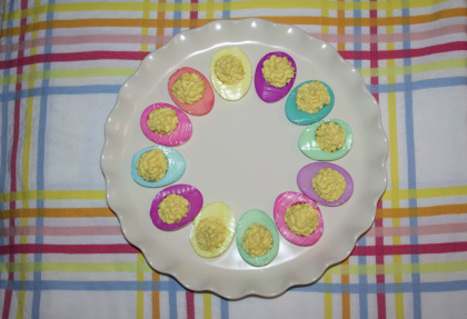
images my own
Xx a 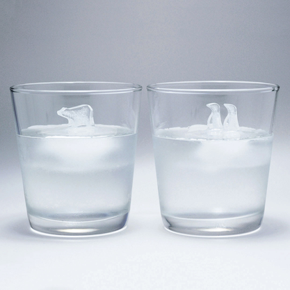
 These ice cubes are so cute! We've seen amusingly-shaped ice cubes before, but these are just a little different. Silicone molds create mini icebergs for a frozen polar bear and pair of penguins to stand upon. Created by Japanese designer Hayashi Atsuhiro, they represent the North and South Poles. As adorable as they will look in your drinks, they also serve a higher purpose: as the ice melts, the cubes act as a reminder of the situation facing real animals living on the receding Arctic and Antarctic ice caps due to global warming. The set of molds is available at Fab. Watch the video below to see how they look in a drink and get a better sense how they're made.
|
#checkout this blog with shop-themed puns
archives
August 2014
categories
All
© 2014 | mrkt
|
 RSS Feed