 Life's been a little crazy lately and I feel the blog has gotten the short end of the stick for sure, so thanks for hanging in with me even though there've been a lot of days without posts. I decided to do another throwback-style post today and share something I worked on three years ago.
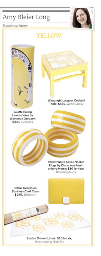
Trad Home, Traditional Home's digital magazine was still under wraps and being produced during the early months of 2011. There was a lot of industry buzz around the issue and it was a very exciting time. We were really trying to turn people's notion of "traditional" on its head. At the time, I was also producing my first major trend feature story completely on my own (plus a bunch of other stories) for the print mag, so I actually didn't have a lot to do with the digital version, but this was my contribution. Each editor had to select a color and source several products for the premier issue. The thing I like about this story—aside from the sorely-needed shot of sunshine it's providing—is that I would absolutely choose all of these products again. None of them seem dated; they're all as classic and relevant as they were three years ago. And not only would I choose them all again for the editorial, I would actually choose each of them in my own life. Sadly, DVF Home no longer exists. I really liked a lot of their tabletop and bedding pieces, so that's a shame. Another thing this does is illustrate that even if you're afraid of a lot of bold color, there are small-scale ways to bring in some brights in order to add interest without overwhelming yourself. I'm a bold color girl, but I can appreciate that some might like to keep their house toned down. (A little surprise here and there never hurt anyone, though.) A bright yellow business card holder, aside from being chic, is practical, too, for finding-it-in-the-abyss-of-your-purse purposes. In addition, you get to see what I look like with a blow-out and my head tipped at an angle, so there's that, too. photo: my own Xx a
0 Comments
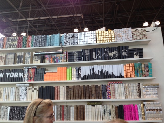
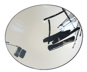
decorative books, including a set with the NY skyline
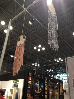
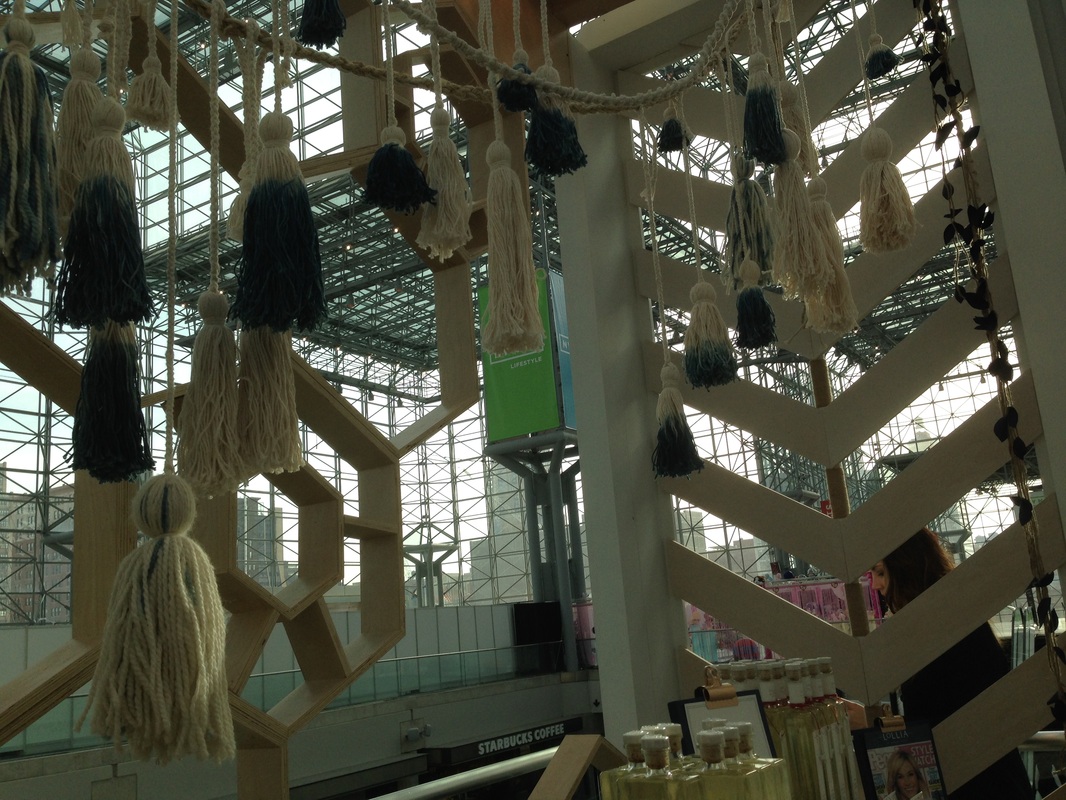
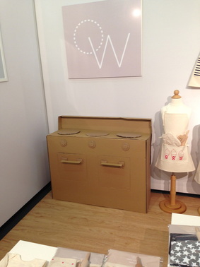
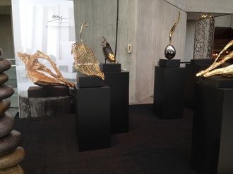
Hope everyone is staying warm and lifting with their knees when they shovel, it's crazy out there lately. I drove down to New York last Friday to attend NYNOW, formerly NYIGF, the gift show at the Javits Center. In two and a half days—and 2700+ pictures later—I walked every single aisle of the show and saw some great products. Mostly, I was really excited to be back in New York and to see a lot of the vendors I haven't seen in a while, since I missed the last three shows (not sure how that time flew so quickly). It was great to catch up with people and this was my first time experiencing the show since they changed the format and rebranded. I think it worked out well to have all the home companies under one roof, though as I walked the show, I realized there were several brands that I didn't see. I'm hoping they'll be there in August. At any rate, I'm looking forward to sharing the things that I saw over the next weeks and months. In addition to new and interesting products, the booths themselves are often styled creatively. Here are just a few fun things I noticed:
Xx a 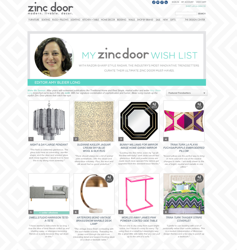
I am supremely honored to share that I am featured as a trendsetter on Zinc Door's feature Wishlists From The Pros. Zinc Door is a great decor resource and I've worked with them for years and it's been a pleasure. It was so much fun picking out these products, especially the tete-a-tete, which I desperately want, and the glass pendant (swoon).
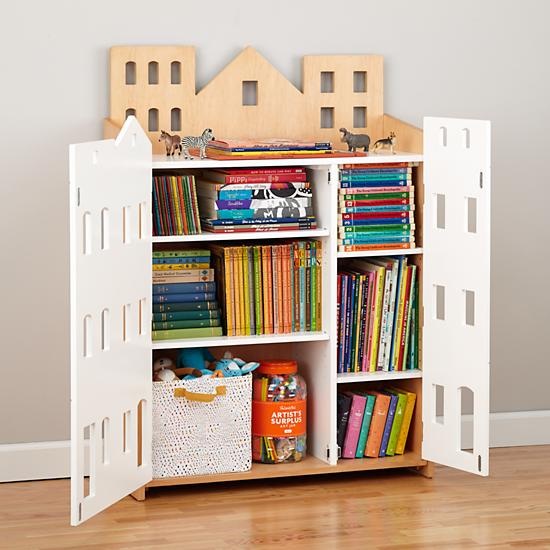
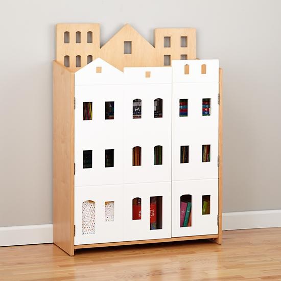
Thank you Zinc Door for the opportunity! What a great way to start the new year! Xx a 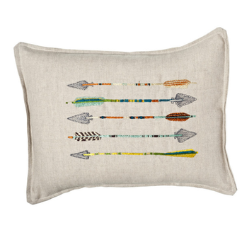 I hope everyone had a wonderful holiday weekend! We had a great time with immediate and extended family celebrating Thanksgiving (several times) and my birthday (also several times!), which was yesterday. I don't put a ton of stock in horoscopes, but I am a pretty true-to-form Sagittarius. I've always been interested in the imagery of the bow and arrow. When I was younger, I had a necklace with an arrow on it, and now I have a pierced brass cuff bracelet with the Sagittarius constellation. When I turned 30 a couple years ago, I stamped an arrow on the little favor bags full of silly things like candy and fake glasses with noses and mustaches attached. I've even used a modified arrow design for the back of my freelance business cards. I don't seem to be the only one interested in the graphic shape of the arrow, either. Check out these sharp finds: images via coral & tusk, ortolan organic, three potato four, haus interior, urban outfitters, 1st dibs, gretel, mid2mod, neiman marcus 1 & 2, net-a-porter, cavern, sucreshop 1 & 2, toodlesnoodles, spoonflower, john derian, house&hold Xx a 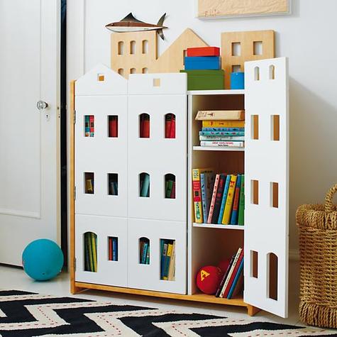 When I was younger, I was a voracious reader and tore through several books a week. Oh, to have the time for that again. It helps when you are also an insomniac starting from a young age (although, now that my 4 year old is following this pattern, I'm not sure how great it is). I also loved to make up stories about people and what they did and where they went. For better or worse, I have a vivid imagination. So when I see the Brownstone Bookcase from The Land of Nod, all I can think is: amazing dollhouse. Yes, it looks great with some books and toys, but how fun would it be to style at least some of this piece as a dollhouse? Decorate some of the shelves, grab some dolls and stuffed friends, and you (or, you know, your child…) could entertain yourself for hours creating lives for the dolls and imagining their interactions. I would have a ton of fun making up stories with my daughters about the apartment dwellers within. At least one shelf would be an Auntie Mame-style penthouse with revolving decor. On the practical side, having the option to close the doors and hide away the toys and books when they're less than neat is a nice plus. The modern design certainly goes with what we have in my house, and I like that it has the natural wood tone as well, so it wouldn't feel overly matchy-matchy with my daughter's white bed and dresser. It is pricier than a simple bookcase, but if your kids are interacting with it on a level beyond organization, it could be worth the additional cost. I love that it could serve more than one function, and of course, I'm partial to anything city-related, so I think it looks super cute. Brownstone Bookcase, $599, landofnod.com

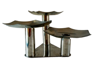
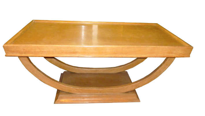
This weekend You & Yours Fine Vintage store in Williamsburg, Brooklyn celebrates its grand opening. Owner Allegra Muzzillo grew up around antiques, learning to scout and training her eye at the side of her dealer/collector mother. She's most drawn to mid-century pieces, which you'll notice by her inventory featuring furniture, decorative accessories, and tabletop predominantly from the 1950s-1970s. Allegra started out selling at the Brooklyn Flea in 2011, which she continues to maintain (booth B30), but will now expand with her brick-and-mortar shop. Her favorite personal scores have been vintage Nambê bowls and platters and a pair of decrepit (now happily rehabbed) Saarinen Armless Executive chairs she found on the street in front of an old grammar school. "I see mid-century pieces as truly timeless and I think they can mix with absolutely anything. The furniture is so simple and clean looking, but built to last, and for tabletop, it's the pieces' cheekiness, sense of fun, and use of color that I love." Allegra says. So it's no surprise that at her shop you'll find a Pucci-esque tray, a sculptural geometric candelabra, or 1920s/30s mini planter shaped like an elephant, mixed in among mirrors, lighting, and mid-century furniture.
As a freelance journalist who built her career writing and editing at shelter magazines (we worked together at Real Simple), Allegra has made You & Yours editor-friendly. The shop also caters to designers and stylists who will enjoy a 15% industry discount. But her completely affordable pieces will make everyone—especially small-space dwellers—happy.
Art and furniture are available for in-store pickup only at this time and the website features a small selection, so be sure to stop in and see what other treasures Allegra has uncovered: You & Yours Fine Vintage 240 Kent Avenue, unit #9 Brooklyn, NY 11249 917-482-4071 Open Wednesday through Sunday, 1p-7p and by appointment 
Let's all admit we have at least one IKEA piece in our house, whether it's the staple POANG chair or a BESTA, KARLSTAD, or HEMNES. And I know how the Elizabeth, NJ IKEA store can be on a Saturday, but putting that aside, do you think you can tell the difference between the often mysteriously-named IKEA products and the names of death metal music groups? Click the image above to test your knowledge of flat-packed fabulousness versus blood-soaked metal bands. Thankfully, no allen wrench required.
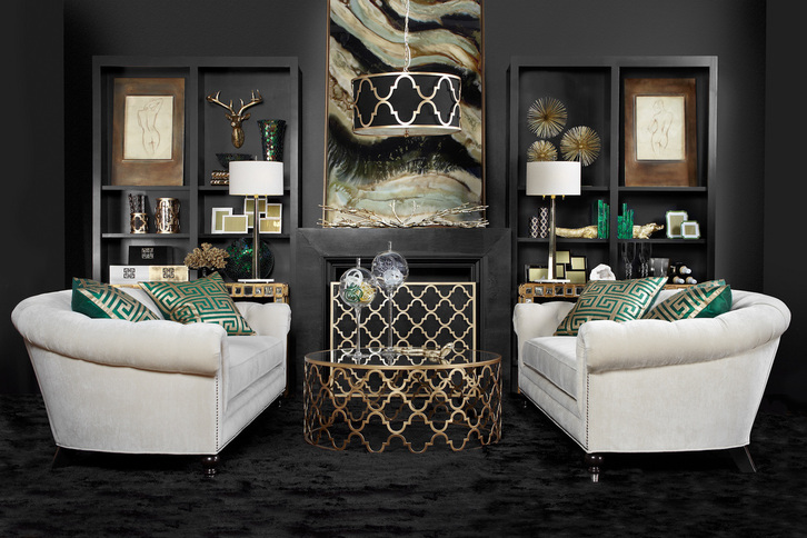
If challenged to choose a handful of only neutral colors and design a room around them, most people would probably not end up with something as moody and glamorous as this. I think we'd see a much lighter room, a lot more creams, browns, tans, greige, maybe some grey, or black, or white—but not this mix and not in this way. This image is actually from ZGallerie's fall look book (which can easily be accessed from their home page or clicking the above photo).
I was immediately drawn to it, not simply because I'm obsessed with moody rooms, but because the concept seems like it shouldn't be too difficult to pull together using an image such as this for inspiration. Essentially, the designers used black, an off-white, green, and a metallic—all of which are neutrals. But the genius is in the pairing. Using more black than white, particularly on the walls, carpeting and mantle creates a very different feeling than if the proportion were the other way around. The sofas balance the darkness and give your eyes a place to rest. The vibrant malachite green acts as an accent color and all of the gold provides additional light and reflection to keep the room from being too heavy and dull. The use of pattern is also fairly restrained, so the mix of shapes and materials is what provides the depth here. Bringing in glass objects, some chrome, and other accessories in these same shades adds interest to the room, and I love the large format framed canvas on the mantle which ties it all together seamlessly. This is also a good example of using a trendy color (emerald) but in a way that's easy to move around if you're someone who likes to switch out accents each season or as trends come and go. Another nice point of balance is the use of a round coffee table and curved sofas in front of the symmetrical very square/rectangular built-ins. I think it all came together brilliantly. What do you think of this room? Does it work for you? image via zgallerie Xx a 
Yin and yang. Shadow and light. The infamous Seinfeld black-and-white cookie episode. We're always looking to black and white to provide harmony. Black and white are huge right now, though I think truthfully we can always say that. There is a comfort in the consistency, it's always chic, and the less-confident home decorator is safe in knowing the two colors always go together and with everything else, too.
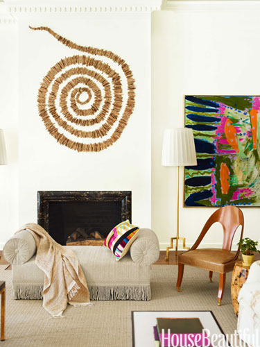
I'm on deadline for a freelance article, so forgive my brevity today (or maybe you welcome it!). Just wanted to share two excellent details from a Naples, FL beach house designed by Carrier and Company, recently featured in House Beautiful. Interior designers Jesse Carrier and Mara Miller are extremely talented, and whenever I've worked with or seen them in the past, it's been an absolute pleasure every time. Look at this insanely cool natural piece by artist Ran Adler that they chose for above the fireplace in the house's living room. I feel like at any moment it may start spinning and suck me into its vortex. I love it. Stringing, wiring, and weaving natural elements like sun-dried horsetail reeds, Adler creates undulating representations of wind and water. The unexpected material and fluidity add a great layer of texture and depth to the room. 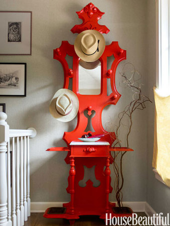
A Victorian hat rack in a vibrant lacquered red becomes a statement piece and remains totally functional. Such a lovely shape made even more special in an attention-grabbing color. I wonder if the homeowner had this piece already and they modernized it, or if the designers brought it in. Either way, wow.
I guess this was my version of brief... Click below to see the whole wonderful project. all images via house beautiful Xx a |
#checkout this blog with shop-themed puns
archives
August 2014
categories
All
© 2014 | mrkt
|

 RSS Feed